Quick text summary
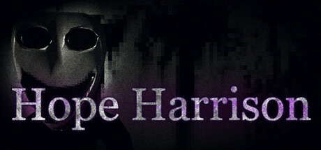
Hope Harrison scored 65/100 on Steam Analyzer — Solid for a Action Roguelike capsule. Top priority fix: [genre_clarity] Introduce a visual element that hints at roguelike or RNG mechanics—such as card symbols, dice, or procedural UI—to differentiate from standard horror.
Capsule scores by dimension
- Genre Clarity: 7/10 — Horror atmosphere clear, survival intent ambiguous. The dark palette, glowing eyes, and distorted face silhouette clearly signal horror/survival horror at all sizes. However, the nightmarish creature aesthetic reads as pure horror rather than explicitly suggesting the RNG roguelike mechanics or permadeath systems mentioned in the description. At TINY size, the genre reads as atmospheric horror first, with survival elements only implied by context.
- Title Readability: 7/10 — Readable at full and small, fragile at tiny. The title 'Hope Harrison' uses a clean serif font with purple/magenta color that contrasts reasonably against the dark background. At FULL and SMALL sizes, the text remains legible with good spacing. At TINY size (120x45), the letters compress but individual words remain distinguishable, though fine serifs begin to blur slightly and overall impact weakens.
- Contrast & Color: 7/10 — Strong dark/light separation, muted palette works. The pale grayscale face and bright glowing eyes create excellent value contrast against the pure black background. The purple title text pops with saturation control that feels intentional rather than jarring. In grayscale test, the face silhouette remains sharp and distinct, though the overall composition relies heavily on this single high-contrast focal element.
- Uniqueness & Polish: 6/10 — Competent horror aesthetic, lacks distinctive hook. The capsule executes a classic survival horror look with the distorted pale mask and glowing eyes—effective but familiar across the genre (similar visual language to Resident Evil, Dead Space, and indie horror titles). The execution is clean and the atmosphere is well-conveyed, but there is no memorable distinctive element that signals 'Hope Harrison' specifically or communicates the RNG roguelike angle that differentiates it from standard horror.
- Brand Consistency: 5/10 — Generic horror, no recognizable identity signals. The pale masked face and glowing eyes are archetypal horror tropes rather than distinctive brand markers. Without access to gameplay visuals or additional store screenshots context, the capsule alone does not communicate a unique franchise identity or memorable visual motif that would anchor brand recognition. The title is the only identifying element; the imagery could belong to many horror titles.
- Composition: 7/10 — Strong focal point, safe layout across sizes. The face occupies the center-left area, creating a clear primary subject with good breathing room. The title 'Hope Harrison' anchors to the right-center, balancing the composition without cluttering. At SMALL and TINY sizes, the layout remains stable—the face reads as primary subject and title remains legible without overlap or edge-cutting issues. Depth is minimal but intentional, with the face and background separation achieved through value contrast rather than layering.
What works
- Strong value contrast. The pale face and glowing eyes against pure black background create excellent silhouette clarity that holds even at TINY size.
- Clear focal point hierarchy. The centered face immediately draws attention with supporting title positioned to the right, avoiding visual chaos or competing elements.
- Atmospheric genre signaling. The distorted mask and glowing eyes immediately communicate horror/survival horror without ambiguity at any viewing size.
What hurts the capsule
- No gameplay mechanic visualization. The capsule does not visually hint at RNG roguelike, permadeath, or 'hand crafted' systems—only generic horror is communicated.
- Generic horror archetype. The pale masked face with glowing eyes is a familiar trope shared across many survival horror titles, offering no distinctive brand memory.
- Limited visual storytelling. The image is atmospheric but does not communicate what makes Hope Harrison unique compared to competing horror games in the genre.
Priority fixes
- [genre_clarity] Introduce a visual element that hints at roguelike or RNG mechanics—such as card symbols, dice, or procedural UI—to differentiate from standard horror.
- [uniqueness_polish] Add a distinctive character trait or environmental detail that feels proprietary to Hope Harrison rather than archetypal horror.
- [brand_consistency] Incorporate a recognizable motif or color accent that could anchor future marketing and player memory across store pages.
Store copy priority fixes
- [uniqueness] Explain 'Hand Crafted RNG' explicitly—e.g., 'Hand-Designed Encounters: randomized within carefully authored spaces, not fully procedural' to differentiate from standard roguelikes.
- [feature_communication] Add a dedicated survival mechanics section detailing resource management, health, stamina, or sanity systems to clarify the 'survival' loop.
- [tone_match] Rewrite the Features section headers and descriptions in the same atmospheric voice as the opening (e.g., 'Multiple Unique Monsters' → 'Beware: Each Creature Hunts Differently'), not clinical.
- [audience_targeting] Add explicit audience signals: 'For roguelike veterans and horror fans' or clarify difficulty/assist options to help the right player self-identify.
Related guides
Steam app ID: 3647620 · Tags: Action Roguelike, Exploration, Resource Management, Psychological Horror, Perma Death