Scoring genre clarity...

Golden Tides capsule

Golden Tides

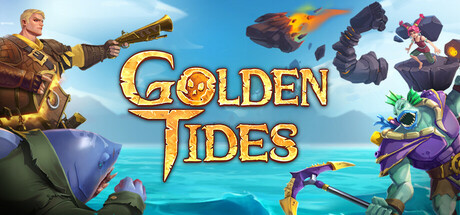
Forget everything you know about MOBAs. Gather your crew and charge into explosive battles across land and sea in Golden Tides. Whether you sail for glory or just for the chaos, every 20–25 minute voyage brings unpredictable encounters, epic ship battles, and tales worth telling at the tavern.

Free to Play
MOBAPvPTeam-Based
Psychedelic Games2026

Golden Tides scores 70/100 — better than 24% of MOBA capsules (n=68).

Free to Play · Released 2026 · By Psychedelic Games

Quick text summary

Golden Tides scored 70/100 on Steam Analyzer — Good for a MOBA capsule. Top priority fix: [uniqueness_polish] Add a signature visual element or gameplay mechanic indicator—such as a prominent ship silhouette, crew roster UI hint, or explosive battle effect—that communicates what makes Golden Tides distinct from standard MOBAs.

Capsule scores by dimension

  • Genre Clarity: 7/10 — Action MOBA with naval theme clear. The capsule immediately communicates action-adventure through dynamic character poses, vibrant combat staging, and visible fantasy characters in tactical positions. The naval setting is reinforced by the water background and ship elements, though at TINY size the specific MOBA mechanics become less obvious—the capsule reads more as general action-adventure rather than strategy-focused gameplay. Genre iconography is present but not as sharp as top benchmarks like HELLDIVERS 2 or Armored Core VI.
  • Title Readability: 8/10 — Gold text stands out well overall. The 'GOLDEN TIDES' title uses a warm golden typeface with strong contrast against the sky-blue background, remaining legible at SMALL size. At TINY size the letterforms hold reasonable clarity, though fine serifs on the decorative font begin to soften. The centered placement over relatively controlled background region supports readability across all viewing sizes without competing background noise.
  • Contrast & Color: 8/10 — Strong value separation and saturation. The palette uses vibrant complementary colors—warm gold title, cool blue water, purple-and-orange character costumes—creating excellent value separation against the dark Steam background. Character silhouettes remain distinct even at TINY size due to bold color blocking and clear lighting separation. The turquoise water midground provides clean depth and contrast without muddying the composition.
  • Uniqueness & Polish: 6/10 — Competent but visually generic execution. The capsule demonstrates solid craft with well-rendered character models and clean color grading, but lacks the distinctive visual hook or memorable art direction found in top benchmarks like DREDGE or Harold Halibut. The scene reads as a standard fantasy-action lineup without communicating a unique selling point—there is no clear visual storytelling that explains what makes Golden Tides different from other MOBAs or naval adventures. The presentation is professional but indistinguishable from similar genre entries.
  • Brand Consistency: 6/10 — Functional but no iconic identity cues. The capsule uses consistent rendering and a coherent warm-cool color palette, but lacks memorable identity signals such as a signature character, symbol, or visual motif that would enable recognition across store pages. The golden title font is the strongest branding element, yet it is generic enough to appear on dozens of fantasy titles. Without access to the 12 store screenshots, internal cohesion appears functional but unremarkable for distinguishing Golden Tides as a franchise.
  • Composition: 7/10 — Balanced layout with clear focal depth. The composition uses effective depth layering—water background, character midground, title integration—creating a clear visual hierarchy. The four characters are positioned to frame the center space without overcrowding, and the title sits in a balanced upper-center zone. At SMALL and TINY sizes the focal point remains the character cluster with the golden title, though at TINY size supporting character details blur together slightly. Margins are safe and the composition resists cropping stress well.

What works

  • Strong color contrast and saturation. Gold title, purple-orange characters, and turquoise water create vibrant value separation that holds at TINY size and pops against Steam's dark background.
  • Clear depth layering and focal hierarchy. Background, midground character cluster, and foreground title elements create a structured visual read that guides the eye naturally without clutter.
  • Legible golden title across sizes. The centered 'GOLDEN TIDES' text maintains reasonable clarity even at TINY size due to bold weight and contrast positioning over controlled background region.

What hurts the capsule

  • Generic visual execution and no unique hook. The capsule reads as a competent but standard fantasy-action scene without communicating a distinct selling point or memorable identity cue that differentiates it from other MOBAs or naval adventures.
  • MOBA mechanics not clearly communicated. At TINY size the capsule reads more as general action-adventure than as a strategy-focused MOBA, losing genre specificity in the visual language compared to benchmarks like HELLDIVERS 2.
  • Character details collapse at TINY size. Supporting character poses and equipment detail become indistinct at TINY thumbnail scale, reducing the ability to recognize unique character identity or gameplay roles.

Priority fixes

  1. [uniqueness_polish] Add a signature visual element or gameplay mechanic indicator—such as a prominent ship silhouette, crew roster UI hint, or explosive battle effect—that communicates what makes Golden Tides distinct from standard MOBAs.
  2. [genre_clarity] Emphasize tactical or strategic elements in the composition—consider adding UI-like frames, ability icons, or crew positioning cues—to sharpen the 'action-strategy MOBA' positioning at SMALL and TINY sizes.
  3. [brand_consistency] Develop and lock a signature color motif, character pose language, or symbolic element (e.g., a crew emblem or ship marking) that can be reinforced across store screenshots and future promotional materials for instant brand recognition.

Store copy priority fixes

  1. [feature_communication] In the hero roster section, replace lore descriptions with one sentence per hero role archetype explaining playstyle impact: e.g., 'Almandee-Breeze is a tide-control mage perfect for coordinating team engages' instead of narrative flavor alone.
  2. [genre_clarity] Add a sentence clarifying WASD combat mechanics in the short description or opening paragraph: 'Direct character control with WASD creates skill-based, action-packed combat unlike traditional MOBA point-and-click,' to differentiate from League/Dota baseline.
  3. [uniqueness] Replace the generic 'constant updates' promise with one concrete differentiator or planned feature: e.g., 'Procedurally randomized islands ensure no two matches play the same, with new biomes and events added monthly.'
  4. [audience_targeting] Add a sentence in the short description or opening paragraph that explicitly signals the blend of competitiveness and adventure: e.g., 'Perfect for teams seeking competitive depth without sacrificing exploration and unpredictability,' to pre-qualify the intended audience.

Related guides

Steam app ID: 3650580 · Tags: MOBA, PvP, Team-Based, Multiplayer, Competitive