Scoring genre clarity...

SyncroChromia capsule

SyncroChromia

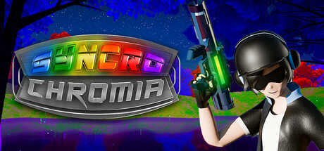
In this *NEW* FPS, rhythm game, dive into the Land of Sync, where EDM is under attack and slimes are mind-controlled by a sinister force. Play as Scissors, a human on a rhythm-fueled mission to save the slimes and restore the beat. Can you stop Evil Corp and save EDM?

Free to Play6 user reviews
SingleplayerMusicFPS
Krispy KreationsMay 12, 2025

SyncroChromia scores 72/100 — better than 44% of Singleplayer capsules (n=16,133).

6 user reviews · Free to Play · Released May 12, 2025 · By Krispy Kreations

Quick text summary

SyncroChromia scored 72/100 on Steam Analyzer — Good for a Singleplayer capsule. Top priority fix: [genre_clarity] Integrate a visual rhythm element—such as sound waves, beat markers, or sync symbols—into the background or weapon to strengthen the rhythm-game identity at tiny size.

Capsule scores by dimension

  • Genre Clarity: 7/10 — Action FPS with rhythm hints. The armed character in tactical gear and the weapon clearly signal action/FPS gameplay. The neon colors and EDM aesthetic hint at rhythm elements, though the connection is not immediately obvious at tiny size. At TINY size, the character silhouette and gun dominate, making it read as pure shooter first with visual flair secondary.
  • Title Readability: 8/10 — Logo strong, readable across sizes. The SYNCROCHROMIA logo uses bright rainbow letterforms on a metallic gray background with clear contrast against the dark blue space background. The logo maintains legibility at small and tiny sizes due to high saturation and distinct letter shapes. The metallic beveled effect adds polish without compromising clarity.
  • Contrast & Color: 8/10 — High saturation, strong separation. Neon rainbow title pops sharply against the dark blue starfield, with the lime green weapon adding a secondary focal point. The black-suited character provides silhouette clarity and value separation from the blue background. At TINY size, the color blocking remains clear and doesn't collapse into muddiness.
  • Uniqueness & Polish: 7/10 — Distinctive visual style, somewhat familiar execution. The neon EDM aesthetic with the rhythm-game-meets-FPS concept creates a memorable hook not typical of standard action shooters. The character pose and weapon feel professionally rendered, though the overall composition follows conventional game capsule structure. The blend of cyber neon and casual gameplay promises something fresh, but execution is competent rather than groundbreaking.
  • Brand Consistency: 6/10 — Cohesive neon identity, limited distinctiveness. The rainbow neon palette, dark character, and lime green weapon create internal visual consistency within this single capsule. However, without reference to the 9 store screenshots, the identity signals are generic neon-shooter tropes rather than uniquely recognizable SyncroChromia branding. The character design and color scheme would need iconic repetition across materials to build strong brand memory.
  • Composition: 7/10 — Clear focal point, slight imbalance. The armed character occupies the right side as primary focal point with the logo anchoring top-left, creating a clean two-element hierarchy. The starfield background provides non-distracting depth, and the layout reads well at all sizes without clutter. Minor weakness: the character-heavy right side leaves slightly dead space on the left near the logo, and the composition is slightly off-center overall, though this remains functional at TINY size.

What works

  • High-contrast neon logo. Rainbow SYNCROCHROMIA text with metallic backing maintains legibility and visual pop across all viewing sizes.
  • Clear action/shooter framing. Armed character in tactical gear immediately communicates the FPS genre without ambiguity.
  • Distinctive EDM+shooter fusion. Neon aesthetic and rhythm-game premise differentiate this from standard action game capsules in the market.

What hurts the capsule

  • Rhythm game identity unclear at tiny. The FPS elements dominate, and without reading the description, the rhythm-game half of the premise is not visually evident at small sizes.
  • Generic tactical character pose. The standing-aim pose is common in shooter marketing and does not communicate the unique protagonist 'Scissors' or the game's quirky slime-saving premise.
  • Right-heavy composition. The character occupies most of the visual weight on the right, creating slight imbalance and wasted space on the left side of the frame.

Priority fixes

  1. [genre_clarity] Integrate a visual rhythm element—such as sound waves, beat markers, or sync symbols—into the background or weapon to strengthen the rhythm-game identity at tiny size.
  2. [uniqueness_polish] Redesign the character to reflect the protagonist 'Scissors' identity or show mind-controlled slimes as secondary elements to communicate the core premise beyond generic shooter framing.
  3. [composition] Rebalance the layout to better distribute visual weight; consider repositioning the character slightly left or adding a secondary visual element on the left to fill dead space and improve symmetry.

Store copy priority fixes

  1. [hook_strength] Rewrite the short description opening to lead with the rhythm-weapon mechanic: 'Shoot to the beat in SyncroChromia, the rhythm FPS where music is your weapon and every hit syncs to EDM.' This frontloads the unique value proposition.
  2. [audience_targeting] Add a one-sentence accessibility statement near the end of the detailed description clarifying difficulty level or player skill expectations, e.g., 'Perfect for both rhythm game newcomers and hardcore players seeking a fresh challenge.'
  3. [uniqueness] Insert a differentiator sentence early in the detailed description such as 'SyncroChromia is the only FPS where your rhythm accuracy directly controls healing and damage output in real-time battles.'

Related guides

Steam app ID: 3651170 · Tags: Singleplayer, Music, FPS, On-Rails Shooter, Rhythm