Scoring genre clarity...
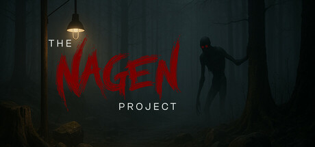
An asymmetric horror game where, in a haunting forest, a team of hunters tracks a creature lurking in the shadows. But what they seek is hunting them too. Every clue brings them closer to the truth—and to their demise.
$4.992 user reviews
PvPSurvival HorrorAdventure
NAGEN LABSep 8, 2025