Scoring genre clarity...
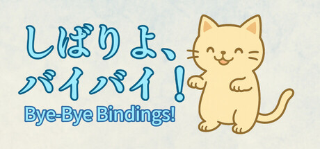
Bye-Bye Bindings! is a stress-relief clicker game where you cut through invisible "En"—spiritual ties—together with a cute spirit cat. Feeling a little worn out? Put on your favorite BGM and gently reset your mind.
Free to Play5 user reviews
CasualPoint & Click2D Platformer
Nisake, NISAKEMay 5, 2025