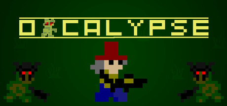
Orcalypse scores 70/100 — better than 24% of Arena Shooter capsules (n=556).

Quick text summary

Orcalypse scored 70/100 on Steam Analyzer — Good for a Arena Shooter capsule. Top priority fix: [uniqueness_polish] Add visual storytelling of waves or horde scale—increase enemy count or add background elements suggesting overwhelming numbers to communicate the survival mechanic

Capsule scores by dimension

  • Genre Clarity: 7/10 — Pixel art action game clear. The retro pixel art style immediately signals an arcade-style action game, and the centered character wielding a weapon with enemies on flanks clearly communicates combat gameplay. At tiny size, the silhouette of the player character and attacking enemies remain readable, though specific genre details like 'horde survival' are less obvious without context.
  • Title Readability: 8/10 — Bold yellow title highly legible. The title 'ORCALYPSE' is rendered in bright yellow-green blocky pixels with strong contrast against the dark green background, maintaining excellent readability across all sizes down to tiny. The geometric letterforms hold their shape at small scale, though the pixel font requires sufficient size to avoid blurring in quick scroll.
  • Contrast & Color: 8/10 — Strong value separation dark background. The bright yellow title pops distinctly against the dark forest green background, and the player character's red hat and blue legs create readable silhouettes against the darker surroundings. At tiny size the color blocking remains effective, though some mid-tone detail in character sprites softens slightly but does not collapse.
  • Uniqueness & Polish: 6/10 — Competent retro style generic scene. The pixel art execution is clean and well-crafted, with consistent sprite quality and readable character design, but the composition of a lone fighter flanked by two identical enemies is a fairly standard action game visual trope. The retro aesthetic is intentional and executed competently, yet does not communicate a distinctive hook or memorable visual identity that separates it from other pixelated action titles.
  • Brand Consistency: 6/10 — Consistent pixel style limited signature. The capsule maintains internal coherence with uniform pixel art rendering, consistent color palette of yellows, reds, blues, and greens, and a recognizable retro game aesthetic. However, there are no distinctive brand motifs, iconic character traits, or signature visual elements that would be immediately recognizable as 'Orcalypse' specifically rather than a generic 8-bit action game.
  • Composition: 7/10 — Clear focal point balanced layout. The player character in the center serves as the primary focal point, with flanking enemies creating natural balance and visual rhythm that guides the eye effectively at all sizes. Safe margins are respected with the title placed securely in the upper zone, though at tiny size the three-character formation compresses into a tight mass that becomes less visually distinct.

What works

  • Strong title contrast and legibility. The yellow pixel-art title maintains excellent readability against the dark green background at all viewing sizes including tiny thumbnail.
  • Clear focal point and balance. The centered player character with symmetrically placed enemies creates an effective visual hierarchy and composition that works at small scales.
  • Consistent retro art direction. Uniform pixel art rendering and sprite quality throughout conveys intentional, polished aesthetic execution rather than cheap asset work.

What hurts the capsule

  • Generic action game composition. The three-character centered arrangement is a common visual trope that does not communicate unique gameplay mechanics or a distinctive selling point.
  • Limited brand identity signals. No iconic character traits, memorable motifs, or signature visual elements that would distinguish this capsule as specifically 'Orcalypse' rather than any other pixel art action game.
  • Lack of horde-survival visual storytelling. The composition does not visually communicate the 'endless waves' or survival mechanics described; it shows only three enemies rather than the chaotic scale of the game.

Priority fixes

  1. [uniqueness_polish] Add visual storytelling of waves or horde scale—increase enemy count or add background elements suggesting overwhelming numbers to communicate the survival mechanic
  2. [brand_consistency] Develop a signature visual motif or iconic character detail that makes the hero visually distinctive and memorable across store screenshots
  3. [composition] Consider adding background atmosphere like falling debris, particle effects, or environmental hazards that hint at the apocalyptic setting and elevate visual interest

Store copy priority fixes

  1. [uniqueness] Add one concrete mechanical differentiator in the short description or opening feature line—e.g., 'Master three unique character archetypes with vastly different playstyles' or 'Combine rapid weapon upgrades with environmental hazards' to signal what makes Orcalypse distinct.
  2. [feature_communication] Expand the Upgrade mechanics and Character selection bullets with 1–2 examples: 'Unlock rapid-fire bursts or piercing shots mid-wave' and 'Choose a berserker for raw damage or a tactician for precision' to help players visualize gameplay.
  3. [audience_targeting] Add a sentence clarifying the intended player: 'Perfect for score-chasing arcade veterans who thrive under pressure' or 'For players who enjoy high-stakes survival with moments of breathing room' to narrow and sharpen positioning.

Related guides

Steam app ID: 3654190 · Tags: Arena Shooter, Shoot 'Em Up, Bullet Hell, PvE, Shooter