Scoring genre clarity...

Chick Defender capsule

Chick Defender

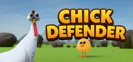
This is a shooting game in which you play as a funny chicken who shoots corn at bees to protect the chick while trying to collect all the keys before the countdown ends. It's a casual and simple game where you challenge yourself to see how far you can go.

$2.991 user reviews
CasualShooterPvE
IgarashiMay 7, 2025

Chick Defender scores 78/100 — better than 82% of Casual capsules (n=10,153).

1 user reviews · $2.99 · Released May 7, 2025 · By Igarashi

Quick text summary

Chick Defender scored 78/100 on Steam Analyzer — Good for a Casual capsule. Top priority fix: [genre_clarity] Add visual cues of the core mechanic—depict the chicken in a defensive pose or hint at corn projectiles/bee enemies to immediately communicate the shooting gameplay rather than relying solely on character charm.

Capsule scores by dimension

  • Genre Clarity: 8/10 — Clear casual action tower defense. The capsule immediately communicates a lighthearted action game through the prominent white chicken character with expressive eyes on the left, the small yellow chick in the center, and the pastoral green field setting. At TINY size, the chicken silhouette and chick remain recognizable, and the casual art style clearly signals indie arcade action rather than complex strategy. The visual language perfectly matches the described shooting mechanic and protective gameplay loop.
  • Title Readability: 9/10 — Bold yellow text dominates clearly. The title "CHICK DEFENDER" uses large, bright yellow letters with a dark brown or black outline that create strong contrast against the light blue sky background. At SMALL and TINY sizes, the letterforms remain fully legible and the title maintains its impact due to the high-saturation yellow and weight of the stroke. The strategic placement in the upper center avoids competition with the background scenery.
  • Contrast & Color: 8/10 — Strong value separation overall. The yellow title pops sharply against the blue-green environment, and the white chicken silhouettes create clear separation from the background foliage and sky. The warm yellow text contrasts well against the cool natural palette, ensuring readability even at reduced sizes. In grayscale, the light chicken and title values distinguish themselves from the mid-tone grass and sky.
  • Uniqueness & Polish: 7/10 — Charming art style, light generic feel. The 3D-rendered art style and expressive character design convey a polished, appealing casual game with genuine charm and personality. The white chicken with googly eyes and red comb, plus the small yellow chick sidekick, create an immediately endearing visual identity that matches the playful tone. However, the pastoral landscape setting and overall composition feel somewhat generic for the casual indie action space, lacking a distinctive visual hook or unique mechanic telegraph beyond character appeal.
  • Brand Consistency: 7/10 — Consistent character-driven identity. The white chicken protagonist and yellow chick are clearly the brand anchors, rendered with consistent clean geometry and expressive design that should be recognizable across store assets. The bright, saturated color palette (yellow, white, green, blue) establishes a cohesive visual identity that signals lighthearted indie action. However, without seeing the 9 referenced screenshots, the evaluation is limited; the capsule alone conveys strong character branding but lacks obvious symbolic motifs or signature visual patterns that would elevate memorability.
  • Composition: 8/10 — Clear focal hierarchy, well-balanced. The large white chicken on the left creates a strong primary focal point, the yellow chick in the center reinforces the core mechanic (protection), and the soft pastoral background provides supporting context without competing for attention. The composition uses depth layering effectively—the bright characters pop from the receding landscape—and safe margins keep key elements away from crop edges. At SMALL and TINY sizes, the chicken and title remain the dominant read with no awkward clutter or lost hierarchy.

What works

  • Title legibility and impact. The bright yellow "CHICK DEFENDER" text with dark outline reads clearly at all sizes and immediately communicates the game name without ambiguity.
  • Character charm and personality. The expressive white chicken and cute yellow chick establish immediate visual appeal and emotional connection that differentiates the game from generic casual titles.
  • Strong color-to-background contrast. The warm yellow and white characters separate cleanly from the cool blue-green environment, ensuring readability even in quick scrolls and at reduced sizes.
  • Balanced composition with clear hierarchy. The focal points (chicken, chick, title) are strategically arranged with supporting scenery that does not distract, creating an easy read across all viewing scales.

What hurts the capsule

  • Generic pastoral background. The soft green field and distant trees provide little visual distinctiveness compared to similar casual indie games and do not reinforce the unique gameplay loop of protecting a chick from bees.
  • No visible gameplay mechanic telegraph. The capsule shows the protective relationship (chicken, chick) but does not visually hint at the shooting, bee enemies, key collection, or countdown mechanics that differentiate the game.
  • Limited brand identity signals beyond characters. While the chicken characters are charming, there are no symbolic motifs, signature effects, or distinctive visual patterns that would make the brand instantly recognizable in a crowded store listing.

Priority fixes

  1. [genre_clarity] Add visual cues of the core mechanic—depict the chicken in a defensive pose or hint at corn projectiles/bee enemies to immediately communicate the shooting gameplay rather than relying solely on character charm.
  2. [uniqueness_polish] Introduce a distinctive visual hook such as stylized effects, signature color accents, or iconic UI elements that signal the game's unique mechanics and elevate it above generic casual action.
  3. [composition] Replace or enhance the generic pastoral background with a scene that reinforces the tower defense or protection mechanic, such as visible bee threats or key objectives, to strengthen visual storytelling.

Store copy priority fixes

  1. [hook_strength] Rewrite the short description opening to lead with the core verb and immediate appeal: 'Defend your chick from waves of bees as a gunslinging chicken—collect all keys in 25 seconds or face the hive.' This centers gameplay and time pressure immediately.
  2. [feature_communication] Add a bulleted or structured section in the detailed description listing the core mechanics: Collect keys under a 25-second timer per round, Shoot corn at attacking bees, Throw shields to protect Chick, Survive and unlock higher rounds. This transforms narrative description into actionable knowledge.
  3. [uniqueness] Insert a sentence that highlights what differentiates Chick Defender from similar casual shooters, such as: 'The shield-passing mechanic and dual-objective time attack mode set this apart—you're not just surviving; you're solving.' This addresses a glaring gap.
  4. [audience_targeting] Add explicit audience signal in detailed description, such as: 'Perfect for players who love quick arcade challenges and casual high-score chasing.' This clarifies who benefits most from the game's loop.

Related guides

Steam app ID: 3655200 · Tags: Casual, Shooter, PvE, Cute, Third-Person Shooter