Scoring genre clarity...
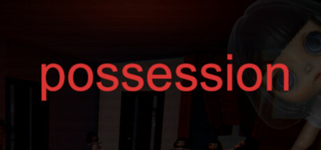
The story begins as the protagonist receives a cursed doll and starts suffering from recurring nightmares. Players explore dark environments and face fear through various horror elements. The game offers two different endings and delivers a short but intense horror experience.
$1.999 user reviews
AdventureWalking SimulatorExploration
TaleonMay 6, 2025