Scoring genre clarity...
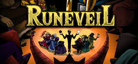
Runeveil capsule

Runeveil

Sequencer Roguelike. Enter the Arena as an elemental wizard, craft powerful rune chains, and break the game with wild artifact synergies. Beat all trials, defeat the Sin Kings, and ascend to godhood. Magic is chaos, order is power!

$9.59Positive(37)
Early AccessRoguelike DeckbuilderCard Game
dicehitJun 23, 2026

Runeveil scores 73/100 — better than 54% of Early Access capsules (n=3,143).

Positive (37 reviews) · $9.59 · Released Jun 23, 2026 · By dicehit

Quick text summary

Runeveil scored 73/100 on Steam Analyzer — Good for a Early Access capsule. Top priority fix: [uniqueness_polish] Introduce a distinctive visual hook or character silhouette that communicates the sequencer-deckbuilding mechanic, such as rune cards or a signature elemental motif that becomes the brand anchor

Capsule scores by dimension

  • Genre Clarity: 7/10 — Wizard fantasy with strategy hints. The silhouetted wizard figures and magical rune-circle composition clearly signal fantasy gameplay with arcane themes. At TINY size, the central glowing orange arena and character poses suggest strategic positioning, though the specific roguelike deckbuilding mechanic is not visually apparent without additional context. The warm magical aesthetic reads as fantasy-strategy rather than action RPG.
  • Title Readability: 8/10 — Bold gold title reads clearly. The RUNEVEIL title uses a strong serif font rendered in bright gold against the dark background, providing excellent contrast and readability at all sizes. At SMALL and TINY sizes, the letterforms remain distinct and the weight holds legibility well. The placement directly above the central imagery avoids competing with the main focal point while maintaining prominence.
  • Contrast & Color: 8/10 — Warm orange arena pops strongly. The luminous orange-gold arena circle creates striking value separation against the dark #1b2838 background, with the gold title amplifying this contrast hierarchy. Silhouetted character figures in dark blue and black read cleanly against the warm glow, maintaining clarity even at TINY size due to strong light-dark separation. The purple and colored costume details add saturation without muddying the core silhouette.
  • Uniqueness & Polish: 7/10 — Polished arena stage, competent execution. The composition shows intentional craft with a theatrical arena presentation that suggests performance and spectacle, differentiating from generic dungeon roguelikes. However, the overall visual hook—silhouetted wizards in a magic circle—is a relatively familiar arcane trope that doesn't immediately communicate the unique sequencer-deckbuilding mechanic. The polish is solid but the distinctiveness is moderate within the indie strategy space.
  • Brand Consistency: 6/10 — Golden magical aesthetic, limited character. The warm gold palette and arcane circle motif establish a consistent magical brand identity that would carry across marketing materials. However, without a distinctive character icon, signature visual style, or memorable symbol unique to Runeveil specifically, the identity feels tied to generic fantasy-wizard tropes rather than a proprietary brand voice. The internal cohesion is competent but offers limited memorability for repeat recognition.
  • Composition: 8/10 — Strong centered stage, clear hierarchy. The composition uses a theatrical stage framing with the title at top and the glowing arena at center, creating clear visual hierarchy and focal depth. Character silhouettes are layered effectively with background elements providing context without clutter, and the balanced framing avoids edge-hugging or awkward gaps. At SMALL and TINY sizes, the centered glow remains the primary focal point with supporting elements reading as supporting rather than competing.

What works

  • Gold title contrast and legibility. The bright gold serif font maintains excellent readability against dark backgrounds across all viewing sizes due to strong value separation and consistent letterform weight.
  • Orange arena focal point impact. The luminous central arena creates an immediate visual anchor that pops at TINY size and guides the eye naturally to the core action area.
  • Layered silhouette depth. Multiple character figures at varying scales create foreground-midground-background separation without cluttering the composition, enhancing visual interest.
  • Theatrical framing intention. The stage-like presentation with warm overhead lighting suggests spectacle and performance, differentiating from standard dungeon crawling visuals.

What hurts the capsule

  • Generic wizard trope visual. The silhouetted robed figures and magic circle are familiar fantasy archetypes that don't immediately communicate the unique sequencer-deckbuilding core mechanic.
  • Limited brand icon differentiation. No distinctive character, creature, or symbol serves as a recognizable identity anchor that would stick in memory or differentiate Runeveil from other wizard-themed games.
  • Roguelike category ambiguity. While the fantasy-strategy genre reads clearly, the specific roguelike or deckbuilding angle is not visually communicated, potentially confusing discoverability.

Priority fixes

  1. [uniqueness_polish] Introduce a distinctive visual hook or character silhouette that communicates the sequencer-deckbuilding mechanic, such as rune cards or a signature elemental motif that becomes the brand anchor
  2. [genre_clarity] Add subtle visual cues like visible rune cards, mana crystals, or a deckbuilding interface element at the bottom to signal the roguelike deckbuilding identity without cluttering composition
  3. [brand_consistency] Establish a proprietary color accent or symbol (e.g., a signature rune pattern or elemental icon) that repeats across all capsule variants and store assets for brand recognition

Store copy priority fixes

  1. [feature_communication] Add 1-2 concrete synergy examples in the 'BREAK THE GAME WITH SYNERGIES' section (e.g., 'Pair the Wildfire Rune with the Phoenix Artifact to trigger double damage on every third rune placement') to make the synergy loop tangible and exciting.
  2. [hook_strength] Replace 'Sequencer Roguelike' in the short description with 'Roguelike where the order of your spells matters more than which spells you pick' to reduce jargon barrier while preserving the core hook.
  3. [feature_communication] Add a brief note in the description clarifying whether the game is accessible to newcomers or primarily for experienced deckbuilder players, given the emphasis on difficulty and synergy depth.
  4. [audience_targeting] Emphasize in the opening or under KEY FEATURES whether this is primarily single-player focused and designed for replayability loops rather than progression-only, to attract the right player segment.

Related guides

Steam app ID: 3656560 · Tags: Early Access, Card Battler, Replay Value, Difficult, Roguelike Deckbuilder