Scoring genre clarity...
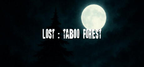
Lost Taboo Forest is a game about an ordinary person who breaks a taboo and enters a forbidden forest to save his sister. Ominous sounds are approaching as you walk in the darkness, but you can't see what makes the sound. Walk through the darkness and avoid letting the sound get too close.
$9.99
FPSWalking SimulatorRPG
Gambut StudioMay 24, 2025