Scoring genre clarity...

Corrupted World capsule

Corrupted World

Get to your target in side-scrolling platform, beat him up in bullet hell.

$11.991 user reviews
ActionAction-AdventurePlatformer
Alexis GuilbaultAug 27, 2025

Corrupted World scores 62/100 — better than 3% of Action capsules (n=8,534).

1 user reviews · $11.99 · Released Aug 27, 2025 · By Alexis Guilbault

Quick text summary

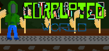
Corrupted World scored 62/100 on Steam Analyzer — Solid for a Action capsule. Top priority fix: [composition] Add environmental context or secondary character/enemy to create visual narrative suggesting the game's core loop and distinguish from generic platformers.

Capsule scores by dimension

  • Genre Clarity: 7/10 — Pixel art action platformer clear. The retro pixel art style, side-scrolling composition, and visible character sprite in idle stance immediately signal a classic 2D platformer. The corruption theme is reinforced by the green hue and distorted character silhouette, though the bullet hell component is not visually evident at any size. At TINY size the platformer genre reads clearly despite compression.
  • Title Readability: 6/10 — Bold neon text readable at all sizes. The lime-green title 'CORRUPTED' uses a thick, blocky sans-serif font with strong contrast against the dark background, maintaining legibility from FULL down to TINY size. The subtitle text below is much smaller and becomes unreadable at TINY size, but the main title remains functional. The all-caps treatment and electric color choice align with the corruption theme.
  • Contrast & Color: 7/10 — Strong green-blue separation works well. The bright lime-green title pops sharply against the dark #1b2838 background, and the cyan-blue subtitle provides secondary contrast. The character sprite uses blue legs and green torso, creating internal color harmony that separates cleanly from the brown ground and gray platform elements. At TINY size the green and blue silhouettes remain distinguishable in grayscale contrast.
  • Uniqueness & Polish: 6/10 — Competent retro pixel style, generic execution. The pixel art is cleanly rendered and thematically appropriate for an indie action game, but the scene composition—a lone character standing on a platform—lacks distinctive visual storytelling or a memorable hook that signals unique gameplay. The corruption glow effect on the character is a nice touch but feels like standard genre execution rather than premium craft. Against benchmarks like Hades II or DAVE THE DIVER, this reads as competent but not standout.
  • Brand Consistency: 5/10 — Minimal identity signals in isolation. The capsule shows consistent pixel art rendering and a coherent green-blue color palette, but without seeing the 5 store screenshots, there are no iconic characters, recurring motifs, or signature visual markers that would make this distinctly recognizable as 'Corrupted World' versus a generic retro action game. The corruption theme is present but not yet established as a brand signature.
  • Composition: 6/10 — Clear focal point, adequate spacing. The central character sprite serves as the clear primary focal point, with the title anchored firmly above and supporting platform elements below creating a three-layer hierarchy. The composition is balanced and does not violate safe margins for Steam cropping. However, the scene feels somewhat static and empty—the single character standing idle lacks dynamic energy or environmental context that would enhance visual interest at SMALL size.

What works

  • Title visibility across sizes. The bright neon-green title remains readable and attention-grabbing from FULL down to TINY size due to thick letterforms and high contrast against the dark background.
  • Color theme coherence. The lime-green and cyan-blue palette creates strong internal unity and supports the corruption aesthetic while maintaining clear silhouette separation.
  • Genre signaling. Pixel art style, side-scrolling composition, and character stance immediately communicate retro platformer action without confusion.

What hurts the capsule

  • Static composition lacks dynamism. The idle character standing on a platform feels passive and does not communicate action, conflict, or core gameplay excitement.
  • No visual unique selling point. The scene reads as generic retro platformer with minimal evidence of what makes 'Corrupted World' distinct beyond the color treatment.
  • Subtitle unreadable at small sizes. The cyan subtext below 'CORRUPTED' disappears into noise at TINY size and provides no value at thumbnail viewing.
  • Bullet hell mechanic invisible. The genre description mentions bullet hell gameplay, but no visual elements hint at this secondary mechanic, creating a disconnect.

Priority fixes

  1. [composition] Add environmental context or secondary character/enemy to create visual narrative suggesting the game's core loop and distinguish from generic platformers.
  2. [genre_clarity] Incorporate a subtle bullet pattern, collision indicator, or visual element that hints at the bullet hell component to match the genre description.
  3. [uniqueness_polish] Introduce a signature visual hook—corruption effect, particle field, or iconic enemy—that elevates the capsule beyond competent to memorable.
  4. [title_readability] Remove or redesign the subtitle text to avoid clutter at small sizes, or ensure it has equal contrast to survive compression.

Store copy priority fixes

  1. [hook_strength] Rewrite the short description to lead with a specific emotional or mechanical hook: 'Outrun a collapsing world in high-speed platforming, then face its corruption in brutal bullet-hell duels.' This adds urgency and stakes.
  2. [uniqueness] Add a sentence explaining the fight-mode-to-flight-mode mechanic as the core innovation: 'Switch between combat and evasion mid-battle—manage your connection to survive waves of impossible projectiles.' This differentiates from generic platformer-shooters.
  3. [tone_match] Correct grammatical errors and inconsistent voice: replace 'connexion' with 'connection,' remove character slurs like 'stupid chessmaster,' and match the formal mechanical tone throughout to improve credibility.
  4. [feature_communication] Expand combat description to include concrete challenge types: explain what 'bullet hell' actually means (dense projectile patterns, dodge mechanics), enemy variety, or boss gimmicks so players know what to expect.

Related guides

Steam app ID: 3660270 · Tags: Action, Action-Adventure, Platformer, Bullet Hell, Side Scroller