Scoring genre clarity...

Gaia Maker capsule

Gaia Maker

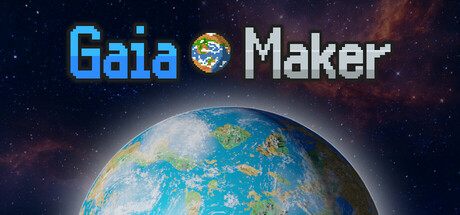
Gaia Maker is a planet-wide simulation game of terraforming, based on real physics and geology. As the planet's overseer, wield advanced technologies to reshape barren planets into life-filled worlds. Foster animal life, cultivate civilizations, or destroy them. Their fate is in your hands.

Free to PlayPositive(33)
SimulationSandboxGod Game
Garkimasera GamesMar 4, 2026

Gaia Maker scores 75/100 — better than 62% of Simulation capsules (n=5,188).

Positive (33 reviews) · Free to Play · Released Mar 4, 2026 · By Garkimasera Games

Quick text summary

Gaia Maker scored 75/100 on Steam Analyzer — Good for a Simulation capsule. Top priority fix: [uniqueness_polish] Integrate a visual element suggesting transformation or terraforming—such as a split-screen showing barren vs. life-filled planet states, or distinct geological/biological layers that hint at the game's core mechanic.

Capsule scores by dimension

  • Genre Clarity: 8/10 — Planet sim theme immediately clear. The large, detailed Earth-like planet in the center with visible continents and atmosphere clearly signals a planetary simulation or god-game genre. At TINY size, the globe silhouette and blue-green coloring remain recognizable as a terraforming or world-building game. The starfield background reinforces cosmic/space management context effectively.
  • Title Readability: 8/10 — Clean title with strong contrast. The 'Gaia Maker' title uses bright cyan and white lettering with excellent contrast against the dark starfield background and avoids placement on busy nebula regions. At SMALL and TINY sizes, the text remains legible with clear letterforms and appropriate spacing. The small globe icon between words adds visual interest without compromising readability.
  • Contrast & Color: 8/10 — Strong value separation throughout. Bright cyan title text and the illuminated planet create excellent contrast against the deep blue-black space background. The warm orange-red nebula glow in upper right adds atmospheric depth while maintaining clear silhouette separation. In grayscale, the planet and title remain distinctly separated from background, supporting visibility at TINY size.
  • Uniqueness & Polish: 7/10 — Polished but familiar space aesthetic. The capsule demonstrates professional rendering quality with realistic planet textures, atmospheric lighting, and star field effects. However, the composition uses common space game tropes (glowing planet, nebula backdrop) that appear in many sci-fi simulators, limiting distinctiveness. The execution is clean and premium-feeling, but the core visual concept lacks a signature hook unique to Gaia Maker's terraforming mechanics.
  • Brand Consistency: 6/10 — Generic space aesthetic, no signature style. The capsule presents a competent but generic sci-fi aesthetic with no memorable icons, character design, or signature visual motifs that would distinguish Gaia Maker from other space games. The planet and starfield are functional brand communicators but lack distinctive visual language that would make this recognizable as Gaia Maker specifically versus any other planet simulation. Without seeing additional store materials, it appears there are no iconic symbols or color signatures being leveraged.
  • Composition: 8/10 — Clear focal hierarchy with safe placement. The composition uses classic centered composition with the glowing planet as undeniable primary focal point and title anchored securely in the top third, well away from crop edges. Background nebula and starfield provide atmospheric context without competing for attention. At SMALL size, the planet dominates and title reads cleanly; at TINY size, the composition remains stable with no elements cut off or lost.

What works

  • Planet as primary focal point. The large, illuminated Earth-like globe commands immediate attention and clearly communicates planetary simulation gameplay even at TINY size.
  • Title contrast and placement. Cyan 'Gaia Maker' text sits cleanly against dark space background with sufficient spacing and weight to remain readable at all viewing sizes.
  • Professional rendering quality. The planet texture, atmospheric glow, and starfield effects convey a polished, premium-quality game rather than indie or low-effort work.
  • Safe composition margins. All critical elements (title, planet) are positioned well within safe margins, ensuring resilience to Steam cropping on various display contexts.

What hurts the capsule

  • Generic space aesthetic lacks signature. The starfield, nebula, and glowing planet are familiar tropes found in dozens of space games, offering no distinctive visual hook or brand identity.
  • Terraforming mechanics not visually hinted. The capsule shows a finished, beautiful planet but does not communicate the core gameplay loop of transforming barren worlds into life-filled ones.
  • No unique color palette or icon system. The cyan-and-white title color and Earth imagery are functional but not memorable or distinctive enough to create instant brand recognition.

Priority fixes

  1. [uniqueness_polish] Integrate a visual element suggesting transformation or terraforming—such as a split-screen showing barren vs. life-filled planet states, or distinct geological/biological layers that hint at the game's core mechanic.
  2. [brand_consistency] Develop a signature visual motif or color accent (e.g., a terraforming grid, geological cross-section, or unique symbol) that appears consistently across all marketing materials to build instant brand recall.
  3. [genre_clarity] Consider adding subtle UI elements like a terraforming tool or technology interface overlay that reinforces the simulation-building aspect beyond just showing a finished planet.

Store copy priority fixes

  1. [hook_strength] Replace the first line of both descriptions with an action-forward hook like 'Shape lifeless planets into thriving worlds by harnessing stellar energy, engineering atmospheres, and guiding civilizations from stone tools to fusion reactors—then watch it all collapse if you choose.' This leads with agency and consequence, not definition.
  2. [audience_targeting] Add one sentence explicitly welcoming idler/incremental players: 'Perfect for players who love long-form sandbox building with no pressure—play at your own pace, step away anytime, and return to see how your world evolved.' This clarifies tone and addresses the Idler tag.
  3. [uniqueness] Add a contrast sentence like 'Unlike arcade god games, every atmospheric change, temperature shift, and carbon cycle action is grounded in real physics—your decisions have scientifically logical consequences.' This articulates why the physics matters to differentiation.
  4. [tone_match] Revise the feature section to add one sentence of voice and fantasy: 'You are not just managing sliders; you are breathing life into dead worlds.' This shifts tone from checklist to creative empowerment.

Related guides

Steam app ID: 3662040 · Tags: Simulation, Sandbox, God Game, Physics, Idler