Scoring genre clarity...
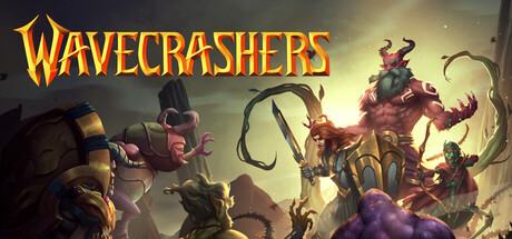
Wavecrashers capsule

Wavecrashers

Hold the line or everything falls. Wavecrashers is a 3-player co-op strategy game where heroes defend against relentless waves of enemies. Build powerful synergies, push your limits, and survive the chaos. Play solo with bots or team up with friends. Every run is a fight to endure the storm.

Tower DefenseSurvivalRTS
Eightfold InteractiveJul 31, 2026

Wavecrashers scores 72/100 — better than 50% of Tower Defense capsules (n=709).

Released Jul 31, 2026 · By Eightfold Interactive

Quick text summary

Wavecrashers scored 72/100 on Steam Analyzer — Good for a Tower Defense capsule. Top priority fix: [genre_clarity] Strengthen wave defense identity by repositioning one hero defensively in a line formation or adding visual barrier/wall elements that imply holding ground against incoming threats.

Capsule scores by dimension

  • Genre Clarity: 7/10 — Wave defense strategy readable. The capsule communicates action-fantasy combat with multiple distinct enemy types (demons, creatures) arranged in a threatening formation against the player's heroes, which aligns with wave defense mechanics. At tiny size, the stacked silhouettes and chaotic arrangement still read as 'enemies vs defenders' but the specific strategy layer is less clear without reading the title. The art direction supports the co-op battle concept but doesn't strongly signal the synergy-building or tower-defense-like strategy elements mentioned in the description.
  • Title Readability: 8/10 — Strong gold title legible at all sizes. The WAVECRASHERS title uses a bold, uppercase serif-like font with warm orange-gold fill and darker outline, positioned in the upper left on a relatively clean background region. The title remains readable at small and tiny sizes due to strong value contrast and letter spacing. No tagline clutter or secondary text competes for attention, keeping the focal point clear across all viewing scales.
  • Contrast & Color: 8/10 — Warm gold palette pops distinctly. The golden-orange title and warm lighting on the central characters create strong value separation against the dark blue-grey background (#1b2838 base). The enemy silhouettes use deep purples, browns, and dark tones that recede, while bright gold accents on armor and the title advance clearly. At tiny size, the color hierarchy still reads because the brightest warm tones cluster at the center and top, preventing muddy collapse in grayscale.
  • Uniqueness & Polish: 7/10 — Polished fantasy chaos with solid craft. The capsule demonstrates professional lighting, particle effects, and coherent 3D rendering that feels premium and intentional. The stacked demon/creature composition with varying sizes and poses suggests chaos and scale effectively, avoiding a generic 'fantasy hero' trope. However, the visual concept—evil creatures threatening heroes—is a familiar archetype in action-RPG marketing, and the capsule does not communicate the co-op synergy or wave-survival uniqueness strongly enough to stand apart from top-tier competitors like Helldivers 2 or Warhammer 40K: Space Marine 2.
  • Brand Consistency: 6/10 — Consistent rendering, weak identity hook. The lighting, color palette, and character rendering style appear consistent with fantasy action IP standards and likely match the in-game art direction. However, the capsule lacks a memorable visual motif, iconic character, or signature symbol that would make Wavecrashers instantly recognizable on a crowded Steam storefront. The title font and gold color scheme are strong but not unique enough to serve as a standalone brand identifier without the wordmark.
  • Composition: 7/10 — Clear hierarchy with minor balance issues. The composition uses a clear focal hierarchy: golden title top-left, stacked enemy formation in center-right, with bright lighting drawing the eye downward toward the primary threat. Background elements fade appropriately, creating depth separation between foreground characters and misty background. However, at tiny size the right edge feels slightly dense with creature silhouettes, and the composition could benefit from slightly more breathing room on the left to balance the title weight against the crowded enemy stack.

What works

  • Bold, readable title treatment. Gold-outlined uppercase serif font in the upper left maintains legibility at all sizes from full header to tiny thumbnail.
  • Strong value contrast and color separation. Warm gold and bright character tones separate cleanly from the dark background, creating visual pop that persists at small scales.
  • Professional lighting and 3D rendering. The capsule demonstrates polished production quality with coherent lighting, particle effects, and no asset-flip or template aesthetic.
  • Effective silhouette layering. Multiple enemy and character silhouettes stack to create perceived depth and threat, communicating the action-fantasy genre without text at small sizes.

What hurts the capsule

  • Generic fantasy villain archetype. The 'horde of demons vs heroes' visual does not differentiate Wavecrashers from dozens of action-RPG competitors and misses the co-op synergy angle.
  • Weak brand identity signals. No iconic character, motif, or color signature that would allow recognition of Wavecrashers in a scrolling list; the capsule reads as 'generic fantasy action' first.
  • Right-side composition density at tiny size. The clustered creature stack on the right creates visual weight that unbalances the composition when scaled down to thumbnail, with limited breathing room.
  • Wave defense mechanic not visually communicated. The capsule shows a chaotic skirmish but does not hint at wave spawning, line-holding, or strategic positioning that differentiates the gameplay loop.

Priority fixes

  1. [genre_clarity] Strengthen wave defense identity by repositioning one hero defensively in a line formation or adding visual barrier/wall elements that imply holding ground against incoming threats.
  2. [uniqueness_polish] Add a signature visual motif or color accent (e.g., a glowing shield symbol, repeating wave pattern, or unique aura effect) that signals Wavecrashers identity and survives tiny-size scaling.
  3. [composition] Reduce right-side creature density and redistribute focal weight; move the title or add negative space on the left to balance against the crowded enemy formation.
  4. [brand_consistency] Define and consistently highlight 1–2 iconic character silhouettes across all marketing so they become recognizable brand symbols in storefront scrolls.

Store copy priority fixes

  1. [uniqueness] Add 1–2 concrete hero examples with specific ability names or synergy mechanics (e.g., 'Lightning Mage + Frost Sentinel triggers Chain Freeze chains') to show what actually differentiates this game from Risk of Rain 2 or existing tower defense games.
  2. [feature_communication] Rewrite the synergy section to include a brief example or analogy of how items create synergies in-game (e.g., 'pair attack-speed items with crit-chance builds to trigger bonus damage multipliers').
  3. [tone_match] Revise the 'Highlights' section to adopt the same conversational, action-forward tone as the opening ('Defend as a team,' 'Earn perks that stick with you') instead of corporate bullet points.
  4. [audience_targeting] Clarify solo play viability by mentioning bot AI difficulty levels or campaign depth when playing single-player, to address whether the full experience is accessible without friends.

Related guides

Steam app ID: 3664090 · Tags: Tower Defense, Survival, RTS, Co-op, Strategy