Scoring genre clarity...

Shards of Dread capsule

Shards of Dread

It is a psychological horror game and walking simulator. Get chased by monsters. Monsters jumping towards at your screen.

$1.992 user reviews
AdventurePsychological HorrorWalking Simulator
Markus KordaMay 2, 2025

Shards of Dread scores 80/100 — better than 94% of Adventure capsules (n=7,922).

2 user reviews · $1.99 · Released May 2, 2025 · By Markus Korda

Quick text summary

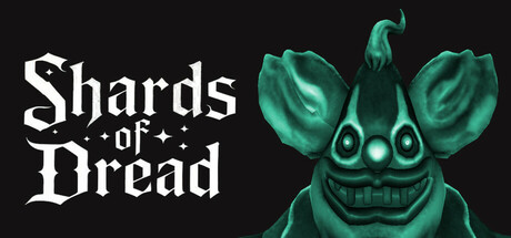
Shards of Dread scored 80/100 on Steam Analyzer — Good for a Adventure capsule. Top priority fix: [contrast_color] Add subtle atmospheric background elements (fog, void texture, or environmental hints) behind the creature to increase visual depth without compromising foreground contrast.

Capsule scores by dimension

  • Genre Clarity: 8/10 — Horror creature clearly communicated. The grotesque green creature with prominent teeth and menacing expression immediately signals psychological horror. The creature's direct stare and aggressive posture suggest threat and chasing mechanics. At tiny size, the creature silhouette and threatening pose remain readable, though fine facial details blur.
  • Title Readability: 8/10 — Bold gothic title, excellent contrast. The white gothic serif 'Shards of Dread' is rendered in strong contrast against the dark background with clear letterforms and strategic placement in the left half. The decorative crosses between words add character without compromising legibility. At tiny size, the title remains readable as a cohesive block, though individual letter detail softens.
  • Contrast & Color: 9/10 — Strong value separation, excellent pop. The bright teal-green creature pops distinctly against the near-black background, creating clear silhouette separation in both color and value. The white title further reinforces the high contrast strategy. In grayscale, the creature remains distinctly separate from the background, and at tiny size the three-value hierarchy (black background, white title, green creature) holds strong.
  • Uniqueness & Polish: 8/10 — Distinctive creature design, polished craft. The asymmetrical creature with protruding ears, grid-pattern mouth, and unsettling grin feels like a signature design rather than generic horror stock. The high-poly modeling and painterly shading suggest premium production quality. The composition avoids cliché jump-scare imagery by showing the threat directly and confidently.
  • Brand Consistency: 7/10 — Strong creature identity, good cohesion. The creature appears to be a recognizable mascot-like antagonist with a distinct silhouette and visual signature that would be memorable across marketing materials. The gothic serif title treatment pairs consistently with the green color palette. Without access to all 5 store screenshots, the creature design suggests a consistent visual identity, though broader brand signals like UI or environmental palette cannot be fully verified.
  • Composition: 8/10 — Clear hierarchy, balanced focal point. The creature occupies the right half as the primary focal point while the title anchors the left, creating natural visual flow without competing elements. The dark background provides clean negative space that doesn't distract. Safe margins protect critical elements at small sizes, and the layout remains legible at tiny thumbnail scale with no crop-vulnerable edge elements.

What works

  • Exceptional contrast against dark UI. The white title and bright green creature create immediate visual pop on Steam's dark background, ensuring discoverability in quick-scroll browsing.
  • Memorable creature design as brand anchor. The asymmetrical, grinning creature with distinct features functions as a visual signature that communicates psychological horror tone effectively.
  • Clean composition with clear focal point. The split layout (title left, creature right) avoids clutter and maintains strong readability even at thumbnail size.
  • Professional gothic typography choice. The serif treatment matches horror genre conventions while remaining legible, avoiding decorative fonts that collapse at small sizes.

What hurts the capsule

  • Limited environmental context. The pure black background provides no setting or narrative hook beyond the creature itself, missing opportunity for storytelling cues.
  • Creature fine details lose definition at tiny size. The grid-pattern mouth and subtle shading on the creature softens significantly at thumbnail scale, reducing the impact of the custom design work.
  • No secondary visual interest or depth layering. The capsule relies entirely on the creature and title without background elements, particle effects, or environmental detail to add visual sophistication.

Priority fixes

  1. [contrast_color] Add subtle atmospheric background elements (fog, void texture, or environmental hints) behind the creature to increase visual depth without compromising foreground contrast.
  2. [uniqueness_polish] Introduce a complementary visual element such as a signature UI frame, brand symbol, or thematic motif that reinforces the game's identity beyond the creature alone.
  3. [composition] Consider adding a very faint secondary character or environmental silhouette in the background to create mid-tone layering and improve the premium feel at small sizes.

Store copy priority fixes

  1. [hook_strength] Rewrite the opening line to lead with the core emotional or sensory hook—e.g., 'A 15-minute descent into psychological dread, where unseen horrors close in and monsters breach the barrier between game and screen' rather than self-labeling the genre.
  2. [feature_communication] Expand the feature list to include at least 2–3 unique gameplay or narrative elements—e.g., what the player is running from, what environments they navigate, any puzzles or choices, or story beats that set this experience apart from generic chase horror.
  3. [uniqueness] Add a sentence that explains what makes this game's approach to psychological horror or jump-scares distinct—e.g., whether it plays with perspective, uses unusual monster design, or subverts walking simulator conventions.
  4. [tone_match] Elevate the prose to evoke dread and unease through language, not just list mechanics—replace passive statements with more visceral, present-tense descriptions that make the reader feel the tension.

Related guides

Steam app ID: 3666830 · Tags: Adventure, Psychological Horror, Walking Simulator, Horror, 1990's