Scoring genre clarity...
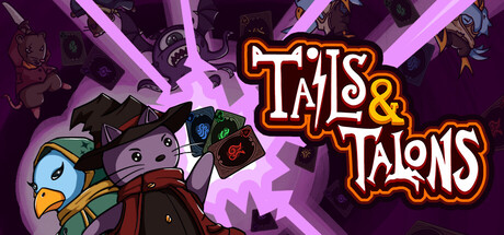
Tails & Talons capsule

Tails & Talons

The tower gets stronger. So does your hand. Match poker-style combos while chaining spells like a sorcerer, and watch your damage explode from single digits to the thousands as you and your furry crew descend into a Lovecraftian tower that really did not want visitors.

DeckbuildingRogueliteCard Battler
RATHQ1 2027

Tails & Talons scores 75/100 — better than 70% of Deckbuilding capsules (n=979).

Released Q1 2027 · By RATH

Quick text summary

Tails & Talons scored 75/100 on Steam Analyzer — Good for a Deckbuilding capsule. Top priority fix: [genre_clarity] Add subtle card or combo visual element (hand of cards, connected nodes, or rune symbols) to signal the deck-building mechanic without cluttering the composition.

Capsule scores by dimension

  • Genre Clarity: 7/10 — Indie adventure with deck-building cues. The capsule signals adventure through the Lovecraftian tower setting and character party on the left, with the magical energy effects suggesting spell-casting gameplay. At tiny size, the colorful character roster and purple mystical aura read as indie adventure, though the poker-combo mechanic is not visually explicit. The card-like character presentation hints at deck-building but is subtle enough that genre remains adventure-forward rather than clearly roguelike-deckbuilder.
  • Title Readability: 8/10 — Bold, readable title with strong outline. The 'TAILS & TALONS' title uses a thick orange-and-white outline against the purple background, maintaining clear legibility at full, small, and tiny sizes. The ampersand is well-spaced and the letterforms are chunky enough to survive squinting and small-scale compression. Supporting elements like taglines are not cluttering the space, keeping focus on the main logo.
  • Contrast & Color: 8/10 — Strong value separation and vibrant saturation. Bright magenta/purple radial rays pop against the darker purple background, and the orange-white title creates excellent contrast with clear silhouette edges. Character silhouettes on the left read distinctly even at tiny size due to varied hue (blues, reds, yellows) and strong value separation from the background. The overall palette is saturated and intentional, with no muddy mid-tones blending the subject into background.
  • Uniqueness & Polish: 7/10 — Cohesive indie aesthetic, playful characterization. The capsule demonstrates intentional art direction with a unified cartoon/chibi character style, exaggerated expressions, and deliberate color choices that feel hand-crafted rather than template-based. The magical energy effect and character lineup suggest a distinctive hook around party synergy and escalating power fantasy. However, the composition and style are somewhat familiar in the indie roguelike space, lacking a completely singular visual identity that would elevate it to premium-tier distinctiveness.
  • Brand Consistency: 7/10 — Recognizable character roster and palette. The distinctive lineup of colorful characters with varied animal/creature designs creates a memorable identity that supports brand recognition across multiple touchpoints. The consistent color palette (warm oranges and magentas against cool purples) and art style establish internal cohesion. The character-forward approach is likely reinforced across in-game and promotional materials, making the capsule feel like a reliable brand signal.
  • Composition: 8/10 — Balanced focal point with clear hierarchy. The character party anchors the left side as primary visual interest, while the title claims the right with strong orange contrast, creating good balance and eye guidance across the horizontal space. The radial energy rays provide depth layering and lead the eye toward the center without creating clutter. At tiny size, the character silhouettes remain distinct and the title stays readable, with no critical elements lost to edge cropping or Steam margins.

What works

  • Title contrast and readability. Orange-white outline on purple background maintains clarity across all viewing sizes with no collapse at tiny scale.
  • Character visual identity. Distinctive colorful roster with varied creature designs creates a memorable and recognizable brand signature.
  • Color saturation and energy. Vibrant magenta rays and bold character palette create strong visual pop against the dark Steam background without muddy blending.
  • Balanced composition. Left-anchored characters and right-anchored title create effective hierarchy and eye guidance with no dead space or clutter.

What hurts the capsule

  • Deck-building mechanic unclear. The poker-combo and spell-chaining core loop is not explicitly communicated through visual iconography, leaving genre positioning ambiguous at tiny size.
  • Generic indie roguelike presentation. While polished, the overall visual approach follows familiar indie adventure tropes without a completely unique selling point that stands out against top-tier genre competitors.
  • Tower setting not prominently featured. The Lovecraftian tower backdrop is atmospheric but recessive, with character focus potentially underselling the dungeon-crawling progression fantasy.

Priority fixes

  1. [genre_clarity] Add subtle card or combo visual element (hand of cards, connected nodes, or rune symbols) to signal the deck-building mechanic without cluttering the composition.
  2. [uniqueness_polish] Consider incorporating a distinctive visual hook such as an iconic spell effect, tower silhouette, or symbolic motif that signals the power-escalation fantasy uniquely.
  3. [composition] Ensure the tower or dungeon environment has slightly more visual weight in the midground to reinforce the core Lovecraftian descent narrative.

Related guides

Steam app ID: 3667460 · Tags: Deckbuilding, Roguelite, Card Battler, Poker, Strategy