Scoring genre clarity...

Guild Hall Simulator: Prologue capsule

Guild Hall Simulator: Prologue

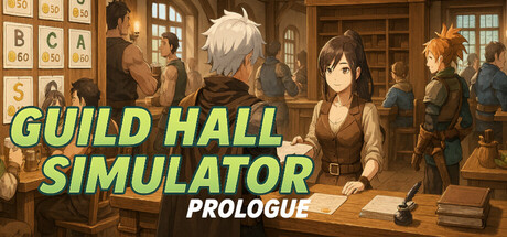
Build your guild. Shape your story. In Guild Hall Simulator, you don't slay dragons — you send others to do it. Manage gold, assign quests, upgrade your hall, and wrangle rowdy adventurers who drink too much. Will your guild rise to fame...or collapse under a mountain of paperwork (and slimes)?

Free to PlayMixed(44)
SimulationManagementEconomy
Obsessive GamesAug 1, 2025

Guild Hall Simulator: Prologue scores 68/100 — better than 17% of Simulation capsules (n=5,188).

Mixed (44 reviews) · Free to Play · Released Aug 1, 2025 · By Obsessive Games

Quick text summary

Guild Hall Simulator: Prologue scored 68/100 on Steam Analyzer — Solid for a Simulation capsule. Top priority fix: [uniqueness_polish] Introduce a distinctive visual hook—feature a signature character close-up or iconic guild symbol in the composition to communicate the game's unique personality and quest-assignment mechanic.

Capsule scores by dimension

  • Genre Clarity: 7/10 — Management sim with fantasy guild setting clear. The warm interior guild hall setting, multiple adventurers in fantasy attire, quest board elements visible on left wall, and management-focused composition immediately signal a management/simulation game with fantasy flavor. At tiny size the scene reads as indoor management rather than action-RPG, though the fantasy elements remain legible. The casual warm aesthetic and multiple NPCs reinforce the simulation and people-management focus.
  • Title Readability: 8/10 — Bold lime green text stands out clearly. The bright lime green sans-serif title 'GUILD HALL SIMULATOR' with white 'PROLOGUE' subtitle sits in the upper portion against a darker brown interior background, providing strong contrast against the Steam dark background. At small size the letterforms remain crisp and separated, though at tiny size the individual letters begin to compress slightly but remain readable due to the bold weight and high saturation. The strategic placement over the less busy upper-left region prevents text from fighting noisy background elements.
  • Contrast & Color: 7/10 — Good value separation with warm palette cohesion. The lime green title pops decisively against both the dark wood interior and the #1b2838 Steam background, using saturation and brightness separation effectively. The mid-brown/tan interior maintains reasonable contrast with figures, and the character silhouettes read clearly at small scale despite the warm tonal range dominating the palette. A grayscale squint test shows the title remains distinct but the interior scene becomes somewhat muddy in value, reducing silhouette clarity of secondary characters at tiny size.
  • Uniqueness & Polish: 6/10 — Competent illustration, generic management game framing. The hand-drawn illustration style is clean and the guild hall interior shows thoughtful detail work with visible quest board, wooden shelving, and character variety suggesting good art direction. However, the composition feels like a standard 'people gathered in a room' setup common to many management sims, and it does not visually communicate the unique selling point (assigning quests, managing adventurers, paperwork comedy) in a way that distinguishes it from other casual sims like Supermarket Simulator or House Flipper 2. The image prioritizes scene-setting over a distinctive visual hook that would stand out in a crowded genre.
  • Brand Consistency: 6/10 — Cohesive warm art style, no memorable icon yet. The interior illustration maintains a consistent warm-toned, hand-drawn fantasy aesthetic with unified lighting and character design across all visible NPCs, signaling strong internal art direction. However, there is no iconic character, motif, or signature visual element that would allow immediate recognition of this specific game versus other cozy fantasy management sims; the palette and style are pleasant but share DNA with competitors like Moonstone Island or Tiny Glade. The lack of a distinctive logo, mascot, or visual trademark limits brand identity strength.
  • Composition: 7/10 — Clear focal point, good depth, balanced layout. The female character in center-foreground with warm lighting creates a clear primary focal point, supported by grouped background NPCs and architectural framing that guides the eye inward. At small and tiny sizes this hierarchy compresses well, with the character remaining recognizable and the title sitting cleanly above without crowding edges. The three-zone depth (foreground character, midground NPCs, background guild hall) creates visual layering that prevents flatness, though the composition is somewhat symmetrical and center-weighted, which works but lacks dynamic tension.

What works

  • Title legibility and contrast. Bright lime green sans-serif holds up clearly at all sizes due to bold weight, high saturation, and strategic placement over controlled background space.
  • Clean hand-drawn art style. Consistent warm illustration technique with thoughtful interior detail creates a cohesive, pleasant visual identity that reads as intentional craft rather than asset-flipped templates.
  • Clear depth and focal point. Centered female character foreground supported by background NPC cluster and guild hall architecture creates natural eye direction and readable hierarchy at small scale.

What hurts the capsule

  • Generic management scene setup. The 'group of people in an interior' composition does not visually differentiate this game's unique mechanics (quest assignment, paperwork management, adventurer wrangling) from other casual sims, missing opportunity to communicate distinctive selling points.
  • No memorable visual icon or motif. The capsule relies entirely on scene-setting illustration without introducing a recognizable character, logo, or signature visual element that would support brand recall across multiple exposures.
  • Warm palette muddy at tiny size. While the title pops, the background character silhouettes and architectural details collapse into a warm mid-tone blur when squinting, reducing secondary information clarity at thumbnail size.

Priority fixes

  1. [uniqueness_polish] Introduce a distinctive visual hook—feature a signature character close-up or iconic guild symbol in the composition to communicate the game's unique personality and quest-assignment mechanic.
  2. [genre_clarity] Add a subtle quest board or management UI element in the foreground to reinforce the simulation and management gameplay identity at tiny size.
  3. [brand_consistency] Develop and place a memorable logo or character mascot in a consistent corner to build brand recognition across all marketing materials.

Store copy priority fixes

  1. [feature_communication] Clearly separate Prologue features from full-game roadmap with a distinct section header like 'In This Prologue' vs. 'Coming in the Full Game' to set realistic scope expectations.
  2. [uniqueness] Add 1-2 sentences explaining what specifically sets this guild management game apart from similar tycoon/management sims (e.g., hero-quest matching system, dynamic economy, town defense mechanics).
  3. [audience_targeting] Revise the opening line from 'Ready your guild. Shape your destiny.' to lead with the core appeal and audience: 'If you love management sims but hate combat, become a guild master instead.'
  4. [hook_strength] Reduce wishlist calls from three to one placed at the end, so the Prologue's own value proposition remains the primary focus throughout the description.

Related guides

Steam app ID: 3667790 · Tags: Simulation, Management, Economy, Singleplayer, Multiplayer