Scoring genre clarity...

Desktop Garden capsule

Desktop Garden

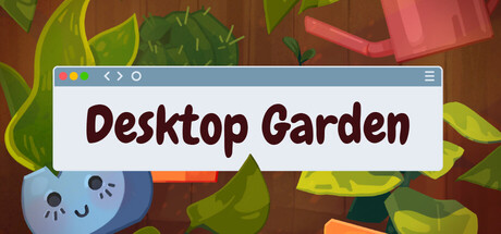
Type and watch your garden grow! Every keystroke and mouse click lets your plants grow. Decorate your screen, or store them away to keep your screen clear. Place stickers on your plants and give them a name! Can you collect all types of plants?

Free to PlayMostly Positive(30)
CasualCuteRelaxing
Morse Morse GamesOct 20, 2025

Desktop Garden scores 68/100 — better than 18% of Casual capsules (n=10,153).

Mostly Positive (30 reviews) · Free to Play · Released Oct 20, 2025 · By Morse Morse Games

Quick text summary

Desktop Garden scored 68/100 on Steam Analyzer — Solid for a Casual capsule. Top priority fix: [genre_clarity] Strengthen the keystroke-growth or collection mechanic visibility—consider adding a small UI hint like a cursor icon or plant growth indicator to communicate core gameplay.

Capsule scores by dimension

  • Genre Clarity: 8/10 — Clear casual garden gameplay. The capsule immediately communicates a cozy, growth-focused casual game through visible plant elements, bright organic shapes, and a cute aesthetic. At tiny size, the stylized plants and warm brown-green palette remain recognizable as a gardening or collection-based experience, though the specific keystroke-growth mechanic is not visually obvious. Genre signals align well with successful casual indie titles like Stardew Valley-adjacent experiences.
  • Title Readability: 8/10 — Strong title in browser window frame. The title 'Desktop Garden' sits in a clean white browser window mockup with dark brown serif lettering that contrasts sharply against the background. At small capsule size, the window frame and text remain legible, though at tiny thumbnail size the text becomes somewhat compressed but still readable. The browser chrome framing is a clever thematic choice that reinforces the 'desktop' positioning without cluttering the design.
  • Contrast & Color: 7/10 — Good value separation with warm tones. The capsule uses a warm brown background with bright lime-green and orange plant elements that pop clearly against the Steam dark background. The blue blueberry character and orange pumpkin create focal warm-cool tension that reads well at all sizes. At tiny size, the color blocks maintain distinction, though some mid-tone foliage detail becomes muddy when squinting.
  • Uniqueness & Polish: 6/10 — Competent casual aesthetic, modest originality. The art style is clean and charming with rounded, soft plant shapes and a sticker-like quality that fits the cozy indie category well. However, the visual presentation feels familiar within the crowded casual-indie space—cheerful organic shapes and warm palettes are common across top performers like Moonstone Island and Tiny Glade. The browser window frame is a nice thematic touch but does not elevate the core visual identity beyond competent execution.
  • Brand Consistency: 5/10 — Recognizable style, limited iconic hooks. The capsule presents a consistent warm, friendly aesthetic with cohesive pastel-plus-bright color treatment and soft art direction. However, there are no strong iconic characters, symbols, or signature motifs visible that would allow immediate brand recognition across multiple touchpoints. The cute blueberry and orange shapes are likable but generic enough that they don't form a unique brand anchor like Snufkin's distinctive silhouette or Dave the Diver's specific visual language.
  • Composition: 7/10 — Clear hierarchy, balanced layout. The browser window frames the title at top center with plant elements distributed around—blueberry lower left, larger green foliage upper left and right, orange pumpkin lower right. The focal point is the title, with supporting botanical elements creating balanced frame without competing for attention. At small and tiny sizes, the composition remains intact and readable, with adequate margins and no critical cropping risk from Steam's typical edge treatment.

What works

  • Strong title contrast and readability. Dark serif lettering on white browser window maintains clarity across full, small, and tiny sizes.
  • Thematic browser window framing. The desktop mockup reinforces the 'Desktop Garden' concept and adds a unique compositional hook without feeling forced.
  • Warm color palette pops against Steam dark background. Orange, lime-green, and brown elements create strong value separation and visual appeal in quick scroll.

What hurts the capsule

  • Generic cute plant aesthetic lacks distinctive identity. While competent, the visual style does not differentiate from dozens of similar cozy casual indie games in the browsing context.
  • No iconic character or symbol for brand recall. The blueberry and orange shapes are charming but interchangeable and won't anchor brand recognition across store pages and social media.
  • Foliage detail becomes muddy at tiny size. Fine texture and layering in the green plant areas lose definition when squinting or viewing as a thumbnail, weakening visual appeal.

Priority fixes

  1. [genre_clarity] Strengthen the keystroke-growth or collection mechanic visibility—consider adding a small UI hint like a cursor icon or plant growth indicator to communicate core gameplay.
  2. [uniqueness_polish] Develop a distinctive character or mascot with a strong silhouette that could serve as brand anchor—move beyond generic cute shapes toward memorable visual identity.
  3. [brand_consistency] Establish a signature color accent or motif (e.g., a unique plant species, sticker style, or icon set) that appears consistently across store screenshots and capsule variants.

Store copy priority fixes

  1. [uniqueness] Add a sentence explaining what types of plants exist or what makes the collection experience distinctive (e.g., 'Grow over 50 unique plant species from succulents to exotic flowers, each with their own growth rates and visual styles').
  2. [feature_communication] Clarify the sticker and naming system with concrete detail (e.g., 'Customize your plants with hundreds of stickers and personalize each with a nickname to build attachment').
  3. [audience_targeting] Broaden audience signals by adding one sentence that explicitly welcomes pure casual/idle game players, not just productivity users (e.g., 'Whether you're looking to gamify your workday or enjoy a meditative idle experience, your garden awaits').
  4. [hook_strength] Consider a secondary hook in the short description that emphasizes the collection/completion element (e.g., add 'Can you collect all types of plants?' to highlight the long-term goal more prominently at the top).

Related guides

Steam app ID: 3669610 · Tags: Casual, Cute, Relaxing, Collectathon, Incremental