Scoring genre clarity...
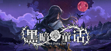
《Dark Fairy Tale》 is a role-playing game blending light Rogue elements, deconstructing classic fairy tales into a shattered world of dark fantasy. Build powerful characters through weapons, talents, and runes. Gradually uncover the truth and save this world corrupted by evil thoughts!
$3.99Mixed(35)
RogueliteTurn-Based StrategyStrategy RPG
Fun WorkshopSep 16, 2025