Scoring genre clarity...

Job Battle Simulator capsule

Job Battle Simulator

Don't hide in the toilet anymore. Leave the office and fight your boss! The crazy war between jobs is on, which profession will win, office worker, policeman, doctor, farmer or any other profession.

$5.995 user reviews
SandboxSimulationPhysics
Weird GameNov 16, 2025

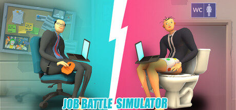
Job Battle Simulator scores 70/100 — better than 25% of Sandbox capsules (n=1,519).

5 user reviews · $5.99 · Released Nov 16, 2025 · By Weird Game

Quick text summary

Job Battle Simulator scored 70/100 on Steam Analyzer — Good for a Sandbox capsule. Top priority fix: [uniqueness_polish] Develop a distinctive character design or art style signature (exaggerated proportions, unique color palette, or visual effect) that differentiates from generic 3D asset libraries.

Capsule scores by dimension

  • Genre Clarity: 7/10 — Clear casual action-comedy premise. The split-screen composition with two stylized characters in absurd office scenarios (one with guitar, one on toilet) immediately communicates a humorous, casual game about unconventional workplace conflict. At tiny size, the contrast between left and right halves and the exaggerated character poses remain readable enough to suggest comedy-action gameplay, though the specific 'job battle' mechanic is not immediately obvious from visuals alone.
  • Title Readability: 8/10 — Bold, clear sans-serif title placement. The title 'JOB BATTLE SIMULATOR' is rendered in large, bright cyan sans-serif text positioned at the bottom center with a clean white stroke, ensuring strong legibility across all sizes. Even at tiny thumbnail size, the bright cyan against the dark background and pink areas remains readable; the spacing is generous and the letterforms are simple enough not to collapse at small scales.
  • Contrast & Color: 8/10 — Strong value separation with vibrant palette. The turquoise-to-magenta diagonal split creates excellent value contrast and visual pop against the Steam dark background (#1b2838). Character silhouettes are clearly defined with strong lighting and distinct color blocking; the cyan title reinforces the palette and stands out sharply. At tiny size, the bold color division and character outlines remain distinct and do not blur together.
  • Uniqueness & Polish: 6/10 — Competent humor concept, generic execution. The concept of 'office worker vs. toilet' and job-based combat is quirky and humorous, differentiating it from standard action games, but the 3D character models and scene setup feel like standard game assets without a distinctive artistic signature. The execution is clean and professional but does not demonstrate a unique visual style or memorable craft that would elevate it above competent simulator genre fare.
  • Brand Consistency: 6/10 — Coherent split-screen aesthetic, limited identity. The internal visual cohesion is solid—both characters are rendered in the same stylized 3D style, the color palette is consistent, and the symmetrical split-screen layout is a recognizable motif for the game. However, there are no distinctive character designs, iconic symbols, or signature palette cues that would make this capsule instantly memorable or recognizable as a future brand identity anchor.
  • Composition: 7/10 — Balanced symmetry with clear focal depth. The split-screen composition creates natural left-right balance and draws the eye to both characters equally; the central lightning bolt divider adds visual interest and reinforces the 'battle' concept. The title placement at bottom center is safe from Steam crop edges, and at small sizes the composition remains readable with clear foreground (characters), midground (office setting), and background (color zones).

What works

  • Strong title readability and contrast. Bright cyan text with white stroke on the dark background ensures the title remains legible at all sizes including tiny thumbnails.
  • Vibrant color palette with clear visual pop. The turquoise-to-magenta split creates excellent contrast against the Steam background and maintains visual distinction at all zoom levels.
  • Balanced and deliberate composition. The symmetrical split-screen layout with central divider creates natural hierarchy, guides the eye effectively, and leaves title safe from edge crop.

What hurts the capsule

  • Generic 3D character assets and styling. The stylized 3D models lack distinctive visual personality and feel like standard game engine assets without a memorable signature aesthetic.
  • Unclear job-battle game mechanic at first glance. While the humor reads, the actual gameplay concept (what 'job battles' entail mechanically) is not communicated visually by the office and toilet imagery alone.
  • No memorable brand identity anchors. The capsule lacks iconic character designs, logos, or signature visual motifs that would make the game instantly recognizable in future marketing or comparison contexts.

Priority fixes

  1. [uniqueness_polish] Develop a distinctive character design or art style signature (exaggerated proportions, unique color palette, or visual effect) that differentiates from generic 3D asset libraries.
  2. [genre_clarity] Add a subtle visual indicator of the core mechanic—such as job-role icons, weapons unique to professions, or a competing 'profession' symbol—to clarify the game's central gameplay hook.
  3. [brand_consistency] Introduce a repeatable visual motif or icon (e.g., a branded logo, character silhouette, or symbolic object) that can anchor future marketing and create long-term recognition.

Store copy priority fixes

  1. [feature_communication] Clean up formatting: separate the incomplete sentences ('Although' and 'AlthoughOUTSTANDING FEATURES'), add clear line breaks before each major section (GAMEPLAY, OUTSTANDING FEATURES), and use bullet points throughout for scannability.
  2. [audience_targeting] Add one sentence explicitly signaling the core audience (e.g., 'Perfect for players who love physics chaos and funny moments to share' or 'Solo campaign or sandbox sandbox creator—your choice') to close the targeting ambiguity.
  3. [uniqueness] Strengthen the differentiation by adding a specific contrast: 'Unlike turn-based strategy games, every match is a physics-driven spectacle' or 'The only game where you battle entire job archetypes in absurd, unrepeatable combat scenarios.'

Related guides

Steam app ID: 3671980 · Tags: Sandbox, Simulation, Physics, Funny, Casual