Scoring genre clarity...

FloorBreaker capsule

FloorBreaker

Smash through the enemy’s floor in this fast-paced ball-blasting battle! Break the Floor is a physics-driven, high-impact action game for solo players or 1–4 players.

$1.99
Top-Down ShooterPhysicsDestruction
PotGamesAug 1, 2025

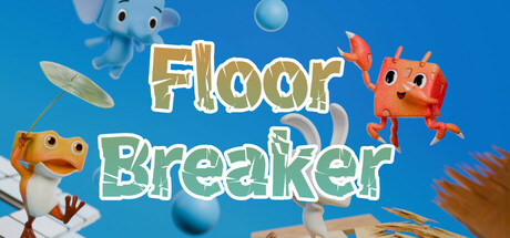
FloorBreaker scores 70/100 — better than 26% of Top-Down Shooter capsules (n=801).

$1.99 · Released Aug 1, 2025 · By PotGames

Quick text summary

FloorBreaker scored 70/100 on Steam Analyzer — Good for a Top-Down Shooter capsule. Top priority fix: [uniqueness_polish] Introduce a distinctive visual signature—such as a unique cube design, logo, or UI element—that makes Floor Breaker recognizable without the title text.

Capsule scores by dimension

  • Genre Clarity: 7/10 — Physics action gameplay clear. The capsule effectively communicates a casual action game through the bright, playful aesthetic, floating objects, and animated character sprites that suggest physics-based gameplay. At tiny size, the orange block character and scattered elements still read as action-oriented, though the specific 'floor-breaking' mechanic is not immediately obvious without context. The colorful, bouncy visual style aligns well with casual physics games.
  • Title Readability: 8/10 — Bold, clean typography. The title 'Floor Breaker' uses a thick, golden-outlined font with crisp white fill that maintains strong contrast against the blue background at all sizes. At tiny size, the letterforms remain distinguishable and the two-word stacking is intentional and clear. The outline thickness and value separation ensure legibility even at 120x45 pixels, though some fine details of the outline may soften slightly.
  • Contrast & Color: 8/10 — Vibrant separation from background. The bright blue background (#1b2838 is significantly darker) provides strong value contrast with the golden title text, orange character, and pale blue geometric elements. At small and tiny sizes, the warm orange block character clearly silhouettes against the cool blue background, and the white-outlined text pops distinctly. The saturation and lighting separation remains clean across all viewing scales without muddy mid-tones.
  • Uniqueness & Polish: 6/10 — Competent but familiar aesthetic. The capsule uses a clean, colorful 3D character style with floating objects that is well-executed but follows established casual game design conventions. The orange cube character is distinctive enough but the overall composition—floating geometric shapes, bright primary colors, playful theme—reads as competent rather than standout. While the craft is solid, there is no distinctive visual hook or memorable stylistic choice that separates it from other casual indie games.
  • Brand Consistency: 6/10 — Consistent but generic visual identity. The capsule presents a cohesive palette of blues, oranges, and golds with consistent rendering of 3D characters and objects, creating internal visual harmony. However, the elements are generic—floating shapes and a colorful block character—without a distinctive motif, icon, or signature palette that would aid recognition. The style is recognizable as 'a casual game' but not as 'Floor Breaker' specifically without the title text.
  • Composition: 7/10 — Clear hierarchy with balanced layout. The title anchors the center-upper region with strong visual weight, while the orange cube character on the right and blue character on the left create framing elements that guide the eye. The composition uses foreground (characters), midground (floating objects), and background (solid blue) effectively. At tiny size, the title and primary orange character remain the clear focal points, though some floating elements in the middle create minor visual noise that could distract from the core message.

What works

  • Title legibility maintained at tiny size. The thick golden outline and white fill on 'Floor Breaker' preserve readability even at 120x45 pixels with clear letterform distinction.
  • Strong color contrast against dark Steam background. The warm orange and cool blue palette separates cleanly from the dark gray Steam interface, ensuring the capsule pops during quick scrolling.
  • Coherent visual direction. The 3D character rendering, floating physics objects, and color palette create internal consistency and signal a playful, action-oriented game.

What hurts the capsule

  • Generic visual identity without memorable hooks. The floating shapes and colorful cube character lack distinctive branding elements that would make this capsule recognizable as uniquely 'Floor Breaker' versus other casual physics games.
  • Scattered secondary elements create visual noise. Multiple floating objects (spinning platforms, spheres, geometric shapes) compete for attention in the middle ground, diluting focus at small viewing sizes.
  • Unclear core mechanic at glance. The capsule communicates 'colorful action game' but does not clearly convey the specific 'floor-breaking' gameplay hook that differentiates it competitively.

Priority fixes

  1. [uniqueness_polish] Introduce a distinctive visual signature—such as a unique cube design, logo, or UI element—that makes Floor Breaker recognizable without the title text.
  2. [composition] Reduce floating element count and consolidate the midground to strengthen focal hierarchy; consider repositioning secondary objects to frame rather than compete with the primary orange character.
  3. [genre_clarity] Add subtle gameplay context—such as a cracked floor section, collision impact lines, or a clear target element—to immediately communicate the floor-breaking mechanic at tiny size.

Store copy priority fixes

  1. [hook_strength] Remove or clarify the phrase 'Break the Floor' in the short description—either rename it to match the title FloorBreaker or reword to avoid the title-like disruption: 'Smash through the enemy's floor in this fast-paced ball-blasting battle.'
  2. [uniqueness] Add 1–2 sentences that differentiate FloorBreaker from other physics-based or arena shooters—e.g., how the floor-breaking mechanic creates emergent gameplay or how character abilities create distinct playstyles.
  3. [feature_communication] Expand the character and item sections with 1–2 concrete examples—e.g., 'The Tank character can reinforce floor tiles beneath themselves, while the Speedster's ice magic slows enemy ball trajectories.'
  4. [audience_targeting] Add a sentence signaling competitive/ranked players if applicable, or clarify the skill ceiling and replayability for players seeking depth beyond casual local play.

Related guides

Steam app ID: 3672250 · Tags: Top-Down Shooter, Physics, Destruction, Cute, Casual