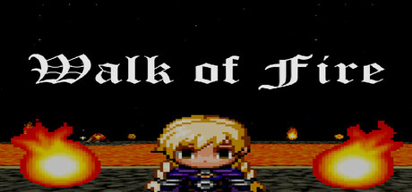
Walk of Fire scores 67/100 — better than 15% of Casual capsules (n=10,153).

Quick text summary

Walk of Fire scored 67/100 on Steam Analyzer — Solid for a Casual capsule. Top priority fix: [title_readability] Simplify the Gothic font letterforms or increase tracking to prevent compression blur at small sizes, or consider a cleaner serif/sans-serif hybrid that holds detail better when scaled down.

Capsule scores by dimension

  • Genre Clarity: 7/10 — Pixel RPG with danger theme. The retro pixel art style, centered character sprite, and flame hazards immediately signal an indie RPG or adventure game with action elements. At tiny size, the bright fire effects and small character silhouette remain readable, though the specific 'path navigation' mechanic is not visually obvious without the description. The overall vibe reads as classic pixel adventure rather than simulation or casual.
  • Title Readability: 6/10 — Gothic font, moderate legibility. The ornate Gothic serif typography reads well at full size with strong white contrast against the black sky background. At small size (231x87), the letter spacing and decorative flourishes remain mostly intact but lose some elegance. At tiny size (120x45), the title becomes noticeably cramped and some letterforms blur into each other, particularly the 'f' characters, reducing quick-scan recognition slightly.
  • Contrast & Color: 8/10 — Strong light-dark separation. The white title text pops sharply against the black sky, and the bright yellow-orange flame effects create excellent value contrast and draw immediate attention. The pixel character in blue armor maintains clear silhouette separation from the background. Even at tiny size, the flame glow and white text remain the dominant visual anchors without muddiness or mid-tone collapse in grayscale.
  • Uniqueness & Polish: 6/10 — Competent retro aesthetic. The capsule executes a clean retro pixel art style with intentional flame effects and a deliberate color palette, avoiding random asset vibe. However, the composition—centered character with mirrored flames—feels like a familiar template for indie RPGs rather than communicating a distinctive mechanic or unique selling point beyond 'fire hazard game.' The craft is solid but the concept presentation lacks memorable differentiation.
  • Brand Consistency: 6/10 — Recognizable retro identity. The pixel art style, Gothic title font, and flame motif create a coherent internal aesthetic that would be consistent across 5 screenshots. The blue-armored character and fire element pairing form a basic iconic symbol, though without reference to other brand assets, it reads more as 'retro RPG archetype' than a distinctive brand signature. The identity is functional but not particularly memorable or unique.
  • Composition: 7/10 — Clear hierarchy, balanced layout. The title anchors the top with the character centered in the middle and symmetrical flame effects on both sides, creating a clean focal point hierarchy. At small and tiny sizes, the composition remains readable with the character and flames as primary subjects. The black background provides safe margins, though the title-to-character spacing is slightly tight; at tiny size, elements compress noticeably but don't collapse into confusion.

What works

  • Excellent contrast against dark background. White text and bright orange-yellow flames create strong value separation that pops immediately at all sizes including tiny thumbnail view.
  • Clear focal point hierarchy. Centered character with symmetrical flame framing guides the eye efficiently without scattered attention or competing elements.
  • Retro style internally consistent. Pixel art, Gothic font, and color palette work together as a coherent visual identity that reinforces the indie RPG genre.

What hurts the capsule

  • Gothic font loses elegance at tiny size. Ornate letterforms and decorative flourishes compress and blur noticeably at 120x45, reducing quick recognition of the title text.
  • Generic composition template. Centered character with mirrored flames is a familiar indie game layout that doesn't communicate unique mechanics or distinguish this title visually.
  • Limited brand identity memorability. The pixel character and fire motif feel archetypal rather than distinctive, offering no signature visual hook that would stick in player memory.

Priority fixes

  1. [title_readability] Simplify the Gothic font letterforms or increase tracking to prevent compression blur at small sizes, or consider a cleaner serif/sans-serif hybrid that holds detail better when scaled down.
  2. [uniqueness_polish] Add a specific visual cue or unique element that signals the 'path navigation' or 'one wrong step' core mechanic rather than relying on generic fire hazard imagery.
  3. [genre_clarity] Consider subtle UI or environmental detail (e.g., a winding path, cracked ground texture) that reinforces the navigation and peril theme beyond just flames.

Store copy priority fixes

  1. [feature_communication] Replace the bullet-point list with a 2-3 sentence paragraph that explains the core loop: e.g., 'Navigate three increasingly difficult trial levels by avoiding flames, then engage turn-based combat encounters against fire-born enemies. Equip items and abilities to adapt your strategy.'
  2. [hook_strength] Rewrite the opening to emphasize a unique angle: e.g., 'Master the rhythm of fire avoidance and turn-based combat as you ascend the Tower of Fire' or 'Survive three trials where precision movement meets tactical combat.'
  3. [genre_clarity] Clarify the game's primary identity early: lead with either 'A casual puzzle-action RPG' or 'A turn-based RPG with flame-avoidance challenges' to set accurate expectations.
  4. [audience_targeting] Add a sentence signaling difficulty and player type, e.g., 'Perfect for puzzle and RPG fans seeking a relaxed but rewarding challenge' or 'Ideal for players who enjoy thoughtful navigation and light tactical combat.'

Related guides

Steam app ID: 3672490 · Tags: Casual, RPG, Simulation, Walking Simulator, 2.5D