Scoring genre clarity...

Paradise Sea capsule

Paradise Sea

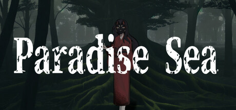
Where are we? But the destination is clear. In this sea of trees, my final home, there must be a paradise. Who am I? But my purpose is clear. The noise that wanders in the deep consciousness, seeking the peace that lies beyond.

$2.095 user reviews
AdventureVisual Novel2D Platformer
mokosoftJul 11, 2025

Paradise Sea scores 72/100 — better than 48% of Adventure capsules (n=7,922).

5 user reviews · $2.09 · Released Jul 11, 2025 · By mokosoft

Quick text summary

Paradise Sea scored 72/100 on Steam Analyzer — Good for a Adventure capsule. Top priority fix: [uniqueness_polish] Introduce a distinctive visual element—either a unique character design detail, recurring symbol, or striking color accent—that differentiates this from other moody forest adventures and creates a memorable brand hook.

Capsule scores by dimension

  • Genre Clarity: 7/10 — Atmospheric adventure with mystery. The lone figure in a dark forest setting signals a narrative-driven adventure or psychological exploration game, but the exact subgenre remains ambiguous at tiny size. The somber palette and isolated protagonist suggest introspective indie adventure rather than action or puzzle-focused gameplay. At tiny size, the silhouette and forest environment read clearly enough to convey 'mysterious journey' but lack specific gameplay iconography.
  • Title Readability: 8/10 — Strong serif font with clear contrast. The title 'Paradise Sea' uses a bold, distressed serif typeface in white that maintains legibility at both full and small sizes due to strong value contrast against the dark forest background. The text placement across the upper-middle area avoids dense foliage, and letter spacing is generous enough to prevent collapse at tiny size. Minor issue: at tiny size the distressed texture of the letters becomes harder to parse, but the word shapes remain recognizable.
  • Contrast & Color: 8/10 — Strong light-dark separation. The white title and the crimson-robed central figure create clear silhouettes against the dark, cool-toned forest environment, ensuring good contrast against the Steam dark background. The figure's warm red tone and white text pop distinctly even when squinting or at small scale. The background uses muted greens and grays that recede, allowing the subject and text to hold focus without muddy mid-tone collapse.
  • Uniqueness & Polish: 7/10 — Moody indie aesthetic with restraint. The capsule conveys a deliberate, contemplative tone through its stark composition and distressed typography, avoiding generic fantasy clichés and instead suggesting a more literary or artistic adventure. The lone figure in forest setting is familiar in indie games, but the refined color palette and minimal visual noise demonstrate craft and intention. However, the concept is not visually distinctive enough to stand out sharply among peer titles like Jusant or The Invincible, which offer more striking visual hooks.
  • Brand Consistency: 6/10 — Coherent mood but limited identity cues. The capsule establishes a consistent melancholic, introspective mood through its color palette and composition that likely aligns with the game's narrative themes. However, there are no immediately memorable iconographic elements—no unique character design, symbol, or signature visual motif that would make this recognizable in a grid of similar atmospheric indie games. Without access to store screenshots, the internal cohesion appears solid but the brand differentiation is minimal.
  • Composition: 7/10 — Clear focal point with balanced depth. The central robed figure serves as a strong primary focal point with the forest creating layered depth that reads well at all sizes. Title placement in the upper portion avoids competing with the figure and allows both elements to coexist without visual conflict. At tiny size, the composition remains parseable, though the figure loses some silhouette definition; the title and subject stay sufficiently separated for quick recognition.

What works

  • Title contrast and readability. White distressed serif text maintains clarity at small sizes against the dark forest background with generous letter spacing and strategic placement away from busy foliage.
  • Atmospheric mood and cohesion. The cool, muted forest palette and somber figure create a unified contemplative tone that reinforces the game's narrative premise and feels intentional rather than generic.
  • Silhouette clarity at scale. The crimson-robed figure and white title both maintain strong value separation even when reduced to tiny thumbnail size, ensuring discoverability in quick scroll.

What hurts the capsule

  • Limited visual uniqueness. The lone-figure-in-forest concept is familiar in atmospheric indie games and lacks a distinctive visual hook or memorable motif that differentiates it from similar titles.
  • Unclear gameplay inference. At tiny size, the genre reads as 'mysterious adventure' but gives no clear signal of core mechanics or whether this is exploration, puzzle, narrative-driven, or action-based.
  • Minimal brand iconography. No signature character design, symbol, or recurring visual element is present that would allow recognition of the game in a future grid or sequel.

Priority fixes

  1. [uniqueness_polish] Introduce a distinctive visual element—either a unique character design detail, recurring symbol, or striking color accent—that differentiates this from other moody forest adventures and creates a memorable brand hook.
  2. [genre_clarity] Add subtle UI or object elements (like a journal, compass, or abstract icon) in the composition that hint at the core gameplay loop or narrative mechanic without breaking the atmospheric mood.
  3. [brand_consistency] Refine a signature color or texture motif across the capsule and (where possible) key store screenshots to build immediate recognition and reinforce the game's identity.

Store copy priority fixes

  1. [genre_clarity] Immediately clarify the actual genre in the short description—is this a visual novel, text adventure, platformer, or horror game? Resolve the tag contradiction before the store page goes live.
  2. [hook_strength] Replace or supplement the abstract opening with a concrete premise sentence: 'You awaken in a mysterious forest with no memory. Uncover the truth about your identity as you navigate toward an elusive paradise.' This grounds the philosophical tone in actionable narrative.
  3. [feature_communication] Add a brief gameplay section explaining core interactions—e.g., 'Read environmental storytelling, make dialogue choices (if any), solve environmental puzzles, or navigate the forest'—to help players understand what 'text adventure' actually means.
  4. [audience_targeting] Add an explicit line like 'Ideal for fans of introspective narrative games and mystery-driven stories' to immediately signal who should play this game.

Related guides

Steam app ID: 3675130 · Tags: Adventure, Visual Novel, 2D Platformer, 2D, Cute