Scoring genre clarity...

3Tower capsule

3Tower

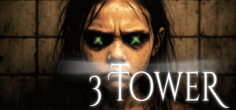
3Tower is a first-person horror adventure experience where you play as a night watchman on the graveyard shift. You might explore what going on here, or you might survive the night shift. It's up to you. This is a dense deep exploration in natural fears of graveyards - but pushed to a new level.

$1.993 user reviews
AdventureAction-AdventureWalking Simulator
Wechselbalg StudioJul 2, 2025

3Tower scores 72/100 — better than 48% of Adventure capsules (n=7,922).

3 user reviews · $1.99 · Released Jul 2, 2025 · By Wechselbalg Studio

Quick text summary

3Tower scored 72/100 on Steam Analyzer — Good for a Adventure capsule. Top priority fix: [composition] Move title lower or to side with clear padding to ensure safe distance from Steam crop zones and improve layout resilience

Capsule scores by dimension

  • Genre Clarity: 8/10 — Horror atmosphere clearly signaled. The haunted face with glowing green eyes, dark grimy environment, and grid-patterned industrial setting immediately communicate a horror experience. At tiny size, the glowing eyes and skeletal makeup remain the dominant visual cue, successfully conveying supernatural dread over action-adventure ambiguity. The graveyard/facility setting aligns well with the night watchman horror premise.
  • Title Readability: 7/10 — Title legible but symbol placement risky. The white serif-style '3TOWER' text has good contrast against the dark face and maintains readability at small size, though the cross symbol integrated into the '3' adds visual interest. At tiny size the text remains distinguishable, but the cross detail may blur slightly. The placement directly over the character's chest area is effective but leaves limited margin for Steam's potential edge cropping.
  • Contrast & Color: 8/10 — Strong dark value separation achieves pop. The pale skeletal makeup with green glowing eyes creates distinct silhouette separation against the dark brown-gray background and darker grid environment. The high-value face pops clearly even at small sizes, and the saturated green eyes draw immediate attention. In grayscale, the face maintains strong separation from background through luminosity alone, ensuring readability at all viewing sizes.
  • Uniqueness & Polish: 7/10 — Effective horror imagery, modest craft execution. The haunted makeup and glowing-eye effect feel distinctive for a graveyard-horror premise and communicate the core fear concept effectively. The execution is clean but relies on familiar horror makeup tropes rather than novel visual storytelling; the capsule successfully conveys the game's core tension but lacks a standout hook that distinguishes it from other horror titles beyond thematic clarity.
  • Brand Consistency: 6/10 — Generic horror aesthetic, limited identity cue. The haunted-face imagery and green-eye effect are thematically consistent with graveyard horror but lack a distinctive brand signature or recurring motif that would make 3Tower recognizable on sight. The title treatment with the cross symbol offers some potential identity marker, but without reference to game UI or environment uniqueness, this reads as generic supernatural horror rather than a branded property with memorable visual DNA.
  • Composition: 7/10 — Centered face focal point, title integration works. The composition places the character's intense face dead-center as the primary focal point with the title overlaid at chest level, creating a clear visual hierarchy that draws immediate attention. The close crop on the face eliminates distraction and maintains strength at all sizes, though the title placement leaves minimal safe margin from potential Steam edge cropping. At tiny size, the composition collapses well into a single readable symbol: haunted face plus text.

What works

  • Glowing eyes create instant recognition. The bright green glowing eyes are the single most memorable element and provide a strong focal point that remains visible and impactful even at tiny thumbnail size.
  • High contrast ensures legibility at scale. The pale face against dark background maintains clear silhouette separation in grayscale and color, with the title text remaining readable across all viewing conditions.
  • Horror genre immediately apparent. The skeletal makeup, graveyard setting, and supernatural visual language communicate the game's core experience without ambiguity.

What hurts the capsule

  • Title placement risks Steam crop damage. The '3TOWER' text sits very close to the chest edge with minimal safe margin, making it vulnerable to being cut or cramped during Steam's standard capsule cropping on different store pages.
  • Generic horror makeup, not distinctive brand. The haunted face aesthetic is familiar horror iconography without unique visual markers that would make 3Tower specifically recognizable versus other supernatural horror games.
  • No environmental storytelling or unique hook. The image communicates 'horror game' effectively but lacks visual elements that hint at the specific night-watchman premise or the 'dense deep exploration' gameplay differentiator.

Priority fixes

  1. [composition] Move title lower or to side with clear padding to ensure safe distance from Steam crop zones and improve layout resilience
  2. [brand_consistency] Introduce a visual motif specific to 3Tower identity—such as a tower silhouette, night-shift emblem, or distinctive color accent—to increase recognizability beyond generic horror
  3. [uniqueness_polish] Layer in subtle environment detail like a tower structure or graveyard grounds in the background to hint at the watchman setting and increase visual storytelling depth

Store copy priority fixes

  1. [hook_strength] Rewrite the short description opening line to lead with a clear verb: 'Survive your night shift as a watchman guarding three ancient towers that contain something far worse than the dead—or uncover the truth buried beneath the graveyard.' This is punchier and removes ambiguity.
  2. [feature_communication] Expand or clarify the walking simulator / exploration pillar in the main copy; add a sentence about environmental storytelling, collectibles, or areas to discover to justify the tag and depth claim.
  3. [tone_match] Move or condense the 'DEVELOPMENT & SUPPORT' section to a footnote or separate it visually; the shift to crowdfunding language breaks the horror atmosphere and should not interrupt the core experience narrative.
  4. [uniqueness] Strengthen the differentiator by adding one concrete example: 'For instance, if a tower failure causes a power surge, ghosts may manifest in unexpected locations, forcing you to adapt your strategy rather than memorize scripted encounters.' This makes the systemic claim tangible.

Related guides

Steam app ID: 3677120 · Tags: Adventure, Action-Adventure, Walking Simulator, Exploration, Immersive Sim