Scoring genre clarity...
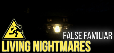
Carl Williams, a 15-year-old boy, finds himself alone at home one unsettling night. What begins as a quiet evening soon spirals into something far stranger. Shadows shift, silence speaks, and someone—or something—seems to know him better than he knows himself.
Free to PlayMostly Positive(40)
Choices MatterDialogue HeavyHorror
Eiko InteractiveJun 9, 2025