Scoring genre clarity...
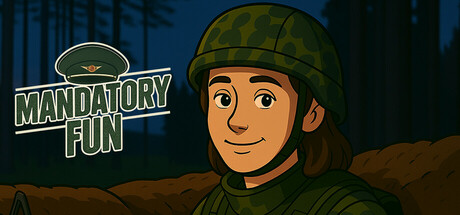
You play as a young man conscripted into the Finnish military. Your actions shape how things turn out — for you, and for those around you. This is a story-rich experience with elements of drama, comedy, and romance… if you can call it that.
Free to PlayMixed(12)
Visual NovelStory RichComedy
RoomTen GamesJun 7, 2025