Scoring genre clarity...
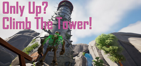
Looking for high-speed action? Then do yourself a favor and DON'T buy this game! Thrilling speed? Nope. What we do have is perfect jumps, awkward micro-adjustments, and a healthy dose of soul-crushing frustration! Your only goal? Hop endlessly onto tiny platforms and pray you don’t fall... again.
$7.991 user reviews
AdventureStrategyParkour
NTSBrothersMay 9, 2025