Scoring genre clarity...

Cubeverse: The Lonely Planets capsule

Cubeverse: The Lonely Planets

Rotate lonely cube planets and spot the differences. A 3D healing puzzle that blends emotion and discovery.

$1.99
Hidden ObjectCasualPuzzle
NARAENCMay 15, 2025

Cubeverse: The Lonely Planets scores 82/100 — better than 96% of Hidden Object capsules (n=1,334).

$1.99 · Released May 15, 2025 · By NARAENC

Quick text summary

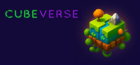
Cubeverse: The Lonely Planets scored 82/100 on Steam Analyzer — Good for a Hidden Object capsule. Top priority fix: [genre_clarity] Add a subtle visual hint of the core mechanic, such as a faint second cube or highlight circle, to clarify the 'spot the difference' gameplay at TINY size

Capsule scores by dimension

  • Genre Clarity: 8/10 — Puzzle adventure with isometric cue. The vibrant isometric cube structure with nature elements (plants, spheres, mountain) immediately signals a casual puzzle or exploration game. The pastel color palette and organic shapes avoid combat or action genre confusion. At TINY size, the distinctive cube silhouette and puzzle-like assembly remain recognizable, though specific genre details blur.
  • Title Readability: 9/10 — Excellent contrast and bold letterforms. CUBEVERSE uses a clean geometric sans-serif split across two lines with crisp color separation: bright green and purple on a dark navy background. The title maintains full legibility at SMALL (231×87) and TINY (120×45) sizes due to high value contrast and adequate letter spacing. The two-color split creates visual interest without sacrificing clarity.
  • Contrast & Color: 9/10 — Strong value separation throughout. The bright yellow-green cube and warm orange accents create excellent silhouette separation from the deep navy-purple background. The golden sphere at the top adds luminous focus. In grayscale, elements remain distinct with clear value hierarchy, and the design pops during quick scrolls on the Steam dark background (#1b2838).
  • Uniqueness & Polish: 8/10 — Distinctive isometric art style. The handcrafted 3D isometric cube with layered materials, organic vegetation, and a cohesive warm palette conveys premium indie polish. The composition shows intentional lighting and shadow work that differentiates it from generic asset-store visuals. The healing/puzzle angle is subtly communicated through the serene, layered composition rather than explicit UI.
  • Brand Consistency: 7/10 — Coherent style with solid identity. The isometric cube and warm pastel palette appear to align with the game's core mechanic (rotating cube planets). The soft, rounded forms and nature-forward aesthetic suggest emotional, non-violent gameplay. Without access to store screenshots, internal consistency appears strong, though a more iconic character or symbol could strengthen future brand recall.
  • Composition: 8/10 — Balanced layout with clear focal point. The title sits safely in the upper left with ample breathing room, while the isometric cube anchors the right side as the primary visual hook. The layered depth (foreground sphere, midground cube, background mountain) creates visual hierarchy and guides the eye naturally. At SMALL and TINY sizes, the cube remains the dominant focal point without title competition.

What works

  • Title contrast and legibility. Bright green and purple letterforms maintain sharp readability against dark navy at all viewing sizes including TINY.
  • Distinctive isometric 3D craft. The handcrafted cube with natural elements and warm lighting conveys premium indie polish and stands apart from generic casual game templates.
  • Strong background separation. Deep navy background provides excellent value contrast that makes the warm-colored cube and golden sphere luminous and focal at quick glance.
  • Balanced composition hierarchy. Title and visual anchor are well-separated with no overlap, creating clean spatial organization across all viewing scales.

What hurts the capsule

  • Genre specificity could be stronger. While the puzzle nature is implied, a TINY viewer may perceive this as generic casual/exploration rather than specifically a difference-spotting puzzle game.
  • No iconic character or symbol. The cube is thematic but lacks a memorable mascot or signature motif that could anchor brand identity beyond this single capsule.
  • Tagline or subtext absent. No visible subtitle or secondary text communicates the core mechanic ('spot the differences') or emotional hook ('healing puzzle'), leaving some positioning unclear.

Priority fixes

  1. [genre_clarity] Add a subtle visual hint of the core mechanic, such as a faint second cube or highlight circle, to clarify the 'spot the difference' gameplay at TINY size
  2. [brand_consistency] Develop a signature visual motif or character element (e.g., a mascot creature or repeating symbol) that can anchor brand identity across future marketing materials
  3. [title_readability] Consider adding a small secondary line or icon that conveys 'puzzle' or 'differences' to strengthen genre communication without sacrificing clarity

Store copy priority fixes

  1. [feature_communication] Expand the companion/item unlock bullet to explain their role in gameplay (e.g., 'Unlock animal companions that hint at puzzle solutions and reward your progress') and how player choice or narrative ties them to the lonely planets.
  2. [uniqueness] Add one sentence after 'reimagined in a beautiful 3D space' that explains the specific emotional or narrative hook—e.g., 'Each planet's story unfolds through the differences you discover, rewarding curiosity with character and lore.'
  3. [audience_targeting] Insert a sentence clarifying scope and accessibility early in the detailed description, such as 'Perfect for puzzle lovers seeking a relaxing, story-lite experience at your own pace,' to set expectations.
  4. [feature_communication] Explain how 'Choices Matter' tag manifests mechanically or narratively, as it is mentioned in tags but absent from the copy itself.

Related guides

Steam app ID: 3685180 · Tags: Hidden Object, Casual, Puzzle, Emotional, Colorful