Scoring genre clarity...
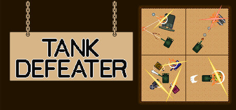
This is a top-down 2D tank action game. Players control a tank called a "TANK" and clear missions by defeating opposing TANKs by charging and firing. The appeal of this game is being able to freely develop tactics based on the battle situation, terrain, and your own equipment, and win.
$2.99
Action2DTanks
bitman, bitman_gamesNov 27, 2025