Scoring genre clarity...

Screen Boy capsule

Screen Boy

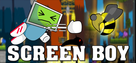
Screen Boy is a fun 2D platformer adventure full of excitement and danger! Join Screen Boy as he explores colourful worlds, dodges traps, and takes on massive bosses. With smooth controls and action-packed levels, it’s a thrilling quest that keeps you playing! Can you Save Screen Girl?

$5.991 user reviews
ActionAdventureCasual
Psychedelic Toad StudiosAug 5, 2025

Screen Boy scores 70/100 — better than 29% of Action capsules (n=8,534).

1 user reviews · $5.99 · Released Aug 5, 2025 · By Psychedelic Toad Studios

Quick text summary

Screen Boy scored 70/100 on Steam Analyzer — Good for a Action capsule. Top priority fix: [uniqueness_polish] Introduce a distinctive visual element or effect that communicates Screen Boy's core mechanic (e.g., screen glitch effects, unique screen-based hazard visualization) to elevate from competent to premium-feeling

Capsule scores by dimension

  • Genre Clarity: 7/10 — Clear platformer with playful tone. The capsule immediately communicates a 2D platformer through the character sprite, cartoon art style, and dynamic action pose with the bee enemy. At TINY size, the colorful protagonist and hazard elements (bee, angry monitor) still read as action-platformer gameplay. The visual language aligns well with casual platformer expectations, though the monitor-headed character is unconventional enough to add some ambiguity about the exact tone.
  • Title Readability: 8/10 — Strong bold title placement. SCREEN BOY is rendered in large, clean white sans-serif text with a black outline at the bottom of the composition, providing excellent contrast against the darker background elements. The title remains fully readable at SMALL and TINY sizes due to its size and outline treatment. The logo placement in safe space below the action avoids being obscured and maintains legibility across all viewing conditions.
  • Contrast & Color: 8/10 — Vibrant colors with good separation. The bright lime-green monitor, bold yellow bee, and white character elements pop distinctly against the dark urban background and Steam dark theme (#1b2838). The color saturation and value separation create clean silhouettes even at TINY size. The orange and blue city lights in the background provide complementary depth without competing with the foreground characters.
  • Uniqueness & Polish: 6/10 — Playful but familiar platformer aesthetic. The concept of a screen-headed protagonist is distinctive and memorable, with decent cartoon polish on the character design and enemy sprite work. However, the overall composition feels like a standard colorful indie platformer scene with recognizable 2D assets rather than demonstrating a unique visual hook or signature art style. The execution is competent and the bee/monitor enemies add personality, but it lacks the standout premium polish of top-tier genre entries like DREDGE or Viewfinder.
  • Brand Consistency: 6/10 — Consistent cartoony style, limited identity. The art direction is internally coherent with a unified cartoon aesthetic across the protagonist, enemies, and background environment. The screen-headed character is a memorable visual motif that could serve as brand identity. However, without additional reference material, the capsule lacks distinctive signature elements that strongly differentiate it from generic indie platformers—the palette and rendering style feel standard for the category.
  • Composition: 7/10 — Clear hierarchy with balanced spacing. The composition uses a three-part structure: screen-headed character in the left-center as primary focal point, bee enemy on the right as secondary threat, and bold title anchoring the bottom. The urban background provides context without overwhelming the foreground action. At TINY size, the focal point remains clear and the title doesn't interfere with character readability; however, there is some empty upper-right space that could feel slightly wasteful in extremely compressed views.

What works

  • Readable title with strong outline. Large white text with black outline maintains legibility from full header down to TINY thumbnail size.
  • Distinct character silhouette. The screen-headed protagonist is immediately recognizable and stands out as the primary visual hook against the background.
  • Good color contrast and saturation. Vibrant lime-green, yellow, and white elements pop clearly against both the dark background and Steam's dark theme.
  • Coherent cartoon art style. Unified 2D aesthetic across character, enemies, and environment creates a polished, intentional look.

What hurts the capsule

  • Generic platformer scene composition. The layout resembles standard indie platformer capsules without a distinctive visual narrative or unique staging that communicates core mechanic.
  • Limited brand identity signals. While the screen-head is memorable, the overall palette, effects, and staging lack signature elements that would create strong brand recognition across multiple capsules.
  • Upper-right void space. The composition leaves considerable empty area in the top-right quadrant that could be better utilized or addressed at TINY sizes where compression increases perceived imbalance.

Priority fixes

  1. [uniqueness_polish] Introduce a distinctive visual element or effect that communicates Screen Boy's core mechanic (e.g., screen glitch effects, unique screen-based hazard visualization) to elevate from competent to premium-feeling
  2. [composition] Add a subtle secondary focal point or environmental detail in the upper-right void to create better balance and reduce perceived empty space at compressed sizes
  3. [brand_consistency] Develop 1-2 signature visual motifs (color accent, icon, or pattern) that could be consistently applied across store screenshots and future marketing to build stronger brand recall

Store copy priority fixes

  1. [hook_strength] Rewrite the short description to lead with the core conflict (kidnapped girlfriend, trapped in underground caves) instead of generic adjectives like 'fun' and 'exciting'—this narrative hook is the game's strongest differentiator.
  2. [uniqueness] Add a specific sentence explaining what makes Screen Boy's 90's platformer experience distinctive—e.g., art style, boss design philosophy, level gimmick, or narrative twist that sets it apart from other retro platformers.
  3. [feature_communication] Expand the detailed description with 2-3 concrete gameplay features or progression mechanics (e.g., unlock abilities, environmental puzzles, boss patterns) to balance the narrative focus and help players envision actual moment-to-moment gameplay.
  4. [audience_targeting] Explicitly mention the intended player type in the short or opening of detailed description—e.g., 'for retro platformer fans seeking a story-driven adventure' or 'casual players who love 90's nostalgia with charming pixel art.'

Related guides

Steam app ID: 3690980 · Tags: Action, Adventure, Casual, Platformer, 2D Platformer