Scoring genre clarity...

Cursor Blast capsule

Cursor Blast

UMA NAVE ESPACIAL QUE TEM QUE SOBREVIVER INUMERAS ORDAS COM CARTINHAS EM UM JEITO INCOMUN DE JOGAR SHMUPS. MIRA NÃO LINEAR!

$3.99No user reviews
Card BattlerShoot 'Em UpTop-Down Shooter
NRZGAMESOct 5, 2025

Cursor Blast scores 78/100 — better than 89% of Card Battler capsules (n=660).

No user reviews · $3.99 · Released Oct 5, 2025 · By NRZGAMES

Quick text summary

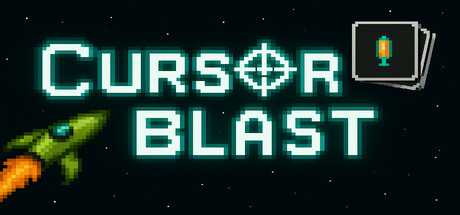
Cursor Blast scored 78/100 on Steam Analyzer — Good for a Card Battler capsule. Top priority fix: [title_readability] Reduce glow intensity slightly or add a thin dark outline to ensure crisp pixel-perfect legibility at 120x45 thumbnail size without sacrificing visual impact.

Capsule scores by dimension

  • Genre Clarity: 8/10 — Retro shmup action clear. The pixel art rocket with orange flame exhaust immediately signals a shoot-em-up or space action game, reinforced by the starfield background and glowing crosshair UI element in the top right. At tiny size, the rocket silhouette and explosive visual language remain readable and genre-appropriate. The retro arcade aesthetic strongly communicates casual action gameplay.
  • Title Readability: 8/10 — Bright cyan neon legible. CURSOR BLAST uses a high-contrast cyan neon glow font that reads cleanly at all sizes, with strong separation from the dark background. The crosshair symbol integrated into the title reinforces the gameplay mechanic. At tiny size the text remains distinct, though the glow effect may slightly blur letterforms—still well above the legibility threshold.
  • Contrast & Color: 9/10 — Vibrant neon pops sharply. The bright cyan glow of the title contrasts dramatically against the pure black starfield, creating excellent silhouette separation and visual pop. The orange-yellow rocket flame provides warm accent color that guides the eye without competing. The grayscale squint test shows strong value separation across all key elements, making the design resilient at any viewing size.
  • Uniqueness & Polish: 7/10 — Polished retro appeal distinct. The pixel art rocket and neon arcade aesthetic feel intentional and cohesive, avoiding generic template look common in action games. The crosshair integration into both the title and UI element (top right) communicates a unique non-linear aiming mechanic mentioned in the description. While retro arcade style is familiar, the execution is clean and premium-feeling with deliberate craft in the glow effects and spacing.
  • Brand Consistency: 7/10 — Recognizable neon arcade identity. The cyan neon glow, pixel rocket, and starfield create a consistent visual identity that would be recognizable across marketing materials. The crosshair motif appears both in the title and UI element, establishing an iconic brand symbol for the non-linear aiming mechanic. The palette and style are distinct enough to stand out in the action genre without feeling derivative of competitors.
  • Composition: 8/10 — Clear hierarchy balanced layout. The title anchors the upper left with strong emphasis, while the rocket in the lower left and card UI element in the upper right create a balanced triangular composition that guides the eye naturally. Negative space is used effectively around the title to ensure readability, and the rocket silhouette has room to breathe without edge hugging. At small and tiny sizes the focal hierarchy remains clear with no clutter or competing elements.

What works

  • Cyan neon glow pops powerfully. The bright, high-saturation cyan title with glow effect creates exceptional contrast against the dark background and remains readable and striking at all viewing sizes.
  • Retro rocket silhouette communicates genre. The pixel art rocket with orange flame instantly signals a space action game and maintains clear recognition even at tiny thumbnail size.
  • Crosshair motif strengthens brand identity. The crosshair appears in both the title and as a UI card element, creating a memorable symbol tied directly to the non-linear aiming mechanic and reinforcing core gameplay.
  • Balanced composition guides eye naturally. Title and rocket anchor opposite corners with the UI card providing upper-right accent, creating a stable triangular layout with no awkward dead zones or clutter.

What hurts the capsule

  • Glow effect may soften small text. While the neon glow is visually appealing, it can cause slight letterform blur at very small sizes, potentially affecting pixel-perfect legibility on smaller devices.
  • Minimal supporting visual context. The capsule relies heavily on title and rocket with a relatively empty starfield, offering limited visual storytelling about game depth, mechanics, or setting beyond the retro arcade aesthetic.
  • Card UI element lacks clear function. The small card icon in the top right is thematically referenced in the game description but its purpose and visual integration could be more obviously connected to core gameplay without additional context.

Priority fixes

  1. [title_readability] Reduce glow intensity slightly or add a thin dark outline to ensure crisp pixel-perfect legibility at 120x45 thumbnail size without sacrificing visual impact.
  2. [composition] Consider adding a subtle secondary visual element (enemy sprite, power-up, or game card preview) to the mid-ground to increase visual interest and storytelling without disrupting the clean layout.
  3. [uniqueness_polish] Enhance the card UI element with more visual polish or animation suggest (trails, glow) to make its connection to the card-based mechanic more intuitive at a glance.

Store copy priority fixes

  1. [hook_strength] Replace the Portuguese short description with a punchy English hook that leads with the unique non-linear mouse aiming mechanic: 'Retro space shooter where you aim freely with your mouse instead of firing straight—survive infinite waves and unlock card-based upgrades to grow stronger.'
  2. [feature_communication] Add a bullet-point feature breakdown under the detailed description explaining: (1) How card selection works post-stage, (2) What upgrade categories exist (damage, movement, defense, etc.), (3) Rarity system impact, (4) How infinite stages scale in difficulty.
  3. [tone_match] Remove or replace all off-topic sentences (steak/juice line, vague encouragement) with consistent, retro-inspired copy that reinforces the 90s bootleg game tribute theme without jarring tonal shifts.
  4. [audience_targeting] Add a clear sentence targeting the intended player type: specify if this is for roguelike veterans, retro arcade fans, or casual players seeking bite-sized action.

Related guides

Steam app ID: 3691030 · Tags: Card Battler, Shoot 'Em Up, Top-Down Shooter, PvE, Strategy