Scoring genre clarity...

is THIS a game? capsule

is THIS a game?

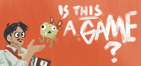
Is THIS a game? Well, it has everything you'd expect: buttons, pixels, achievements, a mouse-cursor to point and click sometimes, an axolotl, more than 50 mini-”games”. Is this enough? What even is a game? How much interactivity do you need? Are games art? Are there TOO many axolotls in this game?

$3.99Positive(21)
AdventureSatirePhilosophical
Johannes LottJun 15, 2025

is THIS a game? scores 68/100 — better than 22% of Adventure capsules (n=7,922).

Positive (21 reviews) · $3.99 · Released Jun 15, 2025 · By Johannes Lott

Quick text summary

is THIS a game? scored 68/100 on Steam Analyzer — Solid for a Adventure capsule. Top priority fix: [title_readability] Increase title stroke weight or add subtle outline to maintain letter clarity at TINY thumbnail size without sacrificing hand-drawn charm.

Capsule scores by dimension

  • Genre Clarity: 7/10 — Playful indie adventure with meta themes. The axolotl character, cartoon art style, and question mark imagery clearly signal a quirky indie game with puzzle or narrative focus. At TINY size, the absurdist character design and whimsical tone remain readable, though the specific 'mini-games collection' concept is not immediately obvious from visuals alone. The visual language communicates indie adventure more than it communicates the game's actual 'interrogating what is a game' premise.
  • Title Readability: 6/10 — Bold text readable at all sizes. The title 'IS THIS A GAME?' uses a chunky, hand-drawn white font that contrasts well against the warm orange background and remains legible at SMALL and TINY sizes. The typography is intentionally imperfect and playful, which fits the tone but slightly reduces precision at the smallest viewing sizes due to irregular letterforms and slight paint-stroke effects. At TINY size the text is still parseable but loses some of its charm due to compression.
  • Contrast & Color: 8/10 — Strong warm-cool separation. The warm orange background provides excellent contrast against the cool white title text and the character's cooler skin tones. The axolotl's pale pink and cream coloring pops clearly against the orange, and the left character in cool gray-brown tones creates good depth separation. This warm-dominant palette maintains strong silhouette clarity even at TINY size and reads well in grayscale due to solid value separation.
  • Uniqueness & Polish: 7/10 — Charming indie aesthetic with personality. The hand-drawn character design, playful axolotl mascot, and meta-commentary title text convey personality and intentional craft rather than template reuse. The illustration quality is clean and polished with consistent line work and purposeful color choices, though the overall concept is not radically distinct from other indie adventure games that embrace absurdism. The visual hook—the absurd question paired with charming characters—effectively communicates the game's core selling point without feeling generic.
  • Brand Consistency: 6/10 — Consistent style within capsule. The illustration style is internally cohesive with unified character design, consistent color palette, and a recognizable hand-drawn voice throughout. However, there are no immediately iconic symbols, repeated motifs, or signature visual devices that would anchor strong brand recognition across multiple touchpoints. The axolotl has potential as a brand mascot, but it's used here as a single element rather than a reinforced identity cue.
  • Composition: 7/10 — Clear focal points, balanced layout. The left character and central axolotl create a natural left-to-right reading flow, with the title anchoring the right side and providing visual balance. The composition uses good depth layering with the character in foreground, axolotl in mid-ground, and orange background, creating clear hierarchy even at TINY size. Safe margins protect the main elements, though the title's right edge approaches the frame boundary which could risk minor crop loss depending on Steam's rendering.

What works

  • Excellent color contrast. Warm orange background with cool white text and character tones creates strong silhouette separation that reads clearly at all viewing sizes.
  • Charming hand-drawn character design. The quirky left character and axolotl mascot have personality and polish that communicate indie game identity without feeling generic or template-based.
  • Clear focal point hierarchy. The composition guides the eye from left character through axolotl to right title, maintaining readable order even at TINY thumbnail size.

What hurts the capsule

  • Title font loses precision at tiny size. The irregular hand-drawn letterforms and paint-stroke effects of the title text compress and blur slightly at TINY viewing size, reducing legibility from 'charming' to 'adequate.'
  • Limited brand identity reinforcement. No repeated motifs, icons, or signature visual devices exist to create strong brand recall or consistency across multiple marketing touchpoints beyond this single capsule.
  • Core mechanic concept not visually apparent. The 'collection of 50+ mini-games' premise is not communicated through the capsule visuals, which read as a standard character-driven adventure rather than hinting at gameplay variety.

Priority fixes

  1. [title_readability] Increase title stroke weight or add subtle outline to maintain letter clarity at TINY thumbnail size without sacrificing hand-drawn charm.
  2. [genre_clarity] Add a subtle visual hint of gameplay variety—such as small UI elements, buttons, or icon repetition—to better communicate the 'collection of mini-games' concept.
  3. [composition] Pull the title text slightly left to create more safe margin clearance from the right edge and reduce crop risk on Steam's rendering.

Store copy priority fixes

  1. [feature_communication] Add 1-2 sentences describing the actual moment-to-moment interaction: 'You click through surreal scenes, solve absurdist mini-games, and unlock achievements as the game questions its own nature' or similar. This clarifies what 'playing' actually entails.
  2. [genre_clarity] Consolidate the philosophical questions into one punchy statement early (not repeated 3+ times) to avoid redundancy while maintaining the meta hook.
  3. [audience_targeting] Add a one-line expectation-setter like 'Not for players seeking traditional narrative or challenge; best enjoyed by experimental game enthusiasts and philosophy-curious players' to filter for the right audience.
  4. [feature_communication] Briefly explain the axolotl's role (mascot, collectible, puzzle element) to transform it from a random quirk into a recognized feature.

Related guides

Steam app ID: 3691100 · Tags: Adventure, Satire, Philosophical, Surreal, Point & Click