Scoring genre clarity...

Free For Fall capsule

Free For Fall

A 3D party platformer where you grab obstacles from a shared box, place them on the course, then race through the deadly gauntlet you all created. Outsmart your friends while surviving your own traps!

$7.99Positive(41)
MultiplayerPartyFunny
Baboon Digital, HamunoNov 7, 2025

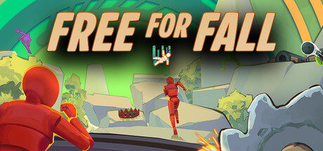
Free For Fall scores 72/100 — better than 39% of Multiplayer capsules (n=2,820).

Positive (41 reviews) · $7.99 · Released Nov 7, 2025 · By Baboon Digital

Quick text summary

Free For Fall scored 72/100 on Steam Analyzer — Good for a Multiplayer capsule. Top priority fix: [uniqueness_polish] Introduce a visual element that communicates the trap-placement mechanic (e.g., a shared obstacle box, a trap being placed, or a player holding/manipulating an object) to differentiate from generic multiplayer platformers.

Capsule scores by dimension

  • Genre Clarity: 7/10 — Party platformer chaos clearly signaled. The capsule communicates competitive multiplayer action through bright, chaotic visual language with multiple characters, obstacles mid-air, and dynamic movement cues. The red character in an action pose and scattered environmental elements read as party game energy at full size. At tiny size, the multiple characters and colorful scene still suggest multiplayer fun, though the specific trap-placement mechanic is not visually obvious without game knowledge.
  • Title Readability: 8/10 — Bold italic title pops effectively. The 'FREE FOR FALL' text uses thick, italic yellow-gold letterforms with a dark shadow outline that stands out cleanly against the green background at all sizes. The text is positioned in the upper third with controlled spacing and remains legible at small and tiny sizes. The tagline below is too small to read at tiny size, but the primary title carries the entire communication.
  • Contrast & Color: 8/10 — Vibrant warm palette strong separation. The bright lime green background, warm yellow title, and saturated red character create excellent value separation against the Steam dark background #1b2838. The mid-tones are controlled with clear silhouettes, and even in grayscale the yellow text and red character maintain distinct separation. The composition resists muddy blending at all viewing sizes.
  • Uniqueness & Polish: 7/10 — Colorful and polished indie style. The 3D render quality is clean with good lighting and material definition on the characters and environment, showing professional production values. The warm color palette and chaotic multi-character layout feel distinctive for a party game without being overly generic. However, the visual concept—colorful characters in action poses—shares similarities with other casual multiplayer titles in the benchmark list, preventing a higher score.
  • Brand Consistency: 6/10 — Consistent render style lacks iconic anchor. The capsule maintains a coherent bright, cheerful 3D art style with warm tones and playful character design that aligns with casual indie aesthetics. No singular character, mascot, or visual motif stands out as immediately iconic or distinctive enough to become a strong brand identifier for repeat recognition. The palette is consistent but not deeply memorable.
  • Composition: 7/10 — Balanced layout with clear focal points. The layout distributes attention across the red character in the center-left, the yellow title at top, and background obstacle elements, creating a coherent visual hierarchy without dead zones. The red character serves as the primary focal point while the title anchors the top third, and this structure reads clearly at small and tiny sizes. Margins appear safe from Steam's typical cropping, though the right-side obstacle is close to the edge.

What works

  • Strong color contrast against dark Steam background. The vibrant lime green, bold yellow title, and saturated red character create immediate visual pop and maintain clarity at all viewing sizes including tiny thumbnails.
  • Readable title with intentional styling. The thick italic yellow letters with dark shadow outlines remain legible across full, small, and tiny sizes without collapsing or losing letterform clarity.
  • Professional 3D rendering quality. Clean material definition, consistent lighting, and polished character models convey production value appropriate for a casual indie release.
  • Chaotic energy communicates multiplayer fun. Multiple characters in action poses against dynamic environmental elements immediately signal competitive party game gameplay.

What hurts the capsule

  • Tagline unreadable at small and tiny sizes. The secondary text below the title is too small to parse when the capsule is viewed at 231×87 or 120×45, limiting messaging depth at key visibility moments.
  • No distinctive iconic character or mascot. While the red character is present, it lacks a memorable unique silhouette or recognizable design that would anchor future brand recognition across other materials.
  • Generic party game visual language. The colorful characters-in-action aesthetic overlaps significantly with other casual multiplayer titles, missing a unique visual hook that differentiates the core trap-placement mechanic.
  • Core gameplay mechanic not visually communicated. The trap-placement and obstacle-sharing central to the game's pitch are not evident from the visual composition; it reads as generic action rather than trap-based strategy.

Priority fixes

  1. [uniqueness_polish] Introduce a visual element that communicates the trap-placement mechanic (e.g., a shared obstacle box, a trap being placed, or a player holding/manipulating an object) to differentiate from generic multiplayer platformers.
  2. [genre_clarity] Add a subtle UI hint or environmental prop that clarifies the shared trap mechanic, such as a highlighted obstacle or a player positioning element that hints at the core gameplay loop.
  3. [brand_consistency] Develop a distinctive character silhouette or color signature (e.g., unique outfit, iconic pose, or mascot element) that could serve as a recognizable brand anchor across store screenshots and community materials.

Store copy priority fixes

  1. [feature_communication] Add 1-2 concrete examples of obstacle types (spinning blades, moving platforms, bouncing spheres) to the 'Extensive obstacle library' bullet to help players visualize the creative depth.
  2. [feature_communication] Add a brief sentence explaining the level editor and workshop functionality in the detailed description (after the obstacle placement paragraph) to address a category feature not yet mentioned in copy.
  3. [uniqueness] Strengthen the closing by explicitly comparing or contrasting this to standard party games: e.g., 'Unlike traditional platformers where the course is fixed, in Free For Fall you *architect the challenge itself*—then live with the consequences.'

Related guides

Steam app ID: 3691910 · Tags: Multiplayer, Party, Funny, Platformer, Online Co-Op