Scoring genre clarity...

Exit Strategy capsule

Exit Strategy

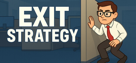
Stealth puzzles set in a dangerously relatable office. Sneak past your boss, dodge HR, and escape early—or build your own chaotic office layouts and share them on Steam Workshop. Use distractions, vents, lockers, and pure audacity. Build. Escape. Repeat.

$4.99
CasualStrategySandbox
Kevin SmithAug 10, 2025

Exit Strategy scores 78/100 — better than 82% of Casual capsules (n=10,153).

$4.99 · Released Aug 10, 2025 · By Kevin Smith

Quick text summary

Exit Strategy scored 78/100 on Steam Analyzer — Good for a Casual capsule. Top priority fix: [uniqueness_polish] Add a subtle visual hint of the stealth or evasion mechanic—such as the character crouching, hiding, or a faint boss silhouette looming—to differentiate from generic office comedy games.

Capsule scores by dimension

  • Genre Clarity: 8/10 — Office stealth puzzle immediately clear. The businessman character in a tie with glasses and waving hand gesture, combined with the office building backdrop and the word STRATEGY, clearly signal a puzzle or strategy game with comedic office setting. At tiny size, the character silhouette and office environment remain readable, and the casual art style suggests indie puzzle gameplay rather than action or combat. The visual does not communicate the stealth mechanic explicitly, but the genre context is unambiguous.
  • Title Readability: 9/10 — Bold white text excellent legibility. The all-caps STRATEGY text uses a bold, clean sans-serif font with white letterforms placed on a semi-transparent dark background region, ensuring strong contrast against both the office backdrop and the #1b2838 Steam background. At full, small, and tiny sizes, the text remains crisp and readable without any collapse or muddiness. The letterform spacing and outline are tight and professional, making it one of the strongest elements.
  • Contrast & Color: 8/10 — Strong value separation overall. The white STRATEGY text has excellent contrast against the blue-toned office background, and the orange-brown businessman stands out clearly from the cooler palette. The character and building silhouettes maintain clear edges in a grayscale squint test, with distinct light and dark values. At tiny size, the character remains distinguishable from background, though some fine detail in glasses and tie loses crispness.
  • Uniqueness & Polish: 7/10 — Competent cartoon style, moderate distinction. The illustration uses a clean, consistent cartoon aesthetic with smooth lines and solid color fills typical of indie casual games. The character has personality and the office setting is coherent, but the overall presentation is relatively familiar within the indie puzzle genre—similar casual character illustrations appear across titles like Dave the Diver and Content Warning. The waving gesture adds some life, though it doesn't communicate a unique mechanic or standout selling point.
  • Brand Consistency: 7/10 — Consistent character and office palette. The businessman character and office environment establish a recognizable identity consistent with stealth-puzzle office comedy gameplay. The warm brown and orange tones against cool blue backgrounds create a coherent color scheme. Without access to the seven store screenshots, it appears the character design and office setting would likely repeat, establishing visual memory, though there are no highly iconic motifs or signature visual hooks that leap beyond the genre standard.
  • Composition: 8/10 — Clear hierarchy, well-balanced layout. The businessman is positioned on the right as the primary focal point, while the STRATEGY text anchors the left side on a controlled background zone, creating strong visual hierarchy. The composition uses depth effectively with the office building behind and the character in front. At small and tiny sizes, the eye is immediately drawn to the character then the text, with no competing elements or dead zones. The spacing is balanced, and critical elements remain well within safe margins.

What works

  • Title readability excellence. Bold white sans-serif text on a semi-transparent dark region maintains clarity at all sizes from full to tiny with no legibility collapse.
  • Clear genre communication. The office setting, businessman character, and STRATEGY text immediately signal an indie strategy or puzzle game with comedic office themes.
  • Solid visual hierarchy and composition. Character on right, text on left, and background building create a balanced, easy-to-read layout with a clear primary focal point.
  • Good value contrast throughout. Warm character and cool office background colors maintain clear silhouette separation in grayscale test and across small sizes.

What hurts the capsule

  • Generic indie illustration style. The cartoon character and office aesthetic are competent but visually similar to many other indie casual games, lacking a memorable distinctive hook.
  • Stealth mechanic not visually implied. The waving gesture and office setting suggest strategy or puzzle gameplay but do not specifically communicate stealth, sneaking, or evasion gameplay.
  • Limited brand identity signaling. No iconic character, motif, or signature element stands out as uniquely recognizable for Exit Strategy versus other office-themed indie titles.

Priority fixes

  1. [uniqueness_polish] Add a subtle visual hint of the stealth or evasion mechanic—such as the character crouching, hiding, or a faint boss silhouette looming—to differentiate from generic office comedy games.
  2. [brand_consistency] Introduce a distinctive visual motif or character trademark (signature pose, accessory, or office object) that could become iconically tied to Exit Strategy across marketing materials.
  3. [genre_clarity] Consider a secondary visual element like a vent, HR sign, or escape route indicator to reinforce the stealth-puzzle-escape core gameplay loop at tiny size.

Store copy priority fixes

  1. [hook_strength] Replace 'Build. Escape. Repeat.' with a more specific call-to-action or gameplay outcome that feels less formulaic, such as 'Climb the leaderboards or craft your masterpiece in Build Mode.'
  2. [feature_communication] Add a single sentence clarifying campaign progression—e.g., 'Complete dozens of office levels with escalating difficulty, or build your own endless scenarios' to better define the gameplay arc.
  3. [audience_targeting] Explicitly address difficulty/pacing expectations—e.g., 'Perfect for casual puzzle fans and creative builders' or 'Quick play sessions ideal for office breaks' to signal the intended player mindset.

Related guides

Steam app ID: 3692530 · Tags: Casual, Strategy, Sandbox, Puzzle, Level Editor