Scoring genre clarity...

SAFE INSIDE capsule

SAFE INSIDE

Stay close together and use teamwork to fight through hordes of infected and other mutated freaks while navigating between saferooms.

ZombiesOnline Co-OpMultiplayer
Broken Chair StudiosTo be announced

SAFE INSIDE scores 75/100 — better than 78% of Zombies capsules (n=697).

Released To be announced · By Broken Chair Studios

Quick text summary

SAFE INSIDE scored 75/100 on Steam Analyzer — Good for a Zombies capsule. Top priority fix: [uniqueness_polish] Introduce a distinctive character or infected mutation design rather than generic skull to create a memorable visual hook unique to SAFE INSIDE

Capsule scores by dimension

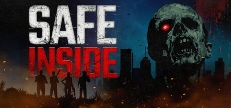
  • Genre Clarity: 8/10 — Clear zombie action horror. The decomposed skull with glowing red eyes on the right immediately signals horror/zombie genre, while the silhouetted armed figures on the left and orange firelight establish action combat setting. At tiny size, the skull and figure silhouettes remain readable enough to convey infected-fighting action, though fine details blur slightly.
  • Title Readability: 8/10 — Strong legible title placement. SAFE INSIDE uses white sans-serif typography with clear letter spacing positioned in the upper-left third against a darker controlled background region with a subtle gold lock icon. The title maintains readability at small and tiny sizes; at tiny size the lock icon adds a memorable secondary cue without cluttering the read.
  • Contrast & Color: 8/10 — Excellent value separation. The white title text pops sharply against the dark background, while the skull's pale bone and hot red eyes create strong silhouette contrast against the cooler blue-to-orange gradient backdrop. The warm orange fire on the left and cool blue on the right create effective value layering that maintains clarity even when squinting, with figures reading as dark shapes against bright background fire.
  • Uniqueness & Polish: 7/10 — Competent craft with familiar tropes. The design executes zombie-action fundamentals well with a polished gradient, proper lighting, and a posed skull focal point, but the composition—zombie head plus silhouetted survivors—is a common horror-action template seen in many infected-themed games. The lock icon adds a small unique teamwork/safe room narrative touch, but overall feels more solidly executed than distinctly original.
  • Brand Consistency: 6/10 — Functional but generic identity. The skull, lock icon, and survivor silhouettes are cohesive within this single image and align with the game's safe-room teamwork concept, but these elements lack a distinctive signature style or memorable visual hook that would make SAFE INSIDE recognizable across multiple store assets. The rendering is clean but does not establish a unique brand palette or character motif.
  • Composition: 8/10 — Clear hierarchy and focal balance. The skull anchors the right side as primary subject with strong visual weight, while the title and lock occupy the upper left, creating diagonal balance without clutter. Supporting silhouettes in the background fire establish context without competing for attention. The layout respects safe margins and scales well across sizes; at tiny size the focal triangle of title, lock, and skull remains clear.

What works

  • Strong contrast against dark steam background. White title text and pale skull silhouettes pop clearly against the #1b2838 Steam background with minimal value crush, maintaining readability at all viewing sizes.
  • Clear action-horror genre identity. Zombie skull, armed silhouettes, and firelit urban setting immediately communicate infected-combat gameplay without ambiguity.
  • Well-balanced focal hierarchy. The skull and figures create a clear primary-secondary visual relationship that guides the eye without scattering attention across competing elements.

What hurts the capsule

  • Generic zombie-action composition. The skull-plus-survivors arrangement is a familiar template in infected-genre games, lacking a distinctive visual hook or mechanic storytelling that separates it from competitors.
  • Minimal brand identity signal. The capsule does not establish a recognizable character, color palette, or visual motif that would anchor brand memory or feel unique to SAFE INSIDE.
  • Lock icon clarity at tiny size. The gold lock icon, while thematically apt, reduces to a small detail at thumbnail size and may not register as a meaningful brand cue without prior game knowledge.

Priority fixes

  1. [uniqueness_polish] Introduce a distinctive character or infected mutation design rather than generic skull to create a memorable visual hook unique to SAFE INSIDE
  2. [brand_consistency] Establish and reinforce a signature color accent or visual motif across all store assets to build recognizable brand identity
  3. [composition] Increase emphasis on the 'teamwork' safe-room concept by adjusting figure poses or lighting to suggest cooperative urgency rather than generic silhouettes

Store copy priority fixes

  1. [hook_strength] Rewrite the short description to lead with a high-stakes moment or emotional consequence rather than a mechanical instruction—e.g., 'Survive hordes of infected and betray your teammates to save yourself—or risk everything to bring them home.'
  2. [feature_communication] Add specific weapon, enemy, or combat mechanic examples in the detailed description to answer 'what do I actually shoot and how do I survive?'
  3. [uniqueness] Insert a concrete differentiator about the infected types, saferoom mechanics, or campaign progression that explains why this co-op shooter stands apart from Left 4 Dead or similar titles.

Related guides

Steam app ID: 3695950 · Tags: Zombies, Online Co-Op, Multiplayer, Horror, Shooter