Scoring genre clarity...

Raidbound capsule

Raidbound

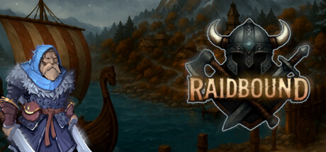
Raidbound is a Viking-themed auto-battler with a worker placement style system. Recruit warriors, forge gear, sacrifice for power, and raid rival clans. Choose your path, build your warband, and earn glory across a mythic map of tactical choices.

$4.995 user reviews
RogueliteAuto BattlerMedieval
Rustin RobinsonNov 17, 2025

Raidbound scores 68/100 — better than 15% of Roguelite capsules (n=2,290).

5 user reviews · $4.99 · Released Nov 17, 2025 · By Rustin Robinson

Quick text summary

Raidbound scored 68/100 on Steam Analyzer — Solid for a Roguelite capsule. Top priority fix: [uniqueness_polish] Add a visual cue that hints at the core mechanic—consider a subtle UI element (worker placement grid, sacrifice symbol, or gear icon) that differentiates Raidbound from generic Viking games.

Capsule scores by dimension

  • Genre Clarity: 7/10 — Viking strategy theme clear. The Viking longship, Norse warrior character, and horned helmet logo immediately signal Viking-themed gameplay. The axe and shield iconography in the logo reinforce a combat/strategy context. However, the auto-battler and worker placement mechanics are not visually apparent at tiny size, so while the Viking theme reads perfectly, the specific game loop remains ambiguous.
  • Title Readability: 8/10 — Logo readable, strong hierarchy. The 'RAIDBOUND' title with horned helmet emblem is centered and clearly legible at full, small, and tiny sizes due to bold sans-serif letterforms and consistent spacing. The logo maintains strong contrast against the background and the supporting shield/axe frame reinforces the mark. At tiny size the text collapses slightly but the iconic horned helmet silhouette remains recognizable.
  • Contrast & Color: 7/10 — Good separation, warm tones work. The golden 'RAIDBOUND' text and metallic horned helmet create strong value contrast against the darker teal-blue water and misty forest background. The character portrait on the left uses warm purples and blues that separate cleanly from the background. Some mid-tone foliage blends slightly, but key elements—title, logo, character—maintain clear silhouettes even at tiny size.
  • Uniqueness & Polish: 6/10 — Competent Viking aesthetic. The capsule delivers a cohesive Viking-themed presentation with period-appropriate character design, a well-rendered longship, and atmospheric forest/water setting. The horned helmet logo is cleanly executed with metallic effects. However, the overall composition feels like a straightforward fantasy setting without a distinctive visual hook that communicates the unique auto-battler mechanic or what makes Raidbound mechanically distinct from other Viking games.
  • Brand Consistency: 6/10 — Consistent Viking identity. The capsule establishes a strong Viking visual identity through costume, ship, environment, and the iconic horned helmet mark. Warm metallics and cool-toned backgrounds create a consistent palette. However, without reference to other brand touchpoints, the identity feels more like 'generic Viking game' rather than distinctly Raidbound; there is no immediately memorable motif or signature element that would be recognizable across multiple marketing materials.
  • Composition: 7/10 — Clear focal hierarchy, balanced layout. The character portrait anchors the left side, the logo and title occupy the prime center-right zone, and the atmospheric background fills the void without competing. The layering (foreground character, midground ship/water, background forest/sky) creates depth and guides the eye logically. At small and tiny sizes the composition holds well, though the character portrait edges slightly close to the left margin and could benefit from more breathing room.

What works

  • Strong Viking theme iconography. The horned helmet, longship, warrior outfit, and weapons immediately communicate a Norse setting with no ambiguity.
  • Logo stability and recognition. The 'RAIDBOUND' mark with embedded helmet remains legible and distinctive at all viewing sizes, from full header to tiny thumbnail.
  • Atmospheric layering. The background depth (forest, water, sky) creates visual interest and professional presentation without cluttering the focal points.

What hurts the capsule

  • Generic game-genre feel. The capsule looks like a competent Viking fantasy scene but does not visually communicate what makes Raidbound unique (auto-battler, worker placement, sacrifice mechanics).
  • Limited brand distinctiveness. There is no signature motif, color palette, or visual hook that would make this immediately recognizable as Raidbound versus other Viking-themed games.
  • Character portrait edge placement. The left-side warrior sits close to the margin and may risk cropping or awkward framing on certain Steam display contexts.

Priority fixes

  1. [uniqueness_polish] Add a visual cue that hints at the core mechanic—consider a subtle UI element (worker placement grid, sacrifice symbol, or gear icon) that differentiates Raidbound from generic Viking games.
  2. [brand_consistency] Develop a signature color accent or emblem motif (e.g., a rune, distinctive shield pattern, or ritual symbol) that becomes synonymous with Raidbound across all marketing materials.
  3. [composition] Increase left margin breathing room for the character portrait to reduce edge-hugging risk and improve layout resilience across Steam crop contexts.

Store copy priority fixes

  1. [hook_strength] Rewrite the short description opening to lead with player agency and consequence: 'Lead a Viking clan through mythic trials—recruit warriors, forge legendary gear, and raid rivals in tactical auto-battles where every sacrifice shapes your legacy.' This leads with a verb and emotional payoff rather than genre labels.
  2. [uniqueness] Add a paragraph or bullet comparing Raidbound's blend to other games in the space, e.g., 'Unlike pure auto-battlers, Raidbound fuses deckbuilder-style node choices with permanent sacrifice mechanics—your decisions reshape your warband irreversibly.' This crystallizes differentiation.
  3. [audience_targeting] Clarify PvP prominence and optionality early: add a single sentence in the detailed description overview such as 'Raid asynchronously against other players for glory, or focus on PvE for a story-driven run,' which signals flexibility and reduces decision anxiety.
  4. [feature_communication] Expand the Dishonor/reroll mechanic into a short bullet or sentence: 'Spend glory to reroll unfavorable node choices, but escalating Dishonor makes future rolls costlier and outcomes riskier—a resource-management layer atop every decision.' This clarifies a core strategic tradeoff.

Related guides

Steam app ID: 3696020 · Tags: Roguelite, Auto Battler, Medieval, Vikings, PvP