Scoring genre clarity...

Kickback Clicker capsule

Kickback Clicker

Mutants are flooding the planets! Destroy them all! Improve your technology, upgrade weapons and turn dangerous worlds into safe havens. Every click is a step towards the future of mankind!

$3.99Very Positive(57)
CasualIncrementalStrategy
Dot bloodNov 7, 2025

Kickback Clicker scores 70/100 — better than 29% of Casual capsules (n=10,153).

Very Positive (57 reviews) · $3.99 · Released Nov 7, 2025 · By Dot blood

Quick text summary

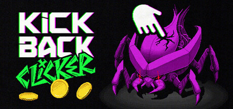
Kickback Clicker scored 70/100 on Steam Analyzer — Good for a Casual capsule. Top priority fix: [uniqueness_polish] Redesign or refine the mutant creature with a more distinctive silhouette, texture, or visual quirk that communicates the game's unique tone and differentiates it from generic sci-fi enemy archetypes.

Capsule scores by dimension

  • Genre Clarity: 7/10 — Action clicker with mutant theme clear. The purple mutant creature on the right immediately signals action-oriented gameplay with a hostile enemy aesthetic. The coin icons and 'CLICKER' text explicitly communicate the incremental/clicker genre mechanic. At tiny size, the mutant silhouette and coins remain readable, though the specific 'clicker' subgenre relies on text rather than pure visual convention.
  • Title Readability: 8/10 — Bright, clean title with strong contrast. The white 'KICK BACK' text and neon green 'CLICKER' are positioned on the dark left side with excellent contrast against the #1b2838 background. The letterforms remain sharp and legible at small and tiny sizes due to the bold sans-serif weight and strategic placement on a clean region. The hierarchical split between main title and subgenre descriptor works well, though the title competes slightly with the mutant graphic.
  • Contrast & Color: 8/10 — High-value separation with vibrant accents. The bright white and neon green text pop dramatically against the dark background, and the purple mutant has strong silhouette separation from the black void. The yellow coin icons add warm accent contrast without overwhelming the composition. At tiny size, the color separation remains clear; the purple mutant and white title maintain strong edge definition in grayscale.
  • Uniqueness & Polish: 6/10 — Competent design with generic mutant creature. The neon green text styling and upward hand gesture add some personality, and the coin motif reinforces the clicker mechanic clearly. However, the purple mutant is a fairly stock sci-fi enemy design without distinctive visual flair, and the overall composition feels functional rather than memorable or premium. Compared to top-tier indie capsules like DAVE THE DIVER or Balatro, this lacks a signature visual hook or art direction that communicates a unique selling point beyond 'clicker + mutants'.
  • Brand Consistency: 6/10 — Functional but lacks memorable identity. The neon green and purple color palette is cohesive within the frame, and the hand-plus-mutant visual could be a recognizable motif. However, there are no iconic character traits, signature symbols, or distinctive rendering style that would be instantly recognizable across store screenshots. The design reads as internally consistent but does not yet establish a strong brand voice or visual identity that would stand out in a library.
  • Composition: 7/10 — Clear focal hierarchy with effective balance. The left side anchors the title in a clean region, while the mutant occupies the right with natural depth separation. The coins sit between as a visual bridge. At small and tiny sizes, the hierarchy reads clearly: title first, then mutant, then coins. The composition respects safe margins and resists edge-hugging, though the mutant's tentacle-like appendages approach the right edge and could risk cropping on some platforms.

What works

  • Bold title contrast and readability. White and neon green text stands out sharply against the dark background and remains legible at tiny thumbnail size.
  • Clear genre communication via text and visual. The word 'CLICKER' explicitly states the mechanic while the mutant creature and coins visually reinforce the action-clicker concept.
  • Strong silhouette separation. The purple mutant maintains distinct edges against the black background, improving readability in low-attention scroll scenarios.
  • Intentional visual hierarchy. Title anchors the left, creature dominates the right, and coins create a visual connector between elements without scattered emphasis.

What hurts the capsule

  • Generic mutant design lacks distinctiveness. The purple creature is a stock sci-fi enemy with no unique silhouette or visual signature that differentiates it from common indie game aesthetics.
  • Limited brand identity and memorability. The capsule reads as competent but interchangeable; there is no iconic motif, character trait, or art style that would be instantly recognizable in a library of similar games.
  • Potential edge cropping risk. The mutant's right-side tentacles sit close to the frame edge and may be cropped or cut off on some Steam display formats.
  • Neon green text saturation. While readable, the bright green can feel slightly harsh and arcade-dated compared to more refined indie capsule typography in the benchmarks.

Priority fixes

  1. [uniqueness_polish] Redesign or refine the mutant creature with a more distinctive silhouette, texture, or visual quirk that communicates the game's unique tone and differentiates it from generic sci-fi enemy archetypes.
  2. [composition] Adjust the mutant placement to move right-edge elements at least 10-15 pixels inward to ensure safe cropping across all Steam display formats.
  3. [brand_consistency] Develop a signature visual motif or iconic element (character expression, armor detail, environment cue) that reinforces brand identity and becomes recognizable across store screenshots and marketing materials.
  4. [title_readability] Consider adding a subtle outline or glow to the neon green text to soften the harshness and improve perceived polish without sacrificing contrast.

Store copy priority fixes

  1. [feature_communication] Add a dedicated line explaining idle/automation mechanics: Does the orbital station deal damage while idle? Are there passive income streams or auto-clickers? This is crucial for the Idler tag audience.
  2. [uniqueness] Articulate one specific mechanical or thematic differentiator: Rewrite the closing sentence to explain what makes this clicker distinct (e.g., 'the only space-themed clicker with planetary unlocks' or 'combines real-time destruction with hands-off progression').
  3. [audience_targeting] Replace vague accessibility language with explicit engagement signals: Rewrite doesn't require masterful skills to indicate ideal session length or player type (e.g., 'perfect for 5-minute play sessions' or 'ideal for idle game enthusiasts').
  4. [hook_strength] Replace the opening of the detailed description with a story or gameplay hook: Change from The captivating clicker game to a sentence that emphasizes the premise (e.g., 'Prepare hostile alien worlds for human colonization by commanding an orbital defense station').

Related guides

Steam app ID: 3696700 · Tags: Casual, Incremental, Strategy, Idler, Simulation