Scoring genre clarity...

Warehouse Warrior capsule

Warehouse Warrior

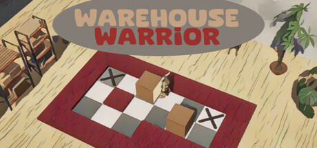
Take on the role of a Warehouse worker and try to solve all the box pushing puzzles. The puzzles start very easy and get tougher with each new level. Can you solve all the challenges and achieve the title of Warehouse Warrior?

$2.992 user reviews
PuzzleSokobanTop-Down
Zbigniew PamulaMay 23, 2025

Warehouse Warrior scores 68/100 — better than 22% of Puzzle capsules (n=4,409).

2 user reviews · $2.99 · Released May 23, 2025 · By Zbigniew Pamula

Quick text summary

Warehouse Warrior scored 68/100 on Steam Analyzer — Solid for a Puzzle capsule. Top priority fix: [uniqueness_polish] Introduce a distinctive character or mascot (warehouse worker, robot, or stylized cat) as the focal point to differentiate brand identity and add personality.

Capsule scores by dimension

  • Genre Clarity: 7/10 — Puzzle mechanics clear, casual tone readable. The overhead isometric view with a grid-based red carpet and stacked boxes immediately signals a puzzle game mechanic. The wooden warehouse interior and casual color palette support the casual puzzle genre. At TINY size, the box arrangement and grid still read as a puzzle challenge, though the specific 'box-pushing' mechanic requires the visible boxes to infer the gameplay type.
  • Title Readability: 8/10 — Title legible at all sizes with good contrast. WAREHOUSE WARRIOR uses two distinct colors: gray for WAREHOUSE and red for WARRIOR, creating strong separation and visual rhythm. The title sits in a clear horizontal band at the top against a neutral light background, ensuring it remains readable at SMALL and TINY sizes. At TINY size, both words are still distinguishable due to the bold weight and color contrast, though fine letter details soften.
  • Contrast & Color: 7/10 — Good value separation, warm palette cohesive. The warm wood tones, burgundy carpet, and neutral beige background create clear silhouette separation from the Steam dark background. The red title pops well against the light band. Grayscale test shows solid mid-to-light value contrast; however, the browns and tans in the furniture and boxes sit in a similar mid-tone range, which slightly softens the overall impact at TINY size where detail blurs.
  • Uniqueness & Polish: 6/10 — Competent but generic warehouse aesthetic. The isometric 3D render is clean and well-crafted, with intentional lighting and object placement that suggests care. However, the scene reads as a straightforward warehouse interior with stock furniture, potted plant, and stacked boxes—elements common in casual puzzle game marketing. The execution is polished but the visual concept lacks a distinctive hook or memorable art style that separates it from other puzzle games in the genre.
  • Brand Consistency: 6/10 — Cohesive render but no distinctive identity cues. The capsule maintains internal consistency: warm wood palette, isometric perspective, neutral lighting, and simple props all align as a unified casual puzzle aesthetic. There are no signature motifs, iconic characters, or distinctive symbols that would make the brand recognizable in future promotional material. The style is competent but generic enough that it could describe dozens of other casual puzzle games.
  • Composition: 7/10 — Clear hierarchy with minor balance concerns. The focal point is the red carpet and box puzzle in the center, supported by the title band at top and supporting props (chairs, plant) at edges. The composition creates depth with foreground boxes, midground carpet, and background wall. At SMALL and TINY sizes, the central puzzle reads clearly. Minor weakness: the left and right props (chairs and plant) occupy valuable space without adding narrative or gameplay clarity; at TINY size, these details become visual noise rather than guides.

What works

  • Strong title contrast and legibility. Two-color title with gray and red separation ensures readability across all sizes, remaining clear even at TINY dimensions.
  • Cohesive isometric render quality. Clean 3D execution with consistent lighting, proportional objects, and intentional spatial layering supports a professional casual aesthetic.
  • Genre-appropriate visual language. Overhead grid-based layout with stacked boxes immediately communicates a puzzle-solving mechanic to the casual game audience.

What hurts the capsule

  • Generic warehouse aesthetic lacks uniqueness. Standard wooden interior, stock furniture, and generic props do not differentiate this capsule from dozens of other casual puzzle game covers.
  • Supporting props compete for attention. The chairs on the left and potted plant on the right occupy prime composition space without supporting gameplay clarity or brand identity, becoming visual clutter at TINY size.
  • Muted mid-tone color palette. Browns, tans, and grays blend together in similar value ranges, softening overall pop and silhouette clarity when scaled down or viewed at quick-scroll speeds.

Priority fixes

  1. [uniqueness_polish] Introduce a distinctive character or mascot (warehouse worker, robot, or stylized cat) as the focal point to differentiate brand identity and add personality.
  2. [composition] Replace or minimize edge props; move the title slightly lower and use the freed space to enlarge or highlight the central box puzzle mechanism to strengthen focal hierarchy.
  3. [contrast_color] Add a bright accent color (lime green, bright yellow, or vibrant orange) to key boxes or the carpet grid to increase visual pop and readability at TINY size.

Related guides

Steam app ID: 3697870 · Tags: Puzzle, Sokoban, Top-Down, Casual, Atmospheric