Grumpy Jack scores 65/100 — better than 12% of Adventure capsules (n=7,922).

Quick text summary

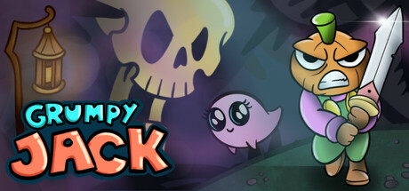
Grumpy Jack scored 65/100 on Steam Analyzer — Solid for a Adventure capsule. Top priority fix: [contrast_color] Increase skull and ghost luminance or add bright outline to separate them from background haze and strengthen silhouette at tiny size.

Capsule scores by dimension

  • Genre Clarity: 5/10 — Unclear genre signals mixed. The cartoonish art style and character expressions suggest comedy or action-adventure, but the bullet-hell mechanic is not visually communicated. At tiny size, the skull and quirky character read as general fantasy-comedy rather than a fast-paced bullet-hell RPG hybrid. The genre identity is ambiguous without the context of the description.
  • Title Readability: 8/10 — Title clear, strong color separation. GRUMPY JACK uses bright cyan and orange gradient text on a dark background, creating excellent contrast and readability at all sizes. The letterforms remain legible at small and tiny sizes due to the bold outline and saturation. However, the title placement slightly overlaps the left side without safe margin, which could risk cropping on some Steam layouts.
  • Contrast & Color: 7/10 — Good value separation, some muddy midtones. The cyan title pops well against the dark purple-teal background, and the orange character on the right has clear silhouette separation. At tiny size, the character reads distinctly, but the skull and floating ghost in the middle-left blend into the murky purple-green background, reducing overall clarity. The purple lantern and skull lack sufficient luminance separation from the surrounding haze.
  • Uniqueness & Polish: 6/10 — Competent cartoon style, generic scene. The art is polished and cohesive in cartoon rendering, with expressive character design and clean linework. However, the composition is a straightforward 'character + spooky elements' layout that does not visually communicate the unique bullet-hell or quirky narrative hook. The scene feels more like a standard RPG character reveal than a distinctive selling point for a comedy-adventure hybrid.
  • Brand Consistency: 7/10 — Consistent cartoon aesthetic, character iconic. Grumpy Jack himself is a memorable and recognizable character with distinctive orange-green coloring and angry expression that could serve as a visual anchor. The cartoon art style is internally consistent with clean cel-shading and consistent color palette of purples, teals, and warm accent colors. The identity feels cohesive, though without more reference material, brand uniqueness is moderate.
  • Composition: 6/10 — Scattered focal points, safe margins weak. The eye competes between three elements: Grumpy Jack on the right (primary character), the skull in center-left (thematic prop), and the ghost floating above (supporting detail). At tiny size, the distributed elements create a cluttered read rather than a clear hierarchy, and the left side title placement encroaches on safe margin space. The composition lacks a strong single focal point that would anchor attention at quick glance.

What works

  • Bright, readable title treatment. Cyan and orange gradient text maintains legibility across all size reductions with strong color separation from the background.
  • Polished character design and rendering. Grumpy Jack is expressive, well-drawn, and maintains visual clarity even at tiny size with a distinctive silhouette.
  • Cohesive internal art style. Cartoon aesthetic is consistent across all elements with unified color palette and clean linework throughout.

What hurts the capsule

  • Genre identity unclear without description. Visuals do not communicate bullet-hell mechanics or action-adventure gameplay; reads as generic fantasy-comedy instead.
  • Background elements muddy and blend. Skull and ghost lack sufficient contrast against purple-teal background, creating visual mud at small and tiny sizes.
  • Composition scattered without clear focal point. Three competing elements (character, skull, ghost) divide attention equally, reducing impact at quick scroll and tiny thumbnail view.

Priority fixes

  1. [contrast_color] Increase skull and ghost luminance or add bright outline to separate them from background haze and strengthen silhouette at tiny size.
  2. [genre_clarity] Add a subtle visual cue like a projectile pattern, burst effect, or UI element to hint at bullet-hell gameplay without cluttering the composition.
  3. [composition] Consolidate secondary elements (skull, ghost) into a tighter background layer; move Grumpy Jack slightly left to create stronger left-to-right hierarchy and protect title margins from crop risk.

Store copy priority fixes

  1. [hook_strength] Replace the opening line of the detailed description with a sentence that emphasizes either the core emotional appeal (e.g., 'Face off against Death's bureaucratic minions in hand-drawn bullet-dodging chaos') or the unique tone that sets it apart from similar games.
  2. [uniqueness] Add one concrete example of a mechanic or story moment that is distinctly Grumpy Jack—e.g., 'Unlock shortcuts and abilities by helping tormented NPCs,' or describe how the coffee mug quest shapes exploration/progression.
  3. [audience_targeting] Clarify in the short description or early in features whether this is a narrative-focused adventure with accessible combat options or a skill-demanding action game with story elements, to set expectations for different player types.
  4. [feature_communication] Expand the combat description to explain what makes the bullethell encounters distinctive (e.g., 'Pattern-based boss encounters,' 'Skill-based evasion mechanics,' or 'Dynamic arena hazards'), not just that they exist.

Related guides

Steam app ID: 3698230 · Tags: Adventure, 2D, Cartoony, Hand-drawn, Top-Down