Scoring genre clarity...
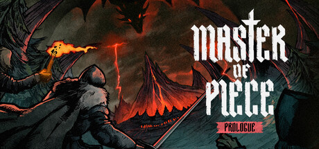
In this Free version of Master of Piece, build your deck of mercenaries, find powerful synergies between various traits and relics to fight against outlaws, fanatics, and cultists, and uncover the secrets of the Dragon Orb.
Free to PlayVery Positive(80)
Roguelike DeckbuilderFree to PlayTurn-Based Strategy
I M GAMEAug 21, 2025