Quick text summary
Dive and Dine Simulator scored 73/100 on Steam Analyzer — Good for a Early Access capsule. Top priority fix: [brand_consistency] Introduce a distinctive visual signature—such as a unique diver character design, restaurant branding element, or color accent (e.g., warm orange/yellow from kitchen) that recurs across store assets and becomes instantly recognizable.
Capsule scores by dimension
- Genre Clarity: 8/10 — Clear diving and cooking hybrid. The capsule immediately communicates a dual-genre experience through the diver in underwater environment with coral and fish, combined with kitchen-focused title treatment mentioning 'SIMULATOR.' At tiny size, the underwater setting and gear-equipped diver silhouette clearly signal adventure/exploration, while the 'DINE' text anchors the cooking/management component. Genre clarity is strong, though the specific hybrid nature (diving + restaurant) might read as slightly split at the smallest size.
- Title Readability: 8/10 — Bold white text with clear separation. The title 'DIVE AND DINE' uses strong white letterforms with excellent contrast against the deep blue underwater background, and the word 'SIMULATOR' is properly sized below in a supporting role. At small and tiny sizes, the large sans-serif font maintains legibility and the layout is clean, though the decorative dive icon embedded in 'DIVE' adds character without compromising readability. The text positioning avoids the busy diver area and sits in a controlled region, supporting quick recognition.
- Contrast & Color: 8/10 — Strong blue-to-white value separation. The white title text creates excellent contrast against the rich teal-blue underwater environment, with clear silhouette separation between the diver figure and background elements. The lighting on the diver (realistic shading with highlights) and the bright water caustics provide depth layering that prevents muddy mid-tones. In grayscale, the white text and bright diver suit maintain clear edges; at tiny size the composition holds its visual punch.
- Uniqueness & Polish: 7/10 — Polished realism with simulator hook. The underwater photography-style rendering of the diver, fish, and coral shows solid craft and premium presentation compared to generic simulator capsules. The integration of the diver character as the visual anchor (rather than abstract imagery) gives personality, and the clear 'SIMULATOR' label communicates the game loop. However, the overall concept—underwater diving + restaurant management—is a novel pairing that distinguishes it, though the execution relies on familiar photorealistic underwater asset quality without a highly distinctive art style signature.
- Brand Consistency: 6/10 — Functional but generic underwater aesthetic. The capsule uses a coherent photorealistic underwater rendering style with consistent lighting and a unified color palette (deep blue and teal tones). However, there are no distinctive brand identity signals—no recurring character design, symbolic motif, or signature visual language that would make this capsule instantly recognizable as 'Dive and Dine' versus other ocean/diving games. The design is competent and internally cohesive, but lacks memorable brand anchors beyond the title itself.
- Composition: 7/10 — Clear focal point with balanced layout. The diver positioned in the left-center area serves as the primary focal point, drawing the eye immediately, while the title occupies the right side without competing for attention. Depth layering is effective: foreground diver, mid-ground coral and fish, background water caustics create visual hierarchy. At small and tiny sizes, the composition remains clear, though at the absolute smallest scale the supporting coral and fish elements become noise; the safe title placement and centered diver figure help maintain readability.
What works
- Strong title contrast and placement. White sans-serif text positioned on controlled background region ensures 'DIVE AND DINE SIMULATOR' remains highly legible from full size down to tiny thumbnail.
- Dual-genre clarity through visual pairing. The diver figure immediately signals exploration/adventure while 'DINE' text anchors the restaurant simulation aspect, communicating the hybrid gameplay loop efficiently.
- Photorealistic polish and professional render. The underwater photography-style imagery with realistic diver gear, lighting, and coral creates a premium feel that stands above flat or generic simulator art.
- Effective depth layering at small sizes. Foreground diver, mid-ground coral/fish, and background caustics maintain visual separation even when scaled down, preventing collapse into muddy blur.
What hurts the capsule
- Limited brand identity and memorability. No iconic character, recurring symbol, or signature visual language makes this capsule feel generic despite solid execution—it could swap branding with similar ocean games without obvious loss.
- Supporting elements become visual noise at tiny size. While the diver remains clear, the coral, fish, and caustic details that add appeal at full size fragment into confusing texture at the smallest thumbnail scale.
- Generic underwater setting without unique hook. The photorealistic diver and ocean environment, though well-rendered, follow familiar visual conventions and don't immediately signal what makes this game distinct from other diving or cooking sims.
Priority fixes
- [brand_consistency] Introduce a distinctive visual signature—such as a unique diver character design, restaurant branding element, or color accent (e.g., warm orange/yellow from kitchen) that recurs across store assets and becomes instantly recognizable.
- [uniqueness_polish] Add a subtle gameplay affordance or visual hook that communicates the restaurant/culinary angle more directly—such as a stylized fish catch, plated dish silhouette, or visual blend of ocean and kitchen elements—to stand out in the cooking simulator space.
- [genre_clarity] Ensure at tiny size the 'DINE' text remains as readable as 'DIVE' by slightly increasing its relative weight or ensuring its contrast is not reduced by background elements.
Store copy priority fixes
- [uniqueness] Add a paragraph explaining what is mechanically different about Dive and Dine's cooking system, ocean exploration, or progression compared to existing cooking or fishing sims—e.g., 'unlike other restaurant sims, every dish is tied directly to your own catch, creating a true farm-to-table loop.'
- [hook_strength] Replace '
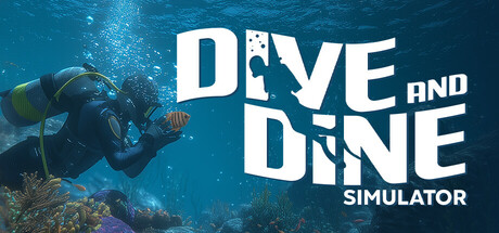
Dive and Dine Simulator is launching soon in Early Access' with a more specific, benefit-driven hook: 'Catch fresh fish, cook gourmet meals, and run a seaside restaurant solo or with friends—the ultimate sea-to-table adventure.'
- [audience_targeting] Add a sentence explicitly addressing solo players: 'Perfect for relaxing exploration and mastery-driven players, or bring friends for cooperative chaos.'
- [feature_communication] Include specific content scope details: e.g., 'Discover 50+ fish species, unlock 100+ recipes, and expand your restaurant across 5 ocean zones.'
Related guides
Steam app ID: 3700830 · Tags: Early Access, Adventure, Simulation, Life Sim, Hidden Object