Scoring genre clarity...
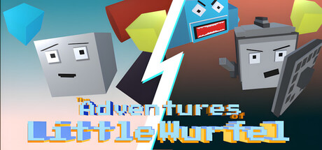
Dive into the world of Little Wurfel — the mighty little cube! Get hypnotized and relax as you watch his astonishing journey through infinity, or take on the thrilling challenge of "Swords & Sharks", where your skills in precision, dodging, and balancing will be put to the ultimate test!
$0.99
CasualIndieAtmospheric
ComputerfamilieJun 9, 2025