Scoring genre clarity...
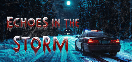
Investigate a series of brutal crimes in a remote Arctic town in this psychological horror experience steeped in oppressive atmosphere. Step into the shoes of Detective James Northland and face the terrifying beast threatening to shatter your sanity in this chilling tale of mystery.
$4.99Mostly Positive(24)
Walking SimulatorPsychological HorrorInvestigation
Dead Blue ScreenOct 23, 2025