Scoring genre clarity...

12 MONTHS TO LAUNCH capsule

12 MONTHS TO LAUNCH

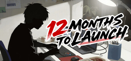
A lighthearted resource-management game of running an indie game studio! Play as a first-time indie game producer, making critical decisions for your team's future while balancing quality against viral appeal. Will you become a laughingstock among players, or a shining star in the industry?

$3.99Positive(11)
Time ManagementGame DevelopmentMemes
BroBroStudioJan 9, 2026

12 MONTHS TO LAUNCH scores 70/100 — better than 28% of Time Management capsules (n=936).

Positive (11 reviews) · $3.99 · Released Jan 9, 2026 · By BroBroStudio

Quick text summary

12 MONTHS TO LAUNCH scored 70/100 on Steam Analyzer — Good for a Time Management capsule. Top priority fix: [uniqueness_polish] Introduce a distinctive art style or visual element that communicates the game's lighthearted tone or unique mechanical hook (e.g., stylized character, signature art direction, or humorous visual motif)

Capsule scores by dimension

  • Genre Clarity: 7/10 — Indie studio management clearly readable. The silhouetted figure at a desk with laptop and coffee cup immediately signals a workplace/management theme. The game dev studio setting is unmistakable at full size, though at tiny size the silhouette alone reads as 'desk work' rather than specifically 'game dev.' The context clues (laptop, creative workspace aesthetic) support the management/simulation genre inference without being ambiguous about the core loop.
  • Title Readability: 8/10 — Bold dynamic title with strong hierarchy. The large red '12' combined with black and white 'MONTHS TO LAUNCH' text creates excellent contrast against the light background. The angled, energetic typography maintains legibility at small sizes due to the bold weight and color separation. At tiny size, the red '12' acts as a strong anchor point that aids recognition, though the smaller text becomes compact but still reads with reasonable clarity.
  • Contrast & Color: 8/10 — Strong value separation with bold accents. The bright white background with dark silhouette and red typography creates clear layering and pops well against Steam's #1b2838 dark theme. The red text is highly saturated and commands attention in the hierarchy. In grayscale, the silhouette maintains strong separation from background, and the red converts to a distinct mid-tone that preserves readability and visual impact at all scales.
  • Uniqueness & Polish: 6/10 — Competent but generic management game look. The execution is clean and professional with polished typography and clear design intent, but the silhouetted developer at desk is a common visual trope in indie studio/management game marketing. The aesthetic leans toward functional clarity over distinctive art style or memorable visual hook. While not generic, it doesn't communicate a unique selling point or specific mechanic that separates it from similar management simulators in the benchmark set.
  • Brand Consistency: 6/10 — Minimal identity cues, functional palette. The capsule uses a clean white-red-black palette that is coherent and professional but not distinctive or immediately memorable. There are no iconic visual elements, character designs, or signature motifs visible that would create brand recognition across marketing touchpoints. The stripped-back aesthetic is consistent but generic, lacking the memorable identity markers present in top performers like Balatro or Sticky Business.
  • Composition: 7/10 — Clear focal point with intentional layout. The silhouetted figure on the left serves as the primary focal point with the dynamic title anchoring the right side, creating good visual balance and clear hierarchy. The desk elements (laptop, coffee) provide supporting context without overwhelming the composition. At tiny size, the layout remains coherent due to the strong contrast zones, though the fine details of the workspace elements become less distinct and the composition relies primarily on the figure silhouette and red text accent.

What works

  • Bold red accent typography. The red '12' creates immediate visual hierarchy and strong contrast against the light background, making the title pop effectively at all viewing scales including tiny thumbnails.
  • Clear value separation and silhouette. The dark figure against bright background maintains excellent readability and silhouette clarity even at small sizes, supporting quick genre/game recognition during scrolling.
  • Coherent professional aesthetic. The clean white-red-black palette and polished typography convey a premium, intentional design that feels well-crafted and professional.

What hurts the capsule

  • Generic visual concept. The silhouetted developer at desk is a common trope in management game marketing and does not communicate what makes this game unique or mechanically distinct.
  • Minimal memorable brand identity. No iconic character, symbol, or signature visual motif is present that would create lasting brand recognition or stand out against competitors like Balatro or Sticky Business.
  • Limited art direction distinctiveness. The functional, flat aesthetic prioritizes clarity over artistic style, lacking the visual personality that elevates top-performing casual/management games in the benchmark set.

Priority fixes

  1. [uniqueness_polish] Introduce a distinctive art style or visual element that communicates the game's lighthearted tone or unique mechanical hook (e.g., stylized character, signature art direction, or humorous visual motif)
  2. [brand_consistency] Develop a memorable visual identity element such as a recognizable character design, icon, or signature color treatment that extends across marketing materials for long-term brand recall
  3. [composition] Consider adding subtle contextual details to the desk workspace that hint at game development (code snippets, design tools, viral metrics display) without cluttering the clean layout

Store copy priority fixes

  1. [feature_communication] Add a concrete example of a key decision: 'Choose between spending resources on game quality or marketing buzz—your choice shapes your studio's reputation and ending.' This illustrates the core tension mechanically.
  2. [uniqueness] Highlight why this game's setting/angle is different: 'The only management sim where your success depends on balancing artistic integrity against viral trends—experience the indie developer's real dilemma.'
  3. [feature_communication] Clarify what 'five distinct endings' means with a brief hint: 'Your decisions determine your fate: will you ship a masterpiece, a viral meme, a commercial flop, or something entirely unexpected?'

Related guides

Steam app ID: 3705980 · Tags: Time Management, Game Development, Memes, Resource Management, RPG