Scoring genre clarity...

Word Mesh capsule

Word Mesh

Do you like word search games? In Word Mesh, you have to find more than 3000 words in 10 languages ( 27000 Words if you play all ;) ).

$2.99
CasualWord GameSpelling
EntwicklerXMay 23, 2025

Word Mesh scores 68/100 — better than 18% of Casual capsules (n=10,153).

$2.99 · Released May 23, 2025 · By EntwicklerX

Quick text summary

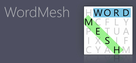
Word Mesh scored 68/100 on Steam Analyzer — Solid for a Casual capsule. Top priority fix: [title_readability] Increase title text weight or add subtle white outline to improve legibility at thumbnail sizes without competing with grid focus

Capsule scores by dimension

  • Genre Clarity: 8/10 — Word search puzzle immediately clear. The grid of colorful letters with diagonal, horizontal, and vertical word paths is an iconic word search visual that communicates the genre instantly at any size. At tiny size, the letter grid and highlighted path pattern remain recognizable as a puzzle game mechanic, though fine details blur slightly.
  • Title Readability: 7/10 — Title readable at all sizes with minor font weight concerns. WordMesh is displayed in a clean, light sans-serif on the left in full header size and reads well at small size. However, at tiny size the thin letterforms lose some crispness against the gray background; the title would benefit from slightly bolder weight or a subtle outline for guaranteed legibility at thumbnail scale.
  • Contrast & Color: 8/10 — Strong color pop from grid letters. The vibrant cyan, green, and yellow letters in the right grid section stand out strongly against both the gray background and the white grid container, creating clear visual hierarchy. The colored letter paths create excellent value separation and silhouette clarity even at tiny size, though the left side title text in light gray could use more contrast support.
  • Uniqueness & Polish: 6/10 — Functional but generic puzzle presentation. The grid layout is clean and professional but represents a standard word search visual treatment without distinctive art style, character presence, or unique mechanic communication beyond the core puzzle type. The design executes well but lacks memorable polish or a standout hook that differentiates it from typical casual puzzle games; it communicates competence rather than premium craft.
  • Brand Consistency: 5/10 — Minimal identity signals present. The capsule shows a straightforward word search grid with no distinctive character, mascot, palette, or motif that would establish brand recognition across marketing materials. Without reference to the store screenshots, there are no iconic internal cues that signal this is specifically WordMesh versus any generic word puzzle; consistency relies entirely on the functional layout rather than memorable identity markers.
  • Composition: 7/10 — Balanced layout with clear focal point. The design splits naturally into title on the left and interactive grid on the right, creating good visual balance and a clear focal point on the colorful letter grid. The composition reads well at small size, though at tiny size the left text area becomes relatively dormant; the white grid frame and colored letters remain the primary draw, which is appropriate for a gameplay-focused casual title.

What works

  • Genre instantly recognizable. The letter grid with highlighted word paths communicates word search puzzle gameplay at all viewing sizes, even at thumbnail scale.
  • Vibrant letter colors create visual pop. Cyan, green, and yellow letters achieve strong contrast against the gray background and white grid, maintaining visibility at tiny size.
  • Clean, organized layout. The two-column composition (title left, grid right) is well-balanced and prevents visual clutter or confused focal point.

What hurts the capsule

  • Generic puzzle aesthetic. The design lacks distinctive art direction, characters, or visual hooks that differentiate it from standard word search games.
  • No memorable brand identity cues. There are no iconic symbols, palette, or motifs that would allow instant recognition of WordMesh versus competing puzzle titles.
  • Title contrast could be stronger. The light gray WordMesh text on medium-gray background loses clarity at tiny size and could benefit from bolder weight or outline support.

Priority fixes

  1. [title_readability] Increase title text weight or add subtle white outline to improve legibility at thumbnail sizes without competing with grid focus
  2. [uniqueness_polish] Introduce a distinctive visual hook—icon, color accent, or character element—that signals WordMesh specifically rather than generic puzzle game
  3. [brand_consistency] Develop a consistent visual identity element (mascot, signature accent color, or symbol) that can be recognized across all marketing materials

Store copy priority fixes

  1. [hook_strength] Replace 'Do you like word search games?' with an action-oriented opener like 'Find hidden words across 27,000 puzzles in 10 languages' or 'Master endless word search challenges with dynamic difficulty and category selection.'
  2. [uniqueness] Add a differentiator sentence such as 'Infinite replayability through procedurally generated grids ensures no two puzzles are ever the same' or highlight what competitors lack (e.g., local co-op, global leaderboards if applicable).
  3. [tone_match] Remove the smiley emoticon and fix 'ultimative' to 'ultimate'; ensure consistent tone throughout—either conversational or professional, not both mixed.

Related guides

Steam app ID: 3708400 · Tags: Casual, Word Game, Spelling, 2D, Old School