SQUASER 9 scores 63/100 — better than 7% of Casual capsules (n=10,153).

Quick text summary

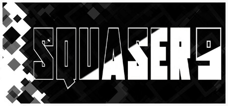
SQUASER 9 scored 63/100 on Steam Analyzer — Solid for a Casual capsule. Top priority fix: [genre_clarity] Add a stylized white square or grid element to the composition to immediately signal puzzle gameplay and clarify the core mechanic at small sizes.

Capsule scores by dimension

  • Genre Clarity: 5/10 — Ambiguous puzzle intent unclear. The title treatment and geometric diamond pattern suggest a puzzle or block-based game, but the large outlined letters and speech bubble shape do not clearly communicate core mechanics at tiny size. At TINY size, the design reads as bold typography with abstract geometry rather than as a clear puzzle game visual, lacking character silhouettes, grid elements, or other puzzle-specific iconography that would immediately signal the genre.
  • Title Readability: 7/10 — Strong at full size, decays small. The title 'SQUASER 9' uses a distinctive outlined sans-serif with excellent contrast against the black background at full header size, and the letters are spaced clearly. However, at SMALL size the letter forms begin to blur together slightly, and at TINY size the fine outline strokes collapse into a muddy silhouette where individual characters are difficult to distinguish, reducing confidence in the exact spelling.
  • Contrast & Color: 8/10 — High value separation works well. The white outlined letters and geometric diamond shapes in light gray create strong value contrast against the pure black background, maintaining clear silhouettes in grayscale. The design reads sharply even at small sizes due to the bold outline weight and minimal color palette, though the diamond pattern in the top-left corner introduces some visual texture that slightly reduces the stark simplicity.
  • Uniqueness & Polish: 6/10 — Competent but generic geometric style. The minimalist outlined letterforms and geometric diamond pattern show intentional design direction, but the execution feels like a standard modern indie typography treatment without a unique hook or distinctive art style. The speech bubble shape around the title is a nice touch for personality, but overall the capsule lacks memorable visual storytelling that communicates the core 'white square erases darkness' mechanic or gameplay loop.
  • Brand Consistency: 5/10 — Minimal identity signals present. The geometric diamond motif and outlined typography create a consistent internal style, but there are no strong iconic symbols, character silhouettes, or signature color palette that would be recognizable across store screenshots or marketing materials. Without reference to the 5 store screenshots, this capsule does not project a memorable brand identity specific to SQUASER 9; it reads as a generic minimalist aesthetic.
  • Composition: 7/10 — Clear hierarchy, tight margins safe. The title dominates the center with the geometric pattern anchoring the top-left, creating a clear focal point and visual hierarchy that survives reduction to SMALL size. The composition respects safe margins and avoids edge-hugging text, though the diamond pattern could feel slightly scattered; at TINY size the primary title remains the only clear read, which is appropriate for quick scroll discovery.

What works

  • Strong black-to-white contrast. The outlined white letters against pure black background create excellent value separation that remains readable at tiny sizes and works well on Steam's dark theme.
  • Clear title hierarchy at full size. The large outlined letterforms with generous spacing maintain legibility at header size and are intentionally styled for a modern indie aesthetic.
  • Consistent geometric visual language. The diamond pattern motif and outlined stroke weight create an internal cohesion throughout the design.

What hurts the capsule

  • Title outline collapses at tiny size. Fine strokes in the outlined letters blur together when reduced, making the exact title text ambiguous at thumbnail viewing distance.
  • No gameplay mechanic communication. The visual design does not convey the core 'white square erases darkness' puzzle mechanic, leaving genre intent unclear for quick-scroll discovery.
  • Generic minimalist aesthetic. The outlined typography and geometric pattern are competent but lack distinctive visual hooks or memorable brand identity signals unique to SQUASER 9.

Priority fixes

  1. [genre_clarity] Add a stylized white square or grid element to the composition to immediately signal puzzle gameplay and clarify the core mechanic at small sizes.
  2. [title_readability] Increase outline stroke weight by 20-30% or switch to a solid fill with outline, ensuring the title remains legible at 120px width without letter collapse.
  3. [uniqueness_polish] Develop a signature visual motif beyond geometric diamonds—consider incorporating the core game mechanic (white square on dark grid) as a compositional element to create brand distinctiveness.

Store copy priority fixes

  1. [uniqueness] Add a specific differentiation statement such as 'combines memory challenges with precision maze navigation' or describe how levels evolve mechanically beyond the first few.
  2. [feature_communication] Expand the detailed description to explain what 'logic and memory' puzzles mean in practice—do levels introduce new mechanics, obstacles, or pattern types? What makes level 40 harder than level 5?
  3. [hook_strength] Reframe the short description opening to emphasize the emotional payoff or unique appeal: instead of 'Clear your path using logic and memory,' try something like 'Push yourself from casual explorer to precision perfectionist' or highlight a specific puzzle tension.

Related guides

Steam app ID: 3710620 · Tags: Casual, Puzzle, Side Scroller, Abstract, Indie