Scoring genre clarity...
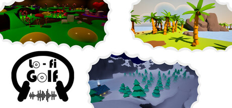
Chill out with a third-person, physics-based golf game set to relaxing LoFi music. Explore dreamy, atmospheric maps with the freedom to find your own path. Will you risk a tricky shortcut or play it safe? Every shot counts, complete each course before running out of strokes!
Free to Play8 user reviews
CasualSimulationGolf
Lazy Sloth GamesJul 17, 2025