Scoring genre clarity...

The Last Diner capsule

The Last Diner

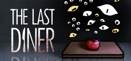
An eldritch being has destroyed humanity and mutated the world. Now it demands you cook for it. Explore the ruined city of , hunt strange ingredients, avoid the horrors, and cook your find in this survival roguelike meets cooking game . Make a meal worthy of a god, or be the meal yourself.

$0.99
AdventureAction-Adventure2D
Team RocketFeb 28, 2026

The Last Diner scores 72/100 — better than 48% of Adventure capsules (n=7,922).

$0.99 · Released Feb 28, 2026 · By Team Rocket

Quick text summary

The Last Diner scored 72/100 on Steam Analyzer — Good for a Adventure capsule. Top priority fix: [genre_clarity] Introduce a subtle cooking tool, utensil, or ingredient element in the composition to signal the cooking mechanic and improve genre clarity at tiny size.

Capsule scores by dimension

  • Genre Clarity: 7/10 — Surreal horror cooking premise clear. The capsule communicates an eldritch cooking theme through the apple on a platform and disembodied eyes floating above, which reads as supernatural and unsettling. At tiny size, the apple and eye motifs remain recognizable enough to signal 'something is wrong here,' though the cooking+horror blend is not immediately obvious without context. The visual leans heavily into atmospheric horror rather than action-adventure, which may slightly misdirect genre expectations.
  • Title Readability: 8/10 — Bold title legible at small sizes. The title 'THE LAST DINER' uses a clean, high-contrast white sans-serif font positioned in the upper left on a dark background, maintaining excellent readability down to small and tiny sizes. The letterforms are sturdy and well-spaced, and the placement avoids the busy eye-filled upper region. A faint red underline or accent adds visual interest without compromising clarity.
  • Contrast & Color: 8/10 — Strong white-dark separation clean. The white title and pale eye motifs stand out sharply against the dark charcoal background, creating excellent value separation. The red apple provides a warm accent that pops and draws the eye, while the golden/yellow eye accents add depth without cluttering. At tiny size, the contrast hierarchy remains intact and the white text does not blur or disappear.
  • Uniqueness & Polish: 7/10 — Distinctive eldritch cooking hook. The concept of an apple on a platform watched by numerous disembodied eyes effectively conveys the unsettling premise and stands apart from typical action-adventure fare. The execution feels intentional and polished, with careful eye placement and subtle shading on the apple and platform. However, the visual presentation is more atmospheric mood-piece than gameplay-revealing, and the cooking mechanic is not explicitly signaled.
  • Brand Consistency: 6/10 — Cohesive surreal aesthetic internal. The capsule establishes a consistent dark, supernatural palette with white typography and glowing eyes that could become a recognizable brand motif for this game. The apple and platform are rendered with subtle realism amid the abstract eye field, creating internal visual coherence. Without other brand reference materials visible, it is difficult to assess whether this visual language extends consistently across promotional assets, though the core identity feels established.
  • Composition: 7/10 — Clear focal hierarchy well balanced. The title anchors the left side while the apple-on-platform serves as a strong central focal point, with the eye field creating atmospheric depth around it. The composition avoids clutter and uses vertical space efficiently, with the dark void at bottom providing breathing room. At small size, the hierarchy compresses well; at tiny size, the apple and eyes may blur slightly but the title remains dominant and the overall silhouette reads.

What works

  • High-contrast typography. White title on dark background reads clearly at all sizes without decorative collapse or outline loss.
  • Memorable visual hook. The combination of an apple and disembodied eyes creates an instantly distinctive and unsettling image that communicates the surreal premise.
  • Balanced composition. Title and central focal point (apple) occupy different zones, allowing the eye to move through the design with clear hierarchy.
  • Color accent effectiveness. The red apple and golden eye accents provide warm pops against the cool dark palette, improving visual interest and scrolling discoverability.

What hurts the capsule

  • Genre ambiguity at small size. The horror-cooking hybrid nature is not immediately clear from visuals alone; it reads as pure supernatural rather than cooking roguelike.
  • Apple and platform realism. The semi-realistic rendering of the apple and platform may feel slightly disconnected from the abstract eye field, causing minor visual inconsistency.
  • Gameplay mechanic not signaled. There is no clear visual hint of the cooking or survival aspects; the capsule prioritizes atmosphere over gameplay clarity.

Priority fixes

  1. [genre_clarity] Introduce a subtle cooking tool, utensil, or ingredient element in the composition to signal the cooking mechanic and improve genre clarity at tiny size.
  2. [uniqueness_polish] Refine the rendering of the apple and platform to better match the abstract or surreal treatment of the eye field for stronger internal visual cohesion.
  3. [composition] Test the capsule at 120×45 resolution to ensure the eye field detail remains readable and does not collapse into a muddy dark mass.

Store copy priority fixes

  1. [hook_strength] Fix the missing city name in the short description ('Explore the ruined city of Watterun') to eliminate the jarring incomplete sentence.
  2. [feature_communication] Add a dedicated bullet-point list of core mechanics (Explore → Scavenge → Cook → Survive) with 1-2 sentence explanations to improve scannability and mental model clarity.
  3. [feature_communication] Specify what cooking minigames involve (e.g., 'timing-based chopping,' 'ingredient-matching puzzles') to make the cooking system feel tangible rather than abstract.
  4. [audience_targeting] Add one explicit sentence identifying the core audience (e.g., 'For roguelike and dark-fantasy fans seeking a fresh take on survival games') to help players self-identify fit.

Related guides

Steam app ID: 3711250 · Tags: Adventure, Action-Adventure, 2D, Singleplayer, Dark