Scoring genre clarity...
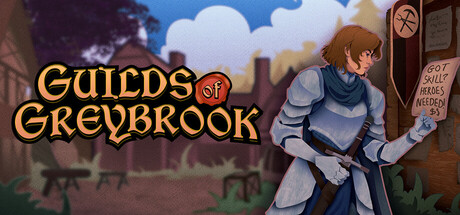
Guilds of Greybrook is a roguelike management simulator where you don't play the hero, you pay the heroes! Operate the choppy waters of business ownership, hire adventurers, take contracts, and choose sides in the dangerous power struggles of the frontier.
$5.999 user reviews
ManagementRoguelikeSingleplayer
Brava GamesFeb 26, 2026