Scoring genre clarity...

BATTLE SHADOW ARENA capsule

BATTLE SHADOW ARENA

A skill-based 1v1 action game where you combine weapons and elements to build custom combos and take on ever-stronger bosses in your own style.

$4.993 user reviews
ActionSouls-likeDifficult
Zni GamesJun 4, 2025

BATTLE SHADOW ARENA scores 67/100 — better than 13% of Action capsules (n=8,535).

3 user reviews · $4.99 · Released Jun 4, 2025 · By Zni Games

Quick text summary

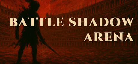
BATTLE SHADOW ARENA scored 67/100 on Steam Analyzer — Solid for a Action capsule. Top priority fix: [uniqueness_polish] Incorporate a visual element that hints at the combo/element system—such as a glowing weapon, elemental aura, or multi-element effect on the warrior—to distinguish Battle Shadow Arena from generic action games.

Capsule scores by dimension

  • Genre Clarity: 7/10 — Action game with combat focus. The silhouetted warrior figure with a sword and the dramatic red-orange arena backdrop clearly communicate action combat gameplay. At tiny size, the character pose and weapon are recognizable, though the specific 1v1 skill-based nature and boss-fighting mechanics are not visually evident—it reads as generic action rather than the combo/element system hook.
  • Title Readability: 8/10 — Clear, well-placed sans-serif title. BATTLE SHADOW ARENA uses a bold cream/off-white serif font positioned in the upper right and center-right of the composition with strong contrast against the dark red background. The title remains legible at small and tiny sizes due to large letterforms and strategic placement away from the busy silhouette; no tagline clutter aids readability.
  • Contrast & Color: 8/10 — Strong warm-dark value separation. The deep red-brown arena background contrasts effectively with the cream-colored title text and the black silhouetted warrior figure, creating clear value separation. The grayscale squint test shows good silhouette clarity; the character and title remain distinct even at tiny size, though the mid-tone red gradient lacks cool color relief and can feel monochromatic.
  • Uniqueness & Polish: 5/10 — Competent but generic action setup. The silhouetted warrior in an arena setting is a familiar trope across action games and lacks visual storytelling about the game's core mechanic—weapon and element combo building. The red arena aesthetic is polished but does not communicate what makes Battle Shadow Arena distinct; it could describe a dozen other action titles and feels template-like despite clean execution.
  • Brand Consistency: 5/10 — Minimal identity signals present. The capsule relies on a generic warrior silhouette and warm arena palette with no iconic character, signature symbol, or memorable visual motif that could be recognized as Battle Shadow Arena specifically. Without reference to the 10 store screenshots, the capsule offers no internal cohesion cues—color, silhouette, and typography could belong to many indie action titles.
  • Composition: 7/10 — Clear hierarchy with safe framing. The warrior silhouette anchors the left-center area while the title occupies the right, creating diagonal balance and a clear focal point at small and tiny sizes. The composition avoids clutter and respects safe margins; however, the right-side title placement leaves some potential mid-ground dead space, and the arena architecture in the background, while atmospheric, competes slightly for attention rather than purely supporting the hero.

What works

  • Strong title contrast and legibility. Cream serif font on dark red background remains readable at tiny size due to excellent value separation and strategic off-center placement.
  • Clear silhouette and focal point. Black warrior figure with sword creates an immediate, recognizable action silhouette that anchors the composition and reads at all viewing sizes.
  • Polished execution and clean craft. Red gradient, typography, and layout show professional attention to detail without visual noise or cheap effects.

What hurts the capsule

  • Generic action game archetype. Silhouetted warrior in arena is a common template across dozens of action titles and does not visually communicate the unique combo/element mechanic.
  • Monochromatic warm palette. Reliance on red-brown tones limits visual distinctiveness and lacks cool color relief to create memorable brand identity cues.
  • No core mechanic visualization. The capsule shows a warrior but does not hint at weapon switching, elemental effects, or boss progression that differentiate the game.

Priority fixes

  1. [uniqueness_polish] Incorporate a visual element that hints at the combo/element system—such as a glowing weapon, elemental aura, or multi-element effect on the warrior—to distinguish Battle Shadow Arena from generic action games.
  2. [brand_consistency] Introduce a signature color accent (cool tone like cyan or purple) or iconic symbol (weapon design, element rune, or character distinguishing mark) that becomes a recognizable identity cue across marketing.
  3. [contrast_color] Add subtle cool-toned lighting (blue-purple rim light, elemental glow) to break the monochromatic red palette and increase visual distinctiveness at tiny size.

Store copy priority fixes

  1. [uniqueness] Add a concrete differentiator sentence in the opening paragraph, e.g., 'Unlike traditional Souls-likes, every weapon, element, skill, and card combines into a limitless combo system—your victory style is entirely your own.'
  2. [feature_communication] Insert a 1-2 sentence example of a real combat scenario showing how a player might chain a weapon attack → elemental skill → card effect → counterattack to demonstrate system interaction.
  3. [tone_match] Rewrite the closing lines to maintain the tactical, skill-focused voice: 'Master your elemental arsenal. Perfect your timing. Claim your victory through precision and strategy.' instead of the mystical narrative framing.

Related guides

Steam app ID: 3713210 · Tags: Action, Souls-like, Difficult, Combat, Boss Rush