Scoring genre clarity...

MoonLight capsule

MoonLight

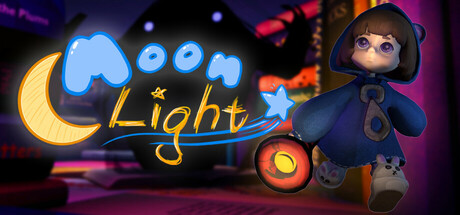
Remember the feeling of being frozen of fear under your blanket, in your childhood bed, being absolutely sure there’s monster under the bed? In MoonLight you get to face your childhood fears, getting rid of shadows through an atmospheric dream world filled with puzzles and wonder.

Free to PlayMostly Positive(18)
AdventurePuzzlePlatformer
Please go to Sleep, This is not Healthy EntertainmentMay 26, 2025

MoonLight scores 72/100 — better than 48% of Adventure capsules (n=7,922).

Mostly Positive (18 reviews) · Free to Play · Released May 26, 2025 · By Please go to Sleep, This is not Healthy Entertainment

Quick text summary

MoonLight scored 72/100 on Steam Analyzer — Good for a Adventure capsule. Top priority fix: [composition] Shift the child character slightly left and inward to create safer margins from the right edge and ensure resilience across Steam crop variations.

Capsule scores by dimension

  • Genre Clarity: 7/10 — Childhood fear adventure clear. The hooded child character, glowing orb, and dark atmospheric setting communicate a puzzle-adventure game with emotional/narrative focus. At tiny size, the silhouette of the frightened character and warm lantern light read as atmospheric adventure rather than action. Genre is clear but could be sharper about the puzzle-solving mechanic itself.
  • Title Readability: 8/10 — Bold yellow title readable. The 'MoonLight' text uses bright yellow with blue cloud outline and a crescent moon icon, creating strong contrast against the dark background. At small and tiny sizes, the title remains legible due to weight and color separation. The decorative moon and cloud elements support rather than obscure the wordmark.
  • Contrast & Color: 8/10 — Strong warm cool separation. Warm orange and yellow (title, lantern, ambient glow) contrast sharply against cool purple and dark blue background, with the child character providing mid-tone definition. The glowing orb and moon create clear focal points that stand out at all sizes. Grayscale test shows strong value separation between character, lights, and background.
  • Uniqueness & Polish: 7/10 — Stylized character, familiar mood. The art style shows clean 3D-rendered character modeling and lighting with intentional atmosphere, feeling premium and cohesive. The hooded child and lantern effectively communicate the game's emotional core of childhood fear. However, the composition reads somewhat similar to other indie adventure games (DREDGE, Slay the Princess) in mood and silhouette placement.
  • Brand Consistency: 6/10 — Cohesive but limited identity. The warm-cool color palette, atmospheric lighting, and character design are internally consistent and match the game's dream-world aesthetic. However, there are no distinctive visual motifs or iconic symbols beyond the character itself that would be instantly recognizable across other store assets. The design is thematically appropriate but not uniquely branded.
  • Composition: 7/10 — Clear focal point, balanced layout. The hooded child anchors the composition at right-center, with the glowing lantern as secondary focal point and the title dominating the upper-left area. The layout shows good depth layering with background glow, mid-ground character, and foreground title. At small size, the arrangement remains readable, though the character position near the edge slightly risks cropping on some Steam placements.

What works

  • Strong title-to-background contrast. Yellow and blue 'MoonLight' text stands out clearly against dark purple background even at tiny thumbnail size.
  • Atmospheric emotional clarity. The hooded child and glowing lantern immediately communicate the game's core fear-and-wonder theme without confusion.
  • Warm-cool color harmony. The orange and purple palette creates visual tension that feels intentional and premium, supporting the dream-world genre.
  • Clean character rendering. The 3D character model is well-lit and defined, reading clearly as a frightened child even at reduced sizes.

What hurts the capsule

  • Limited distinctive branding. The visual identity, while cohesive, relies on mood and character rather than a memorable icon or signature visual motif.
  • Character edge proximity. The child character is positioned close to the right edge, creating slight risk of awkward cropping in some Steam UI layouts.
  • Puzzle-solving mechanic unclear. While the emotional adventure aspect reads well, the capsule doesn't visually communicate the puzzle-solving gameplay element.

Priority fixes

  1. [composition] Shift the child character slightly left and inward to create safer margins from the right edge and ensure resilience across Steam crop variations.
  2. [uniqueness_polish] Introduce a distinctive visual element or icon (beyond the lantern) that becomes a recognizable brand signature across store screenshots and marketing.

Store copy priority fixes

  1. [feature_communication] Add a sentence explicitly mentioning platforming challenges (e.g., 'navigate platforms and obstacles') to match the Platformer tag and set clear expectations.
  2. [audience_targeting] Clarify tone and age-appropriateness with a line like 'A cozy, non-violent adventure for players of all ages' or 'A hauntingly beautiful experience for introspective indie fans.'
  3. [uniqueness] Add a sentence highlighting what makes the companion light mechanic special, e.g., 'Unlike typical puzzle platformers, your light friend is central to both survival and narrative.'
  4. [feature_communication] Include a brief mention of game length or level count (e.g., 'explore 8 haunting dream worlds') to anchor scope expectations.

Related guides

Steam app ID: 3713490 · Tags: Adventure, Puzzle, Platformer, Cute, Puzzle Platformer